Viewing Reports
This chapter describes how to display system reports and user and system logs to evaluate performance or troubleshoot the system. It includes these sections:
Networking Reports
Optimization Reports
Data Store Reports
Branch Services Reports
Report Data
Topology
Overview
This section describes the report format, before describing individual reports.
The time-series reports are clear, interactive, and easy to navigate. The statistics presented in these reports format are readily accessible, and all updates to the report window appear in real time. This section describes the report format in detail.
Navigating the Report Layout
The time-series report format not only makes data easily accessible, but also enhances your ability to explore data in context.
Figure: A Typical Report
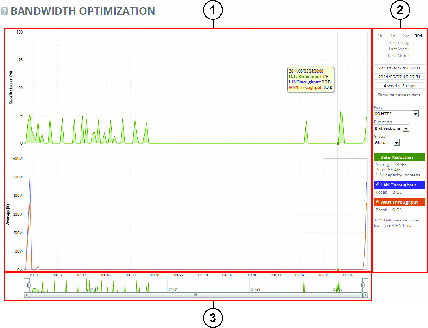
Plot Area (1)
The plot area is where the data visualization occurs. Reports can display either a single-pane or dual-pane layout. In a dual-pane layout, both panes remain synchronized with respect to the x-axis. Each pane is capable of having two y-axes (a primary one on the left and a secondary one on the right).
The reports present the data series as simple line series graphs, but some reports display area series graphs where appropriate. The types of area series graphs are:
• Layered series, that appear on top of each other in the z direction. These are identified by transparent colors.
• Stacked area series, that appear on top of each other in the y direction. RiOS uses stacked area graphs to depict an aggregate broken down into its constituent parts. In this type of graph, each series is a mutually exclusive partition of some aggregate data set, identified by opaque colors. A stacked series is appropriate when the sum of all the series is meaningful.
To view the time stamp and value of each data series at that time
• Place the mouse pointer over the plot area.
A tool tip displays the time stamp and the value of each data series at that time. The plot area colors the series names appropriately, and the data values have their associated units.
The plot area also displays subtle shading to denote work hours (white background) and nonwork hours (gray background). RiOS defines work hours as 8:00 AM to 5:00 PM on weekdays. You cannot configure the work hours.
To zoom in on the plot area
1. Place the mouse pointer over the plot area, and then click and hold the left mouse button.
2. Move the mouse left or right and release the left mouse button to zoom in.
The plot area reflects the changing chart window, as do the associated controls in the control panel.
Control Panel (2)
Use the control panel to control how much data the chart displays, the chart properties, and whether to view or hide the summary statistics.
To change the chart interval
• Click 1h (one hour), 1d (one day), 1w (one week), 30d (30 days), Yesterday, Last Week, or Last Month.
If the current size of the chart window matches any of the links, that link appears in bold black text; the system ignores any clicks on that link. If the time duration represented by any of the links is greater than the total data range of the chart, those links are dimmed.
• Chart window controls - Window-related controls appear below the chart window interval links. These controls offer more precise control of the window and also display various window properties. From top to bottom:
• Text field containing the left edge (starting time) of the chart window.
• Text field containing the right edge (ending time) of the chart window.
• Text field containing the chart window interval. The chart window interval in this text field is not always exactly correct, but it is correct to two units (with the units being days, hours, minutes, and seconds). For example, if the chart window interval is exactly 2 days, 3 hours, 4 minutes, and 5 seconds, this text field displays 2 days, 3 hours.
• Link or static text that represents the chart window state of attachment to the end of the chart. When the chart window is attached, the report replaces the link with the static text Showing newest data. When the chart is showing newest data, you can see new data points as the system adds them automatically to the chart every 10 seconds. This can be very powerful when you launch a new configuration and need to analyze its impact quickly. You cannot change the 10-second default.
When the chart window is not attached to the end of the chart, the report replaces the static text with a link that displays Show newest data. Click this link to slide the chart window to the end of the chart range of data and attach the window.
All three text fields validate your input; if you enter text in an invalid format, an error message appears. If you enter valid text that is logically invalid (for example, an end time that comes before the current start time), an error message appears. With all three text fields, if the focus leaves the field (either because you click outside the field or press Tab), the chart window updates immediately with the new value. Pressing Enter while in one of these fields has the same effect.
Custom Controls
Below the chart window controls is an optional section of custom, report-specific controls. The custom controls vary for each report.
When you change the value of a custom control, the system sends a new request for data to the server. During this time, the control panel is unavailable and an updating message appears on the chart. When the report receives a response, the system replaces the chart, populates it with the new data, and makes the control panel available again.
Chart Legend
The chart legend correlates the data series names with line colors and contains a few other features.
You can hide or show individual data series. When a white check box icon appears next to the data series name, you can hide the series from the plot area.
To hide individual series from the plot area
• Clear the check box next to the data series name.
To display individual series in the plot area
• Select the check box next to the data series name.
You cannot toggle the visibility of all the series, because it does not always make sense to hide a series (for example, if there is only one data series in the chart). For these series, a white check box does not appear next to the series name. You can hide the LAN Throughput and WAN Throughput series, but you cannot hide the Data Reduction series.
The legend also displays statistics. Each report defines any number of statistics for any of the data series in the chart. The system bases the statistics computation on the subset of each data series that is visible in the current chart window. The statistics display changes as the chart window changes. The reports also support nonseries statistics (for example, composite statistics that incorporate the data from multiple data series); these statistics appear at the bottom of the legend, below all the series.
Navigator (3)
Directly above the scroll bar is the navigator, that shows a much smaller and simpler display of the data in the plot area. The navigator displays only one data series.
Use the navigator to navigate the entire range of chart data. The scroll bar at the bottom shows you that portion of the total data range is displayed in the plot area.
The navigator display can appear very different from the plot area display when an interesting or eye-catching series in the plot area is not the series in the navigator.
To resize the current chart window
• Move the handles on either side of the chart window in the navigator.
The charts have a minimum chart window size of five minutes, so if you try to resize the chart window to something smaller, the chart window springs back to the minimum size.
You can also click the data display portion of the navigator (not the scroll bar) and the chart window moves to wherever you clicked.
Setting User Preferences
You can change report default settings to match your preferred style. When you customize any report-specific settings, the system immediately writes them to disk on the SCC. The system saves all of your custom settings, even after you log out, clear your browsing history, or close the browser. When you view the report again, your custom settings are intact.
The system saves report settings on a per-user basis. A message appears at the top of each page when multiple users are logged in, explaining that user preferences can be overwritten.
The system also saves the chart window. Whenever you change the chart window, the next time you view any report, the chart window is set to the last chart window used.
Browser Recommendation
Clear the browser cache and cookies after you upgrade to ensure the reports appear correctly.
Data Grouping
The data grouping approach is used to plot graphs for report pages to increase the readability when there are too many data points.
Data grouping replaces a sequence of data points in a series with one grouped point. The values of each grouped point are calculated from the original values of every point used using the aggregation options, such as average, sum, or high (max). Therefore, when you move the cursor over a graph on a report page the data within the box is aggregated or grouped data for a certain period (or interval). As the zoom-level changes, the duration (or granularity) of the period (or interval) changes too.
The high-charts reports are configured to group samples to these granularities:
• Minute granularities: 5, 10, 15, 30
• Hour granularities: 1, 2, 3, 4, 6, 8, 12
• Day granularities: 1
For high-charts select the appropriate granularity and group data based on the zoom-level.
When high-stock data grouping is active, the time displayed on a data point, when you move the mouse over, is start-time of the time range being grouped.
The data that the SCC collects at each hour is the data for the past hour where the values are for that period of time.
Grouping and Approximation
The grouping depends in the data that is plotted. The three groupings are: average, sum, and high (max).
Most of the graphs use average as their grouping function. These reports use other than average:
• Bandwidth Optimization report graph uses sum. The data reduction graph uses average. The two throughput series uses sum.
• Optimized Throughput report graph uses average. The two average series use average and the four peak series use high.
• Connection History report graph uses max. The half-open and half-closed percentage graph uses average.
• Connection Pooling report graph uses sum.
• SnapMirror report the peak series graph uses high. The LAN and WAN throughput series uses average.
• SRDF report graph the two peak series uses high. The throughput series uses average.
Exporting Statistics
You can export statistics or schedule a time to export from of any individual report by scrolling to the lower part of the report page. You can also export statistics or schedule an export from the Reports > Report Data: Export page.
To export statistics
1. On the report page that you want to export, scroll to the lower part of the page.
2. Under Export, complete the configuration as described in this table.
Control | Description |
Export To | Select either the Email or URL option from the drop-down list. |
Email Addresses | Specify the email address of the recipient. (Only displays when Email is selected.) |
Email Subject | (Only displays when Email is selected.) Specify the email subject. (Only displays when Email is selected.) |
Destination URL | Specify the URL. (Only displays when URL is selected.) |
Format | Select HTML, CSV, or PDF from the drop-down list. |
Per Appliance Report | Enables appliance report settings. Note: Generates graphs per appliance for HTML/PDF reports. Note: Generates one CSV per appliance for CSV reports. |
Export Now | Select Export Now and click Export to start the export immediately. |
Schedule Export | Select Schedule Export and specify the start date, time, and frequency of the export. Use this format YYYY/MM/DD HH:MM:SS |
Export | Exports the data. |
Printable view | Displays the print menu. |