Content Creators: About Resources
A resource is a collection of items that you own or that have been shared with you. Specifically, Portal includes these types of resources:
• Custom Dashboards—A custom dashboard is a dashboard, made up of one or more panels, that was created by a user, as opposed to a dashboard that was automatically created based on a defined application or connected data resources. (For more information, see
“Content Creators: About Custom Dashboards“.)
• Applications—An application consists of an application model (map) that diagrams the relationship between the hosts used for a business application. Additionally, an application model includes end users, identifying the entry point in an application model where users access a host. The application model is used to monitor the performance and status of an application with automatically created dynamic dashboards. For more information, see
“Content Creators: About Application Models“.
•
“Content templates“—A content template is a named collection consisting of one or more metrics and a visualization style that is used to define a panel in a dashboard. Content templates allow you to quickly re-create a consistent look and operation for panels.
•
“Visualization styles“—A visualization style is named collection consisting of an element and configuration settings. In addition to the visualization styles that are included with Portal, you can create custom visualization styles to create a consistent look and operation for panels.
Resources are managed from the Resource Management screen. To access the Resources Management screen, choose Administration > Resources.
Resource management for non-administrators
If you have the read-only Resource Configuration permission, you can manage your own Portal resources: applications, dashboards, content templates, and visualization styles.
Resource Management Screen
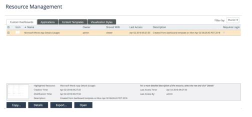
Unlike the Resource Management screen for administrators, the above screen does not have the tree-view side panel for selecting All Resources, Users, or Roles. There is also no functionality for changing ownership of resources or sharing resources.
General workflow for resource management
The following procedure describes the operations that can be performed when managing resources from the Resource Management screen:
Managing resources
1. Choose Administration > Resources.
2. Select the user or group for which you want to manage resources.
– If you have read-write Resource Configuration permission, from the tree view (on the left), select either All Resources or a particular user or role.
– If you do not have read-write Resource Configuration permission, the tree view does not display. Instead, it is assumed that you are managing resource that are either owned by you or shared with you.
3. Select the tab for the resource type that you want to manage:
Applications, Custom Dashboards, Content Templates, Visualization Styles.
4. If in
step 2 you selected a particular user or if the tree view did not display, choose the drop-down menu in the upper right corner for the resource you want to manage: Owned, Shared, or My Roles.
5. Perform the management operation:
– Create a Resource
Perform this operation to create a new resource.
Click New….
Notes:
- For Applications, after entering the application name, the user interface for defining an application model appears. For more information, and an alternate method for creating application models, see
“Content Creators: About Application Models“.
– Copy a Resource
Perform this operation to create a resource similar to an existing resource. After copying the resource, you can then edit the duplicate.
Select the resource(s) to copy and click Make a Copy….
Notes:
- You do not have to own a resource to copy it.
- If more than one resource is selected, Portal individually prompts for the new names, one after another.
- If you have read-write Resource Configuration permission, the copy operation prompts for an owner. Otherwise, it is assumed that the user performing the operation is the owner.
– Change Ownership of a Resource
Perform this operation to change the ownership to another user. The ownership of a resource is important because only the owner and users with whom the resource is shared can access the resource and perform management operations on the resource.
Select the resource(s) to change the ownership and click Change Ownership… .
If more than one resource is selected, the ownership of all selected resources is changed to the selected user.
– Edit a Resource
Perform this operation to edit a resource.
Select the resource to edit and click Edit.
Notes:
- For
“Content templates“, edits are immediately applied to dashboards where the content template is in use.
- For
“Visualization styles“, edits are immediately applied to dashboards where the visualization style is in use.
– Rename a Resource
Perform this operation to change the name assigned to a resource.
(Applies to Custom Dashboards, Content Templates, and Visualization Styles.)
Simply double-click the resource name and enter the new name.
For Applications, use the Make a Copy… option to make a copy of the resource (giving it a new name during the copy operation) and then use the Delete option to delete the original resource.
– Update the Icon Associated with a Resource
Perform this operation to update the icon associated with the resource.
(This operation only applies to Applications and Custom Dashboards).
Simply double-click in the resource’s Icon column, click Choose File to select a graphic, and then click Upload….
– Change the Description
Perform this operation to change the description of a resource.
(This operation only applies to Applications and Custom Dashboards).
Simply double-click in the resource’s Description column, and then edit the description text.
– Specify the Dashboard to Display when the Card is selected on the Home screen
Perform this operation to specify the dashboard to display when the application is selected on the Home screen or from the Applications menu.
(This operation only applies to Applications).
From the drop-down menu in the Initial Dashboard column, select the dashboard to display when the application is selected on the Home screen or from the Applications menu. This setting applies to all users.
The default is High-Level Summary.
– Require Login to View a Custom Dashboard
Select/unselect the Requires Login column for the custom dashboard(s) that you own (or have permission to manage).
– Preview Information for a Resource
Perform this operation to view detailed information for a resource.
(This operation does not apply to Applications)
Select the resource for which you want to view detailed information and click the Details button.
– Identify User and Time that a Resource was Last Accessed
Perform this operation to identify the user and time that the resource was last accessed.
(This operation only applies to Custom Dashboards.)
Mouse over the Custom Dashboard for which you want information.
The Last Access Time and Last Access By fields are shown at the bottom of the screen.
– Share/Unshare the Resource with Other Users/Roles
Perform this operation to control the accessibility of resources to other specified users/roles.
To share, select the resource(s) to share and click Share. Then select the users and/or roles that you want to share the resource with.
To unshare, select the user or role with whom the resource is shared, select Shared from the Filter by drop-down menu, select the resource(s) to unshare, and then click Unshare.
– Delete an Owned Resource
Perform this operation to delete a resource.
Select the resource(s) to delete and click the Delete button.
For
“Content templates“ and
“Visualization styles“, if you attempt to delete a resource that is in use by a dashboard or shared with another user/group, an error dialog box appears and lists instances where the resource is used. You must unshare the resource before it can be deleted.
– Import/Export Resources
Perform this operation to import resources (requires Resource Configuration read-write permission).
Notes:
- The importing user owns all imported resources.
- The importing user owns imported custom visualization styles.
- Any data sources associated with imported dashboards will not be added, but if they already exist or are added in the future, the data source references in the imported dashboard will be maintained.
- Imported dashboards require users to log in by default, even if they had the No-Login designation when they were exported.
- Dashboards that include content templates cannot be imported.
- Dashboards are exported and imported as OWD files.
Content templates
A content template is a collection of settings for displaying dashboard content. Choose from among predefined content templates or create your own. Each content template is specific to a given object type (for example: CPU, Business Group, Application, or Host). Additionally, content templates can include other content templates and metrics that are not part of the status-specific group hierarchy.
For more information, see
Related topic
Creating a content template
1. Choose Administration > Resources. The Resource Management screen appears.
2. Select the Content Templates tab.
3. Click New.
4. If you are an Administrator, then the Select Owner dialog box appears for you to select the owner of the new content template. Click OK.
5. Specify this information:
– Content Template Name—A unique name to identify the content template. For example: CPU Metrics.
– Object Type—The object type that applies to the content template. For example: From the hierarchy tree, choose AppInternals 9.x Data Source > Host > Windows > CPU.
– Visualization Style—The style used for displaying the grouped elements created from this template. Choose from a list of defined styles or click Create New… to define a new visualization style. For example: Area Graph.
– Grouping Settings and Metric Searches (optional).
6. Click OK.
Creating a Content Template—Optional Settings
The Create Content Template dialog box provides these configuration options to help you better organize and display dashboard content:
Configuring Grouping Settings
If you are displaying multiple objects and their corresponding metric values, click Configure to open the Configure Grouping Settings dialog box.
Configure these settings, if necessary:
• For this group, determine rolled-up—Select the data grouping rules to determine how the grouped element (created for this template) accumulates metric data from its constituent members and displays the result as a single value.
– Value Using—From the drop-down menu, select the method for calculating how to combine data from lower-level member elements:
- Automatic (default)—Based on the inherent properties of the lower-level members, the most appropriate grouping rule is chosen for you. For example, if each of the lower-level member elements displays the Maximum Rollup value, the grouped element will be the maximum of these lower-level maximum values.
- Maximum—The highest value of all the group members
- Average—The average of all group member values
- Minimum—The lowest value of all the group members
- Sum—A sum of all group member values
– Status (red/green/…):
From the drop-down menu, select the method for determining the status for displaying data of the grouped element:
- Worst Case—The worst state; for example, an LED group is red if one member is red.
- Child Count—The count of group members exceeding a threshold.
For example, an LED can monitor the CPU utilization of 10 subnet members. If the aggregation LED uses Child Count, then it can have a warning threshold of 6—if six or more child nodes enter a warning state, the LED will turn yellow.
- Child Percentage—The percentage of group members exceeding a threshold.
Similar to Child Count, except the values are measured as a percentage of child nodes. For example, if an LED groups 10 child nodes, then a Child Percentage of 50 is equal to five child nodes.
• Number of levels of grouping—Enter the number of levels that you want to group and then click OK.
Alternatively, click the up and down arrows to specify the number of grouping levels, which then opens the settings for the added levels.
• Visualization Style—Select an appropriate style from the drop-down menu.
• Order By—Enables you to configure the way that elements are ordered at the lowest level. For each additional ordering method that you want, select the + Add Order Method drop-down menu and make your selection.
You can order elements by Displayed Status (green, yellow, or red) with ties broken by metric (which you specify by selecting Metric/Template from the drop-down menu).
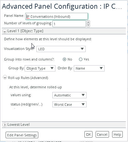
The elements are ordered first by status, and then alphabetically by each of the metrics represented in the panel. If only one metric was used, the Metric/Template ordering criterion is not called upon to be the tie breaker. Once you specify the grouping settings for the Lowest Level, you can, if necessary, configure higher levels (Level 1, Level 2, and so on). For example, you might want to use Level 1 to group by Object Type, and then use Level 2 to group by Metric.
For example, Level 1 is shown in the following figure. Lower levels under Level 1 (Level 2, Level 3, and so on) will have an identical interface.
Level 1 grouping
• Visualization Style—Select an appropriate style from the drop-down menu. Optionally, you can click Create New to create a new visualization style. For more on visualization styles, see
“Visualization styles“.
• Group into rows and columns?—To display dashboard content in a column and row format, select the Yes radio button to open the settings.
• Group By—Specify the grouping at each level by selecting an applicable object property from the drop-down menu.
• Order By—Order each grouping level by selecting Name, Displayed Status, or Displayed Value from the drop-down menu.
• The availability of Name, Displayed Status, and Displayed Value are based on the selected visualization style.
• At this level, determine—Same functionality as described previously in For this group determine (the topmost section in the Lowest Level).
Metrics
Select the Metrics tab, and then select the metrics to include in your content template.
Searches
Select the Searches tab to specify searches for related objects and the template to apply to the results of those searches. By adding searches, you can insert metrics on other related objects into the group hierarchy.
The following figure shows an example of adding a search to a content template called Windows Health, and then selecting a content template called CPU Metrics to apply to the results of that search.
Searches tab: defining members
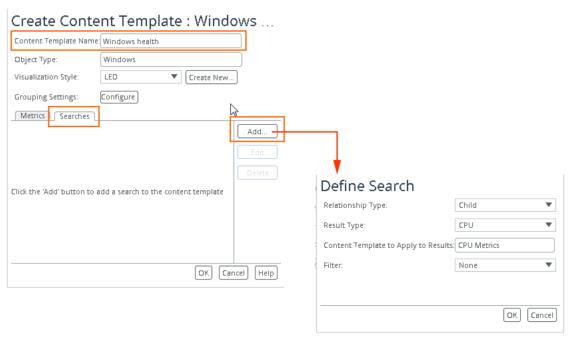
The Windows object type acts as a container of other object types and does not contain any metrics of its own.
By clicking Add from the Create Content Template dialog box, you will see these settings in the Define Search dialog box:
• Relationship Type—The direction (up or down) in the object-type hierarchy, as determined by selecting either Child or Parent from the drop-down menu.
In this example, Windows is the Parent under which you want to nest a Child object type CPU (and to which the content template CPU Metrics is associated).
• Result Type—The selection made for Relationship Type determines the available object types that are available in the Result Type drop-down menu.
If you choose Parent as the Relationship Type, the only available Result Type is Host, as this object type is the only object type higher up in the hierarchy than Windows.
Content Template to Apply to Results—This template will be applied to the results of the search and controls what objects and metrics are displayed in the dashboard hierarchy.
Click in the field to open the Select Content Template… dialog box.
• Filter—You can specify a filter to refine the results of the search. The available filters are defined by the data source.
Editing a content template
You can edit any content template that you own (or have permission to manage).
1. Choose Administration > Resources. The Resource Management screen appears.
2. Select the Content Templates tab.
3. Select the content template to edit and click Edit.
For content templates, you can change these settings:
– Template Name
– Visualization Style (edit or create a new one)
– Grouping Settings
– Metrics and Searches
4. After making the necessary edits, click OK to save changes and close the dialog box.
Related topic
Visualization styles
A visualization style is a configuration of settings used to determine how objects should be displayed. In addition to the visualization styles that are included with Portal, you can create custom visualization styles to create a consistent look and operation for panels.
A visualization style consists of an element and configuration settings.
Visualization style
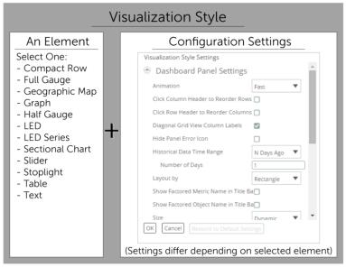
When defining a panel, you select the visualization setting that you want to use. More specifically, you select a visualization style after running the
Object Selection Wizard and when editing the visualization style for an existing panel using the panel’s Edit Settings option.
Specifying and editing visualization style
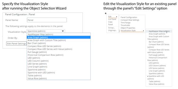
Portal includes numerous default visualization settings, (shown in the figure above). Additionally, you can create your own visualization styles and share them with other users and groups that create content. When created and shared, you and other dashboards content creators can select the new visualization style from the drop-down menus (shown in the figure above).
Consider specifying a different visualization style for each of the hierarchical levels of a grouped element. For example, at the group level, you can use a single LED that quickly identifies the status of all the group members. For lower hierarchical levels, you can use more detailed visualization styles, such as an LED Series or a Graph. For more information about groups, see
“Content Creators: About Group Elements“.
Creating a visualization style
1. Choose Administration > Resources. The Resource Management screen appears.
2. Select the Visualization Styles tab.
3. Click New.
4. If you have the administrative privilege, then the Select Owner dialog box appears for you to select the owner of the new visualization style and click OK.
5. From the Create Visualization Style dialog box:
– Specify a name—In the Name field, enter a unique name for the visualization style.
– Select an element—From the Display As field, select the element from the drop-down menu: Compact Row, Full Gauge, Geographic Map, Graph, Half Gauge, LED, LED Series, Sectional Chart, Slider, Table, Text.
– Configure the visualization style—Click Configure Settings to specify the style settings in the Visualization Style Settings dialog box.
The available style options depends on the element selected in the Display As field. For the description of a setting, mouse over the field label to display a tooltip.
When complete, click OK to save the configuration settings and to close the Visualization Style Settings dialog box.
6. Click OK to save the visualization style and close the Create Visualization Style dialog box.
The new visualization style will now appear in the list of visualization style when you create or edit a panel. Be sure to share the new visualization style with other users and groups if you want others to use the new visualization style.
Modifying a visualization style
1. Choose Administration > Resources. The Resource Management screen appears.
2. Select the Visualization Styles tab.
3. Select the visualization style to edit and click Edit. The Edit Visualization Style dialog box appears.
The Edit Visualization Style dialog box is identical to the Create Visualization Style dialog box. For information about any of the settings, see
“Creating a visualization style“.
4. After making the necessary edits, click OK to save changes and close the dialog box.