Content Creators: About Dashboard Components
Content creators are responsible for creating, configuring, and managing dashboards. They also define the data sources that feed information to dashboards, define metric thresholds, and create application models.
Dashboards are comprised of panels and elements that display the necessary information for monitoring status and performance.
About panels
A dashboard is made up of panels. Each panel is a floating, arrangeable window that contains a particular type of element: LEDs, gauges, graphs, and so on. You can group these elements in a meaningful way. (See
Content Creators: About Group Elements.) Additionally, panels include options for defining the display and sorting of elements.
Each panel has a toolbar for performing tasks, such as refreshing the panel. See
Panel toolbar. If you want to change the panel’s display, click the
Edit Settings (

) icon for options. For more information about these settings, see
Configuring panel settings.All the settings related to a panel, and how it displays data, can be found in the Panel Configuration dialog box. The changes you make with the Panel Configuration dialog box affect all the elements in the panel. You can configure these settings:
• Panel Name—Specifies the name of the panel.
• Visualization Style—Selects a defined visualization style (element) for displaying metrics.
• Order By—Based on the style, there are three potential options for ordering elements:
– Name (alphabetical or reverse alphabetical by the element label)
– Status (green, yellow, and red)
– Value (ascending or descending numerical value)
• Edit Panel Settings—Defines additional panel settings, such as the layout and the time aggregation rules for elements.
• Advanced Grouping—Defines element groups.
Error notifications when creating panels
Occasionally, there may be errors when you create a panel. For example, the search that the panel was based on may have failed, or the data source itself may have disconnected. In such situations, a message in the panel notifies you of the error. For some panel errors, you can obtain additional information by clicking the error (

) icon in the upper-left corner of the panel (for example, when a panel based on a live search fails to load). Additionally, the error icon will appear if there are errors with the data received from the data source, such as when there are gaps in data.
By default, data-error notification for elements is disabled. However, you can enable the notification by specifying a threshold value, as described in
Setting notification threshold for a panel.Configuring panel settings
2. On the
Panel toolbar, click the Edit Settings (

) icon and choose Edit > Panel Configuration.
Setting notification threshold for a panel
By default, the Data Error Notification Threshold (%) option is disabled with a value of 101.
1. On the
Panel toolbar, click the Edit Settings (

) icon and choose Edit > Panel Configuration. Then click
Edit Panel Settings. The Dashboard Panel Settings dialog box appears.
2. Scroll down to the Data Error Notification Threshold (%) option.
3. In the Data Error Notification Threshold (%) field, enter a value representing a percentage of the element’s time range. If the percentage of the data-related errors that occurred during the element’s time range exceeds the specified percentage, then an error symbol will be displayed on the element.
4. Click OK.
To set the notification threshold for all panels in a dashboard:
About elements and element groups
Elements display metric data (such as CPU utilization, memory utilization, or interface throughput) for a given object or group of objects. Your choice of element depends on the particular metrics that you want to monitor, as well as the best way to view the data. For more information about choosing the appropriate element, see
Guidelines for choosing elements.Right-click an element to access options. Depending on the element, those options include:
• Editing the settings for the particular element
• Deleting the element
• Configuring thresholds and object properties
• Opening the element in a new panel
• Displaying element in a graph
• Launching into other products
• Drilling down into other related objects
Each element comes with its own set of attributes. To access the attributes, right-click the element and choose Edit > Settings.
Guidelines for choosing elements
When creating dashboards, you must decide what data is appropriate for the task. The elements that you choose determines how the data is displayed. This table lists guidelines for selecting appropriate elements.
Dashboard task | Appropriate element |
Checking status: normal (green), warning (yellow), and critical (red) | LEDs, Geographic Status Maps, and Text |
Determining metric status over time | LED Series |
Viewing current metric values | Gauges, Sliders, and Geographic Heat Maps, Compact Row Bar Charts, Text |
Tracking metric values over time | Graphs |
Comparing metric values | Pie charts, Donut Charts |
Checking health (status) overview of multiple metrics | LEDs and LED Series |
Determining grouping of metric values (such as total thread count for all JVMs on a host, or average wait time for all JSPs) | Graphs, Gauges, and Sliders |
Tracking metric status over time on a row-by-row basis Tracking metric value trends on a row-by-row basis | Compact Row with LED Series Compact Row with Sparkline |
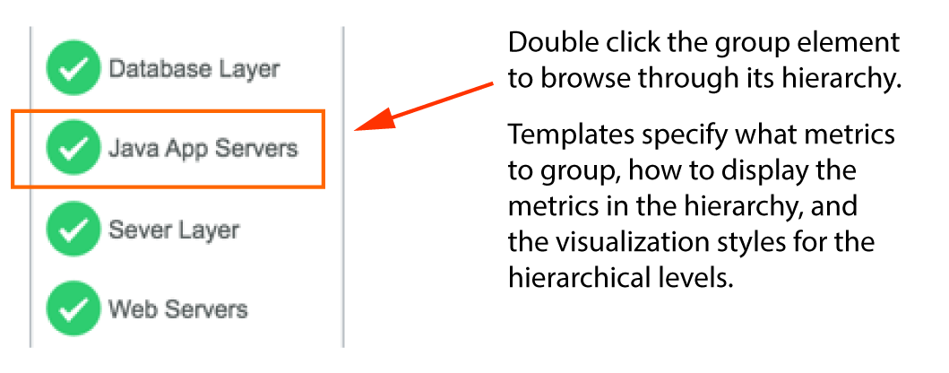
A
group is a collection of multiple elements under a single element. The members of a group can include metrics and other groups, all of which are found in one or more lower levels in the group hierarchy. To get to a particular metric from a group, you must drill down through any associated grouped members in the hierarchy. See
Content Creators: About Group Elements.For a description of elements, see:
To change the object name of an element, see
Changing names of elements (objects)About gauges and sliders
Gauges, both half and full, and sliders show a metric’s value, observed range, and expected range. Gauges and sliders are useful for confirming that a metric is within normal limits, as well as showing how close a metric’s current value is to its warning (yellow) or critical (red) limits.
Gauges and sliders
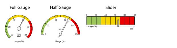
To show the green, yellow, and red colors on a gauge or slider, you must specify values for Threshold Warning and Threshold Critical in the Dashboard Panel Settings dialog box. To access this dialog box, click the
Panel toolbar Edit Settings (

) icon, choose Edit > Panel Configuration, and then click
Edit Panel Settings.
Additionally, from the same Dashboard Panel Settings dialog box, you can configure the range shown on the gauge or slider by specifying minimum and maximum values. For example, you can specify the values of Gauge Minimum and Gauge Maximum to be 0 and 100 respectively. Alternatively, you can accept the default setting of auto for both the minimum and maximum values. An auto value for Gauge Minimum, with a default setting of 0, will reset itself to reflect metric values dropping below 0. Likewise, an auto value for Gauge Maximum, with a default setting of 100, will reset itself to reflect metric values exceeding 100.
About graphs
Graphs display the change of a metric over time. For example, you can use a graph to show throughput for the last 15 minutes in one-minute increments. There are three styles of available graphs: line graph, area graph, and bar chart.
To change the style of a graph, right-click the element and choose Edit > Settings. Then, from Graph Settings, select the Graph Style drop-down menu and select Line Graph, Area Graph, or Bar Chart. (If you select Line Graph or Area Graph, select the Stepline option to connect data points with horizontal and vertical lines.)
Grouped graphs can show average, sum, maximum and minimum values, as well as multiple traces on a single axis (for a Line Graph). For more information, see
Grouping elements.Historical comparisons
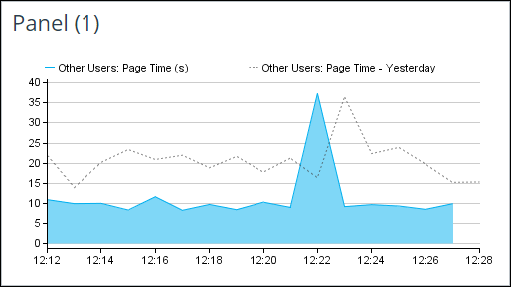
For graphs (area graphs and line graphs), including those with multiple traces, you can show overlaid historical data for a particular metric. This feature is useful for visually comparing a metric with its historical values. As shown in the following figure, a dashed gray line presents the historical data.
Line graph comparing recent and historical data
Historical comparison rows
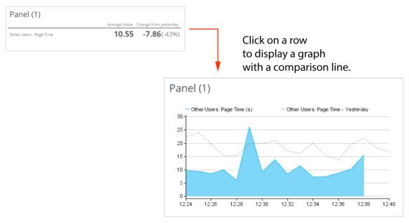
With this feature, using the Historical Comparison Row visualization style, you can view the current value for a particular metric and the change from a previous time period. The following figure shows a panel using the Historical Comparison Row visualization style. Additionally, you can double-click a row to display a graph with a comparison line.
Historical Comparison Row
Configuring graphs to display historical data
1. On the
Panel toolbar, click the Edit Settings (

) icon and then choose Edit > Panel Configuration. The Panel Configuration dialog box appears.
2. Click Edit Panel Settings. The Dashboard Panel Settings dialog box appears.
3. Define the historical data time range:
4. Under the Dashboard Panel Settings section:
– Select a time range option from the Historical Data Time Range drop-down menu.
- N Days Ago /N Weeks Ago—Displays historical data for a single time period.
- Last N Days /Last N Weeks—Displays the average of the historical data for multiple time periods.
– Specify the historical time range, in days or weeks, in the Number of Days / Number of Weeks field.
5. Turn on the display of historical data for graphs. Under the Graph Settings section, select Show Historical Data.
6. Click OK to close the Dashboard Panel Settings dialog box.
7. Click OK to close the Panel Configuration dialog box.
The graphs in the panel refresh and display historical data with a dashed gray line.
Configuring panels to display historical comparison data
The following procedure describes how to create a panel that displays textual historical comparison data. Additionally, the procedure describes how to define the order of the rows.
These visualization options are available:
• Visualization Style—From the drop-down menu, select Historical Comparison Row.
• Order By—From the drop-down menu, select the order of the rows:
– Displayed Values
– Displayed Value (Ascending)
– Name
– Percentage Change
– Percentage Change (Ascending)
These historical time range options are available:
• Select a time range option from the Historical Data Time Range drop-down menu.
– N Days Ago /N Weeks Ago—Displays historical data for a single time period
– Last N Days /Last N Weeks—Displays the average data for multiple time periods
• Specify the historical time range, in days or weeks, in the Number of Days / Number of Weeks field.
1. On the
Panel toolbar, click the Edit Settings (

) icon and then choose Edit > Panel Configuration. The Panel Configuration dialog box appears.
2. On the Panel Configuration dialog box, define the visualization style and order of rows:
3. Click Edit Panel Settings. The Dashboard Panel Settings dialog box appears.
4. Under the Dashboard Panel Settings section, define the historical data time range:
5. Under the Compact Row Settings section, define the look of the panel.
For a description of each setting, mouse over the field label to display a tooltip.
6. Click OK to close the Dashboard Panel Settings dialog box.
7. Click OK to close the Panel Configuration dialog box.
The panel updates with the defined configuration settings.
About graph summary information
You can display time aggregation numerical values (summary information) in a graph. This capability enables you to select, then see at a glance, whatever summary information you deem important for a particular graph. The summary information displays as text in the upper-right corner of the graph, as well as in the tooltip when you mouse over the legend.
For more information on the time aggregation numerical rules used to display values, see
About time aggregation rules.For a Multiple Trace chart, the graph summary information only appears in a tooltip.
Configuring graphs to display summary information
1. On the
Panel toolbar, click the Edit Settings (

) icon and then choose Edit > Panel Configuration. The Panel Configuration dialog box appears.
2. Click Edit Panel Settings. The Dashboard Panel Settings dialog box appears.
3. In the Graph Settings section, click Edit for the Graph Summary Information option. The Graph Summary Information dialog box appears.
4. Specify the values to display.
5. Select a single display value or multiple values. Use the arrows to the right of the fields to specify the order of the values.
6. Click OK to close the Graph Summary Information dialog box.
About LEDs and LED series elements
LEDs show status with the use of color:
• Green = normal
• Yellow= warning
• Red = critical
Choose LEDs when you want to present a single status in a minimum amount of space.
LEDs
When no data is available, LEDs display the status as a gray circle containing a diagonal line (

) and when no threshold is set, LEDs display the status as a gray circle containing a question mark (

).
LEDs are particularly useful for overviews of grouped elements. For example:
• Overall status of a host or many hosts
• Overall status of an application
• Status of all .NET Web requests in an application
An LED Series shows status over a time range. This element is particularly useful for displaying the status of intermittent problems. For example, you can use an LED Series to answer these questions:
• When did the critical issue first occur?
• How long did the critical issue last?
LED Series elements also support visual correlation of multiple metrics, so you can easily identify periods of violations.
LED Series
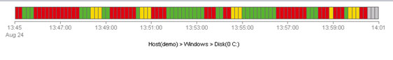
By default, the LED Series element displays a time period with no data as white. Gray indicates a time period where the data has not yet been received.
About compact row elements
The Compact Row element shows multiple aspects of a single metric in a compact area. For example, you can show the metric name, LED Series, numerical value, and status LED for each row of a displayed metric. Doing so enables you to quickly identify violations and to determine the period when the violations occurred.
The following figure shows a panel with example Compact Row elements.
Compact Row elements
In the example (above), the Compact Row style employs these column selections (for each row):
<Metric Name> <Spark Line> <Displayed Value (Text)> <Displayed Status (LED)>
However, there are multiple element types from which you can select for each column. You can also change the order of the columns, as well as add (or delete) columns.
After the Compact Row element is configured, you can then select the element when defining the visualization style for a panel.
A Compact Row can include these columns:
• Bar Chart
• Bar Chart (Stacked)
• Displayed Status (LED)
• Displayed Value (Text)
• Historical Comparison Bar Chart
• Historical Comparison Value
• LED Series
• Metric Name
• Spark Line
Configuring compact rows
1. Choose Administration > Resources. The Resource Management screen appears.
2. Select the Visualization Styles tab.
3. Click New.
4. If prompted, specify the owner of the visualization style and click OK. The Create Visualization Style dialog box appears.
5. In the Name field, enter a name.
6. From the Display As drop-down menu, select Compact Row.
7. Next to Column Settings, click Configure. The Compact Rows Settings dialog box appears.
8. Define the compact row by selecting and arranging the columns and click OK.
9. Optionally, click Configure Settings to define additional settings.
10. Click OK.
Aligning compact rows
To improve readability of compact row data, you can align the compact rows for all panels in a dashboard. For example, you can change the horizontal (pixel) spacing of a compact row’s name and value columns, as well as the vertical (pixel) spacing between compact rows.
1. On the
Panel toolbar, click the Edit Settings (

) icon and then choose Edit > Compact Row Settings.
The Dashboard Panel Settings dialog box appears and shows the Compact Row Settings.
2. To set the width of the Metric Name column, from the Name Column Width field, change the value to Specify Pixel Width and enter the pixel width in the column that appears.
3. To set the width of the Displayed Value (Text) column, from the Value Column Width (pixels) field, select a pixel width.
4. Click OK.
Changing names of elements (objects)
If you prefer to display object names for the elements in the panel, you may want to display more meaningful names than the original object names, which sometimes can be too long.
Changing the name of an element is global. The name change will affect all dashboards displaying that particular object, for all users.
1. Right-click an element and choose Edit > Name. The Configure Dashboards Elements dialog box appears.
2. Select the Naming tab.
3. In the Object Name field, enter a new name and click Apply. To revert to the original name, click Reset.
4. Click Close.
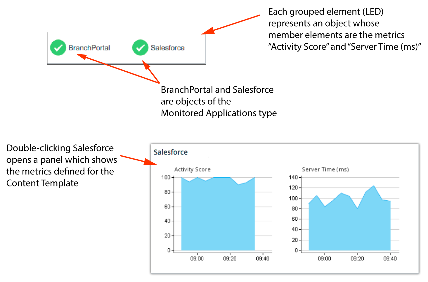
About content templates
You control how elements in a panel are displayed by defining visualization styles or by using content templates with preconfigured settings, which can include visualization styles.
Use content templates when you want to quickly create a panel or element to monitor a specific set of metrics associated with objects of a given type. You can choose from among a set of predefined content templates, or you can create your own. Each content template is designed for a specific purpose, and named accordingly.
For example, you might have a content template defined for objects of type Monitored Application, called App Metrics, which specifies Activity Score and Server Time (ms). The visualization style, already defined in the content template, determines the way that data displays when drilling down into an element created for that template, as shown in the following figure.
Panel created by App Metrics content template
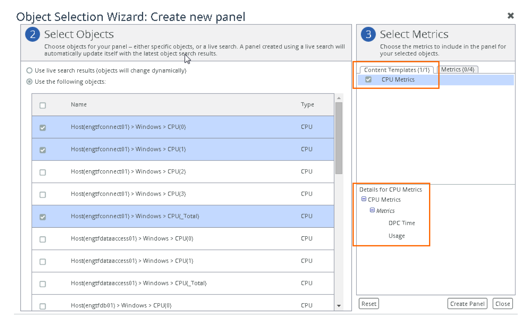
Content templates in the object selection wizard
When you create elements with the Object Selection Wizard, you must first specify the metrics for the objects that you want to monitor. In the Object Selection Wizard, you can either specify the metrics directly or you can choose a content template that already specifies these metrics. The content template that you select can be predefined or one that you created.
In the Object Selection Wizard, available content templates are listed on the Contents Templates tab of the Select Metrics panel. For any given object type, there may be one or more content templates (or there may be none).
For example, suppose you want to monitor metrics on objects of type CPU. In the Object Selection Wizard, you select CPU objects. Templates defined for the CPU object type appear in the Content Templates tab (on the Select Metrics panel). You can then select a template. The following figure shows a content template called CPU Metrics and its associated metrics.
Object Selection Wizard: Selecting a content template
For more information, see
Object Selection Wizard.Content templates that group metrics into hierarchies
You can use content templates to create element hierarchies. In addition to specifying the metrics that you want to monitor, content templates can also group the metrics into hierarchies based on nested content templates and object types. These hierarchies are then represented as grouped elements in the panel, as shown in the following example.
Content templates specifying groups
Content template grouping settings include:
• What visualization styles to display at each hierarchical level
• How to collect metric data and summarize the results (such as Average or Worst Case)
• How to organize members of the group hierarchy
About drill-down right-click menus
You can define the options that are available in an element’s right-click menu, or drill-down, so that you can:
• open specific custom dashboards. When defined, the Open Dashboard option appears on the right-click menu of an element.
• launch external web pages, such as a company web site or a third-party tool. When defined, the Launch External Web Page option appears on the right-click menu of an element.
The following figure shows an element’s drill-down options for defined dashboards and web pages. The Launch External Web Page option is selected and displays the option to launch the Riverbed web site.
Drill-down options can be defined at different levels, depending on your requirements. Options are inherited by lower levels. The levels, starting from the top, are:
• User Level—Drill-down options appear on all elements in all dashboards.
• Dashboard Level—Drill-down options appear on all elements in a dashboard.
• Panel Level—Drill-down options appear on all elements in a panel.
• Element Level—Drill-down options appear on the element.
Take advantage of the hierarchy feature by defining drill-downs at the appropriate level, saving you from having to redefine the same drill-down multiple times. For example, if you want a drill-down to your company website for all elements, it is more efficient to define the drill-down at the top level than to define the same drill-down for each element.
Variables for URL drill-downs
When defining a URL drill-down option, you can specify a variable that will be replaced by the element’s corresponding value. Variables are specified using this syntax:
$$variable_name$$
You can use any object property name as a variable. For example, to use the IP Address object property as a variable, you specify $$IP Address$$. In addition to object properties, you can specify the special variables listed in this table.
Variable | Description |
Data Source
|
$$data_source_instance$$ | The data source ID of the data source. |
Object/Metric
|
$$object$$ | The object ID of the object associated with the element. |
$$object_pretty$$ | The displayed (pretty) name of the object (as opposed to the ID). |
$$metric$$ | The metric ID of the metric associated with the element. |
$$metric_pretty$$ | The displayed (pretty) name of the element’s metric (as opposed to the ID). For example, % Slow Pages (Servers). |
$$factored_name$$ | The factored object name. |
Time
|
$$start_time$$ | The current start time of the displayed time range of the element, in seconds since January 1, 1970. |
$$start_time_minutes$$ | The current end time of the displayed time range of the element, in minutes since January 1, 1970. |
$$end_time$$ | The current end time of the displayed time range of the element, in seconds since January 1, 1970. |
$$end_time_minutes$$ | The current end time of the displayed time range of the element, in minutes since January 1, 1970. |
$$duration_time_minutes$$ | The duration of the current time range for the element, in minutes. |
$$duration_time_seconds$$ | The duration of the current time range for the element, in seconds. |
$$current_time$$ | The current time. |
User
|
$$user$$ | The username of the currently logged in user. |
Related Topics
Defining drill-down right-click menu options
1. If necessary, set the specific dashboard to edit mode:
Skip this step if defining drill-downs at the User Level (all elements for all dashboards for the user).
2. Access drill-down settings for the desired level:
– User Level—All elements on all dashboards for the user.
Choose Administrator > User Dashboard Settings.
– Dashboard Level—All elements on the dashboard for the user.
– Panel Level—All elements in the panel for the user.
From the
Panel toolbar, click the Edit Settings (

) icon and choose Edit > Panel Configuration. Then in the Panel Configuration dialog box, click
Edit Panel Settings.
– Element Level—The element for the user.
Right-click an element and choose Edit > Settings.
3. In the settings dialog box, scroll down to the Dashboard Element Settings section, and for the Drill-down Settings option, click Edit….
A URL for the Riverbed web site has been defined at a higher level, as indicated by Inherited Setting under Menu Source. Options defined at the current level are indicated by Local Setting under Menu Source.
4. To add a new drill-down option, click Add. A new row is added to the bottom of the list.
5. Specify the necessary information in the columns:
– Entry Type—Specify the type of option that you want to define. From the drop-down menu, select one of these options:
- URL
- Dashboard
- URL (Same Browser Window)
– Name—Specify the text that will appear on the right-click menu. Click the cell and enter the name.
– URL—If defining a URL option, specify the target URL. Click the cell and enter the URL.
– Dashboard—If defining a dashboard option, specify the target custom dashboard. From the drop-down menu, select a custom dashboard.
6. To edit an existing drill-down option, click the cell that you want to change and edit/change the setting.
7. To delete an option, click the row that you want to delete and click Remove.
Only options defined at the current level can be deleted. To delete an option that is defined at a higher level, you must access the Drill-down Settings dialog box at the same level. See
Step 28. Define what appears when the element is double-clicked:
– Default—Specifies what to display when double-clicking an element.
From the drop-down menu, select one of these settings:
- Inherit Setting (Perform action defined at the next higher level.)
- URL or Dashboard (Display a specified URL or custom dashboard)
- Show Graph
– Default (Aggregation)—Specifies what to display when double-clicking a grouped element.
From the drop-down menu, select one of these settings:
- Inherit Setting (Perform action defined at the next higher level.)
- URL or Dashboard (Display a specified URL or custom dashboard)
- Show Graph
9. Click OK to save the defined options and close the dialog box.
10. If necessary, set the specific dashboard to monitor:
 ) icon.
 ) icon. The Dashboard Settings dialog box appears.
 ) icon.
 ) icon.
 ) icon.