Content Creators: About Data Sources, Objects, Metrics
Elements display the metric values of objects. The first step in creating a dashboard is choosing the objects whose metrics you want to monitor. You then decide which elements are best to display the values of the applicable metrics. The Object Selection Wizard helps you complete both tasks.
For more information, see:
If your user account does not have the necessary permissions, you may not be able to perform certain tasks described in this chapter. For assistance, contact a Portal Administrator.
About data sources, objects, and metrics
To create dashboards, you must first choose the appropriate data source (such as AppInternals, AppResponse, or NetIM).
Each data source has a specialized use. For example:
• AppInternals continuously monitors thousands of system and application metrics within each server, across all tiers, and automatically spots performance problems.
• AppResponse monitors and analyzes end-user experience for all levels of transactions. AppResponse also supports in-depth monitoring and analysis of the underlying network, a domain that is vital to comprehensive application performance management.
• NetIM uses remote instrumentation interfaces (SNMP, for example) to capture performance information from infrastructure components such as servers, application components, and network devices.
No matter the data source, the fundamentals are the same. Each data source monitors the environment and produces measurements on objects in that particular environment. The two most important concepts to understand are objects and metrics.
An object is anything that a data source can monitor. Object types (such as Windows, Business Group, Disk, or CPU) are classes or categories of objects. Some object types are not monitored by a data source and contain no objects themselves, but act only as containers of other object types (such as in Windows containing CPU).
Objects are the individual instances of an object type. For example, CPU (0), CPU (1), and CPU (2) are all instances of the object type CPU. An object paired with a metric can be represented as an element.
Elements use metrics to represent either the status or the numerical data associated with objects. Because each data source monitors many objects, there can be hundreds or even thousands of available metrics.
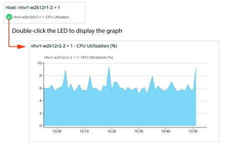
Consider the following example. A CPU object, such as CPU(1), might be paired with a metric called Usage (%) and displayed as an LED showing CPU % Usage. The LED green, yellow, or red, depending on whether the percentage of usage falls within normal, warning, or critical threshold ranges. By double-clicking the LED, you display a graph showing the amount of usage (by percentage) over time, as shown in the following figure.
Double-click LED (showing status) to Display Graph (showing metrics)
Object Selection Wizard
The Object Selection Wizard guides you through the steps of selecting and displaying (through panels and elements) the data-source-specific metrics that you want to monitor. The available choices of objects and metrics depends on the data that is managed by the selected data source.
Rather than manually selecting metrics, you can use predefined content templates. Content templates specify the metric data that you want your elements to display, as well as how to group that data and which visualization styles to use. For more information, see
About content templates.After you choose metrics or content templates, the Object Selection Wizard enables you to configure a new panel or use an existing one. In either case, you can set up one or more visualization styles for the elements that will monitor the metrics.
Using the Object Selection Wizard
The general workflow for adding content to a panel using the Object Select Wizard is as follows:
1. Search for Objects:
– Select the appropriate data source type (such as AppInternals, AppResponse, or NetIM).
– Click Search Now.
2. Select Objects:
– Choose from the objects that match the search criteria.
3. Select Metrics:
– Choose the information to monitor on the selected objects by specifying the corresponding metrics or selecting a content template.
– Click Create Panel.
4. Configure Panel:
– In the Panel Configuration dialog box, specify the panel name and visualization style.
– Click OK.
The following procedure describes using the Object Selection Wizard to select metrics for monitoring.
Selecting metrics to monitor using the Object Selection Wizard
1. Open a custom dashboard.
4. Select the data source from the drop-down menu.
– If there is more than one data source type available (for example: AppInternals and AppResponse), select the data source type from the drop-down menu.
– If there are multiple data sources of the same type, select the specific data source(s) from a separate drop-down menu.
The search fields appear for you to specify the search criteria.
5. After defining the search criteria, click Search Now.
The Select objects panel lists the objects that are managed by the selected data source and that match the search criteria.
6. Select the appropriate objects in the Select Objects panel.
When you make your selection, the default is Use the following objects setting. In contrast, the Use live search results option dynamically updates the objects according to the search criteria. For example, if you search for the top three CPU objects by Usage (%), the objects used in the panel will change in real time as the Usage (%) of the CPU objects change.
For the Use live search results option, the frequency by which objects update will depend on the search criteria. For example, with AppResponse (9.x) as the data source type, Top N search results update every minute, while Navigating Object Tree search results update every two hours.
In the Select Metrics panel, either choose an available content template (from the Templates tab) or manually select the appropriate metrics (from the Metrics tab). The available content templates and metrics are determined by the previously selected object type.
For certain data source types (such as NetIM), you can choose various Rollups. In other words, you can select from the multiple rules by which a data source rolls up data (such as Minimum, Maximum, 95th Percentile, Median). For example, in the Dashboard Data panel, you can use the Rollup Selection drop-down menu to specify one or more Rollups for each metric as shown in the following figure.
Rollups selection
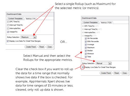
To create 95th Percentile panels with data from NetSensor or NetIM, you must first enable 95th percentile rollups in NetSensor or NetIM using the Rollup Wizard. For more information, see the NetSensor User Guide or the Alluvio NetIM User Guide.
7. After selecting metrics, click Create Panel.
8. Select a visualization style from the Visualization Style drop-down menu and provide a name for the panel. For more information about visualization styles, see
“Visualization styles“.
9. In the Panel Configuration dialog box, click OK to create the new panel.
Related topics
Copy and paste panels
Use the copy and paste panel options to:
• quickly deliver the same content to new or existing custom dashboards.
• gather related panels from different dashboards into a single custom dashboard.
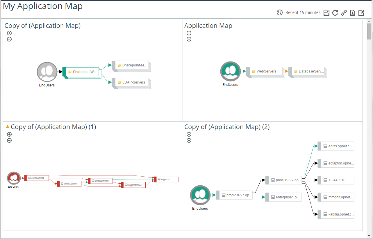
(For example, you can create a custom dashboard that shows all the monitored application maps on a single screen. See figure below.)
• experiment with panel settings (using the copied panels), while still ensuring that the original panel remains intact.
• visualize identical metrics in various ways (such as LEDs and graphs) by defining the objects in each of the copied panels (using different visualization styles)
Example: Custom Dashboard with Copied Application Map Panels
Copying a panel
1. Open the dashboard (Application, Custom, or Default) with the panel that you want to reuse:
2. On the
Panel toolbar, click the Edit Settings (

) icon and choose Copy Panel.
3. Click Home to return to the Home screen.
Pasting the panel
1. Open the custom dashboard to which you want to paste the panel.
3. Right-click the dashboard background and choose Paste Panel.
Related topics
 ) icon.
 ) icon and choose Create new dashboard panel.
 ) icon.