Content Creators: About Custom Dashboards
This section provides information about creating, editing, and managing custom dashboards. To start, you might want to get familiar with
About dashboard settings and
About time aggregation rules. Later topics cover the different methods you can use to create dashboards.
You can create dashboards using different methods, depending on your knowledge of the source data.
•
Creating dashboards using search—Creates a dashboard based on an object, such as a server. Use this method to access data and create dashboards for specific objects—even when you start your search without being certain of the actual object name. As you type criteria into the search bar, Portal searches all connected data sources for objects (such as applications, hosts, devices, and IP addresses) and displays the matching objects.
•
Creating a custom dashboard in 60 seconds using the wizard—Creates a dashboard based on a selected template and objects, such as data sources, applications, and servers. From an element, you can create one or more associated dashboards across connected data sources—even if the data sources are of a different type.
When a dashboard is created by the Search Bar, Drill-down, or Parameterized URL method, you can save the dashboard by clicking the Save as custom dashboard (

) icon on the
About the dashboard toolbar.Related topic
About dashboard settings
Dashboard settings are user-configurable options that you can access from multiple locations. Although Portal provides defaults, you can change the settings to satisfy your requirements. You also determine the granularity of setting changes. In other words, the level at which you make a settings change determines its scope. For more information on determining the scope of the change, see
Inheriting setting changes.Name | Description and access information | Additional information |
Global Dashboard Settings | Define global dashboard settings. Choose Administration > Dashboards: Global Dashboard Settings. | |
Dashboard Settings | Define panel and element settings. On the
About the dashboard toolbar, click the Dashboard Settings icon. | |
Visualization Style Settings | Define the look of elements. Choose Administration > Dashboards: Resources and select the Visualization Styles tab. | |
Panel Settings | Define panels. On the
About the dashboard toolbar, click the Edit Settings icon. Alternatively, on the
Panel toolbar, click the Edit Settings icon. | In the Panel Configuration dialog box, you can edit panel settings and define the display of elements. From the panel-level settings, you can propagate changes to element settings. |
Element Settings | Define the element to display and its behavior. Right-click an element and choose Edit > Settings. | The element settings available depend on the selected element. |
Thresholds and Object Properties | Define metric thresholds and characteristics. Right-click an element and choose either Edit > Thresholds or Edit > Object Properties. Alternatively, on the
Panel toolbar choose either Edit > Thresholds or Edit > Object Properties. | In the Configure Dashboard Elements dialog box, thresholds and object properties each have their own tabbed page from where you can edit and configure their settings. |
Data Sources | Define sources of metric data. Choose Administration > Dashboards: Data Sources. | |
Content Templates | Define sets of dashboard settings. Choose Administration > Dashboards: Resources and select the Content Templates tab. | Content Templates are named collections of settings for displaying dashboard content. |
Inheriting setting changes
Settings at the System Default level are inherited by lower levels. However, you can override these higher level settings at a lower level. Setting changes at a higher level are inherited by the same setting at a lower level. Changes made to a lower-level setting override the corresponding higher level setting and are inherited by lower-level settings.
The following figure shows the levels at which you can change settings, and the lower levels which inherit the changes.
Levels of settings and the path of inheritance
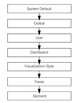
For example, if you change the Show Factored Metric Name in Title Bar setting at the Global Default level (see
Customizing dashboard look and behavior), the setting change applies to all dashboards, and wherever this setting is found. If you change the setting at the Element level, the setting applies to the particular element only.
About time aggregation rules
Each element that shows a single value (such as an LED), has a default time aggregation rule for determining which value to display over the specified time range (which contains multiple single data points).
Time aggregation rules can be numerical based or status based. The rule that you choose to use depends on the type of elements that you want to display in the panel. For example, with LEDs, you typically use a status rule, such as Numerical Value Status. For gauges or sliders, you typically use a numerical rule, such as Maximum.
The following figure shows a half gauge element representing the page views for the TradeFast web application. The Maximum numerical rule is being specified here, meaning the displayed value represents the highest number of page views over the specified time range.
Element specified with a time aggregation rule
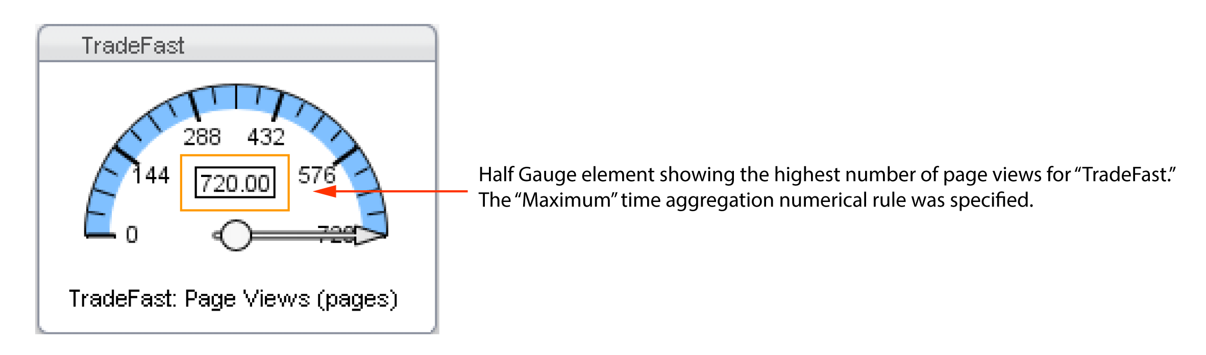
The gauge is blue because the Threshold Warning and Threshold Critical values have not yet been specified for Gauge Settings (accessible from either the panel or element settings level). Once these values are specified, the gauge will show the green (normal), yellow (warning), and red (critical) colors.
For more information, see:
Time aggregation numerical rules
The Time Aggregation Numerical Rule setting is used when the numerical value of time is displayed by elements (such as gauges, sliders, or text elements).
The available time aggregation numerical rules are:
• Last Value—The most recent (last) data point within the time range.
• Average—The average value of all the data points within the time range.
• Maximum—The maximum value of all the data points within the time range.
• Minimum—The minimum value of all the data points within the time range.
• Sum—The total value of all the data points within the time range.
• Status Violation Count—The count of data points where the object is over its threshold.
• Violation Percentage—Percentage of time viewed where the object is over its threshold.
• Valid Values Violation Percentage—Percentage of time viewed, not including any missing data points, where the object is over its threshold
• Automatic (default)—Based on the selected Rollup or metric, this rule automatically determines the correct time aggregation numerical rule to use. For example, in AppInternals, if the Rollup is Maximum, the Maximum time aggregation numerical rule is used. Alternatively, in AppResponse (9.x), if the metric is Page Views, the Sum rule is used.
For more information about selecting Rollups in the Object Selection wizard, see
Object Selection Wizard.Time aggregation status rules
The Time Aggregation Status Rule setting is used when status data (normal [green], warning [yellow], or critical [red]) is displayed by an element (such as LEDs) for a time range.
These time aggregation status rules are available:
• Last Status—The most recent status within the time range. For example, if the last data point in the specified time range has a warning status, the element representing that object is yellow.
• Worst Case—The worst single status within the time range. If at least one data point for an object has a critical status over a given time range, the element representing that object is red.
• Percentage Time—The percentage of the time range where the status of the data points is critical. In the accompanying Threshold Critical and Threshold Warning fields, you must specify values (representing percentages of the time range) to determine when an element turns to a warning (yellow) or critical (red) status.
For example, suppose that you set the time range for 10 minutes, and then specify 30 for Threshold Warning and 50 for Threshold Critical (in the Dashboard Settings dialog box). If the status is critical for more than 30% of the time (that is over 3.0 minutes), the element turns yellow. If the status is critical for more than 50% of the time (that is, over 5.0 minutes), the element is red.
• Percentage Time of Valid Status—The percentage of the time range where the status of valid data points is critical. This rule is identical to the Percentage Time rule, however, the difference is only existing data points are considered. In the accompanying Threshold Critical and Threshold Warning fields, you must specify values (representing percentages of the time range) to determine when an element turns to a warning (yellow) or critical (red) status.
For example, suppose you set the time range for 10 minutes, and then specify 50 for Threshold Warning and 75 for Threshold Critical (in the Dashboard Settings dialog box). Also suppose there is data for only five of those 10 minutes. If the status is critical for more than 50% of five minutes (that is, over 2.5 minutes), the element is yellow. If the status is critical for more than 75% of five minutes (that is, over 3.75 minutes), the element is red.
• Violation Count—Renders as warning (yellow) or error (red) when the object violates its threshold more than the specified number of times. For example, if a device is down more than once in an hour, the LED representing that device is red.
• Numerical Value Status (default)—Compares the value produced by a time aggregation numerical rule with the threshold value specified for the object-metric pair (as represented by the element).
For example, suppose you select the time aggregation numerical rule of Average and configure a threshold value in Portal (for a data source type such as AppResponse 9.x). If that Average value exceeds the threshold value for critical, the LED is red. For more information about thresholds, see
Content Creators: About Thresholds.Related topic
Setting the time aggregation rule
You have the option of changing the default time aggregation rule at the dashboard and panel levels.
• Panels—On the
Panel toolbar, click the Edit Settings (

) icon and choose Edit > Panel Configuration. Then, from the Panel Configuration dialog box, click
Edit Panel Settings.
About the custom dashboard wizard
Portal includes templates that can be used to quickly create custom dashboards to monitor application status and performance. To create custom dashboards, you must have at least one connected data source. For details about data sources, see
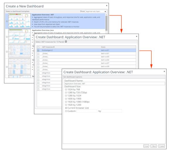
Content Creators: About Data Sources, Objects, Metrics.To begin monitoring with a new custom dashboard, just select the appropriate template and then step through a few short configuration steps. The following figure shows the workflow from screen to screen.
Create a custom dashboard
Creating a custom dashboard in 60 seconds using the wizard
1. Choose Dashboard > Create.
2. Select a dashboard template and click Next.
3. To filter the list of templates, use the Show drop-down menu.
4. Follow the on-screen instructions. If there is more than one data source type that is used by a template—for example, two connected AppInternals data sources—then you are prompted to select the data sources with the metrics you want to use.
5. Select the applicable objects.
6. Specify the dashboard name and size.
7. Click Create.
Creating dashboards using search
1. Enter the name of an object in the Search field.
2. Select an object from the search results.
If more than one template is available, the Create New Dashboard dialog box appears.
3. Select the dashboard template that displays the metrics that you want to monitor.
4. Click Next.
If more than one data source is available, Portal prompts for the data source to use.
The new dashboard is created.
Related topic
Creating dashboards using drill-downs
1. Right-click an element and select Drilldowns.
2. Select an available dashboard from the list. The new dashboard appears.
(When a dashboard is available, that means the data to create the dashboard can be obtained from the data source. Unavailable dashboards are grayed out.)
Creating dashboards using parameterized URLs
Parameterized URLs enable users outside of Portal to launch dynamically created dashboards. After entering the URL in a web browser, you must log in to Portal if you have not already.
The best method for building a URL is to create the dashboard in Portal. When you have the dashboard that you want, simply copy the URL from the web browser address field. If you want to build a URL from scratch, see the list of template names and required object properties located at
http://<scPortal_host>/scPortal/info?report=url_parameters
About URL components
A dashboard URL is comprised of these components: Base, Object Properties, Data Source, and Template.
Note the following rules:
• Sequence of Components: The URL must start with the Base component. The other components can be specified in any order following the Base component.
• Required Components: The Base component and any required Object Properties must be specified. If there are no required Object Properties, then the Template must be specified.
• Component Separator: An ampersand (&) separates the components, except for the component immediately following the Base component. (Also note, when multiple object properties are specified, an ampersand separates the object properties.)
• Escaped Encoding: Spaces and special characters should be escaped. If you do not specify escaped encoding in the URL, often the encodings will be added automatically when you type the URL in a web browser. However, if a template name includes a special character, such as a colon (:), you must specify the encoded version of the character (%253A) in the URL. For example, if specifying the template name Code Details: Java, you should enter Code Details%3A Java. Another common encoding is %2520 for a space.
Base component
The Base component consists of the Portal host, and the necessary path to display a dashboard.
The Base syntax is as follows:
http://<scPortal_host>/scPortal/WebConsole.jsp#dashboard:
For example, if Portal is installed on myhost, then the base looks as follows:
http://myhost/scPortal/WebConsole.jsp#dashboard:
The Base component always ends with a colon (:).
Object Properties component
The Object Properties component consists of the relevant object properties for the template.
An object property is specified using this syntax:
<object_property_name>=<value>
For example, to specify the Host object property with the value engtfdataaccesss01, you enter:
Host=engtfdataaccess01
If specifying more than one object property, separate the object properties with an ampersand (&).For example, this string specifies two properties—Host and IP Address:
Host=engtfdataaccess01&IP Address=172.16.18.167
Data Source component
The Data Source component consists of the data source(s) to use for the dashboard. It is only necessary to specify the data source(s) when there are multiple data sources of the same type (for example, multiple AppResponse appliances).
For a list of the connected data sources, choose Administration > Dashboards: Data Sources. Specify data sources using the Host Name (the first column in the Data Source Management page).
The Data Source is specified using this syntax:
data_source_hostname=<Host_Name>
For example, to specify a data source with the hostname tfrd.lab.rvbd.com, you enter:
data_source_hostname=tfrd.lab.rvbd.com
You can specify multiple data sources separated by two colons (::) encoded as %253A%253A. For example, to specify the trfd.lab.rvbd.com and tfaix.lab.rvbd.com data sources, you enter:
data_source_hostname=tfrd.lab.rvbd.com%253A%253Atfaix.lab.rvbd.com
When specifying the multiple data sources, note the following:
• If the data sources are of different types (for example, AppResponse and NetProfiler), then Portal will use both data sources for the dashboard (assuming the template uses the specified data source types).
• If the data sources are of the same type (for example, AppResponse data sources), then Portal will prompt for the data source to use for the dashboard.
Template component
The Template component consists of the dashboard template to use.
The Template is specified using this syntax:
template_name=<template_name>
For example, to specify the Host Details template, you enter:
template_name=Host Details
Example URL
The following is an example parameterized URL and a description of each component:
http://myhost/scPortal/
WebConsole.jsp#dashboard:Host=engtfdataaccess01&IP%2520Address=172.16.18.167&data_source_hostname
=tfrd.lab.rvbd.com%253A%253Atfaix.lab.rvbd.com&template_name=Host%2520Details
Base component:
http://myhost/scPortal/WebConsole.jsp#dashboard:
• The component specifies the Alluvio Portal host, and the necessary path.
• The component ends with a colon (:).
Object Properties:
Host=engtfdataaccess01&IP%2520Address=172.16.18.167
• The component specifies two object properties, which are required for the specified template.
• The object properties specify the host and IP address.
• An ampersand (&) separates the object properties, and the space in the IP address object property name is escaped with the space encoding (%2520).
Data Source:
&data_source_hostname=tfrd.lab.rvbd.com%253A%253Atfaix.lab.rvbd.com
• The component starts with an ampersand (&) to separate it from the previous component.
• The component specifies two data source hosts: tfrd.lab.rvbd.com and tfaix.lab.rvbd.com.
• The two data sources are escaped with double colon (::) encoding (%253A%253A).
Template:
&template_name=Host%2520Details
• The component starts with an ampersand (&) to separate it from the previous component.
• The component specifies the template Host Details, which requires the specified object properties.
Enabling dark mode from the URL
This feature is only supported for “no login” dashboards.
To enable dark mode for a “no login” dashboard, set the dark_mode parameter to true in the URL, as follows:
https://<hostname>/scPortal/WebConsole.jsp?noLogin=true&dark_mode=true#dashboard:dashboardId=<DashBoard_ID>
Setting the project time from the URL
To set the project time from the URL, do one of the following:
• Set duration = X (X is in seconds and displays results for the past X seconds).
• Set start_time = X and end_time = Y (X and Y must be expressed in epoch time).
Epoch times are converted to the time zone configured for the system used to display the URL.
To set project time in the URL for a default "no login" dashboard
• Recent 5 minutes
https:///scPortal/WebConsole.jsp?noLogin=true&duration=300#dashboard:dashboardId=a4307c04-958a-461c-8e49-04b4ee406a51
• From 02/01/2017 to 02/02/2017 (GMT+0):
https:///scPortal/WebConsole.jsp?noLogin=true&start_time=1485907200&end_time=1485993600#dashboard:dashboardId=a4307c04-958a-461c-8e49-04b4ee406a51
To set project time in the URL for a dashboard that requires the user to log in
• Recent 5 minutes:
https:///scPortal/WebConsole.jsp?duration=300#dashboard:dashboardId=a4307c04-958a-461c-8e49-04b4ee406a51
• From 02/01/2017 to 02/02/2017 (GMT+0):
https:///scPortal/WebConsole.jsp?start_time=1485907200&end_time=1485993600#dashboard:dashboardId=a4307c04-958a-461c-8e49-04b4ee406a51
Editing a custom dashboard
Custom dashboards can be modified to display the metric data that you require in the arrangement that you want. When edited, a dashboard remains in
edit mode until the edits are complete, indicated by clicking the Done Editing (

) icon. Therefore, a custom dashboard can be edited in multiple sessions. If a custom dashboard is shared, the changes are not visible to other users until the edits are complete.
1. Open the custom dashboard that you want to edit using one of these options:
– Click the custom dashboard card on the Home screen.
– Choose Dashboards > Open Custom…. Then from the Open Dashboard dialog box, select the custom dashboard that you want to edit, and click Open.
– If the custom dashboard is already in edit mode, from the Dashboards menu, choose Current Edits. From the Dashboards Locked for Editing dialog box, select the custom dashboard, and click Open. (Note: To complete the edits and to make the updated dashboard available to all shared users, click Save Change. To delete all edits, click Discard Changes.)
2. If the custom dashboard is not already in edit mode, click the Edit Dashboard (

) icon.
If the custom dashboard is already in edit mode, and another user made the edits, Portal prompts whether you want to steal the lock. Click Yes for access to the custom dashboard.
4. When all edits have been made, click the Done Editing (

) icon.
Related topic
Managing custom dashboards
Using the Snap-to-Grid option for panels—After creating a dashboard, you can adjust the layout of panels with the snap-to-grid option, which provides finer control and consistency when arranging panels. Simply
drag and drop panels into location. The snap-to-grid option ensures proper panel alignment and consistent panel resizing. When the snap-to-grid option is enabled, a blue dashed-line box appears when dragging a panel. The blue dashed-line indicates where the panel will be placed.
Providing access to dashboards by URLs and embedded HTML—You can provide read-only access to dashboards with URLs. Additionally, dashboards can be embedded in HTML pages, such as your company’s intranet website. By modifying the parameters in the URL, you can specify many aspects of the displayed dashboard. For more information, see
Creating dashboards using parameterized URLs. Access to dashboards that are embedded in HTML pages is disabled by default. For details, go to Knowledge Base article
KB S31065. This was done to protect Portal from click-jacking, or
cross-site framing, attacks.
About auxiliary panels describes how to add auxiliary panels.
For other operations, such as deleting and copying dashboards, see
Content Creators: About Resources.Using the Snap-to-Grid option for panels
Before you can apply the snap-to-grid option, the dashboard must be in edit mode. Additionally, the option only applies to the dashboard that you are editing.
2. In the Dashboard Settings section, select Enable Snap-to-Grid.
3. In the Grid Size (pixels) field, set the grid size.
(A lower value provides for greater control. The default is 10.)
4. Click OK.
Related topics
Providing access to dashboards by URLs and embedded HTML
1. Open the dashboard that you want to provide access to.
3. To obtain a URL:
– Specify whether the viewer must provide a username and password.
– From the drop-down menu, select Requires login or No login required.
Only custom dashboards can be configured to be accessed without login. Additionally, you must have the Resource Configuration read/write privilege and the RBAC read only privilege to select the Requires login option.
– If Requires login was selected, click Select Users… and choose the users and roles that can access the dashboard with the URL.
– Copy the entire text string from the Dashboard URL field and provide the text string to users.
4. To obtain an embedded HTML text string:
– From the drop-down menu, select No login required.
– Copy the entire text string from the Embeddable HTML field and paste the text string into an HTML page.
5. To close the dialog box, click the
Close (

) icon in the upper-right corner.
Related topic
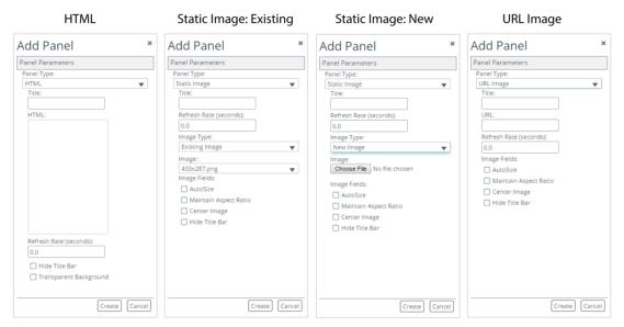
About auxiliary panels
Use auxiliary panels to add labels, hyperlinks, and images to custom dashboards. Supported image formats are .png, .jpeg, .jpg, and .gif.
Select Panel Type
HTML panels
Here are two possible uses of Auxiliary Panels with Panel Type set to HTML:
• Example 1: To define a hyperlink to the Riverbed website, enter:
<a href="http://www.riverbed.com">Visit Riverbed</a>
• Example 2: To embed the Riverbed Support website, enter:
<iframe width=100% height=1000px src="https://support.riverbed.com/"></iframe>
Only use HTML5 elements. Anything outside of the <body> element will get stripped out. Don’t include attributes in the <body> element—for example, instead of this:
<body style="background-color:powderblue;">
...
</body>
use this:
<body>
<div style="background-color:powderblue;">
...
</div>
</body>
If the auxiliary panel is blank, go to Knowledge Base article
S23839. (You must be logged in to view Knowledge Base articles.)
Adding auxiliary panels to dashboards
1. Open the custom dashboard to which you want to add an auxiliary panel.
3. To access the Add (Auxiliary) Panel dialog box, click the Add Content (

) icon on the
About the dashboard toolbar and select Create a new auxiliary panel. The Add Panel dialog box appears.
4. Select a Panel Type:
– HTML—For defining labels, hyperlinks, and other HTML-based text.
– Static Image—For defining an uploaded image.
– URL Image—For defining an image from a URL.
5. Specify the panel parameters for the selected panel type:
– Title—Panel title.
– HTML—For HTML panel type, defines the HTML. After it is displayed, the panel can be resized to display the entire embedded web page.
– Image Type—or Static Image panel type, select:
- Existing Image if the image has been uploaded previously
- New to choose and upload an image
– Image/Choose File—For Static Image panel type, either select the existing image or choose the image file.
– URL—For URL Image panel type, defines the URL of the image.
– Refresh Rate.
– AutoSize—If selected, the image resizes itself when the panel is smaller than the image. Otherwise, the image is cropped.
– Maintain Aspect Ratio—If selected, the image retains its height to width ratio when resizing.
– Center Image—If selected, the image is centered in the panel. Otherwise, the image is aligned left.
– Hide Title Bar—If selected, the title bar is not shown.
– Transparent Background.
6. Click Create. The auxiliary panel appears in the custom dashboard.
7. To adjust/edit an auxiliary panel, right-click the panel and choose one of these options:
– Edit Settings
– Show Title Bar /Hide Title Bar
– Reset Panel Size
Related topic
 ) icon.
 ) icon. The Dashboards Settings dialog box appears.
 ) icon. The Link or Embed Dashboard dialog box appears.
 ) icon on the