Content Creators: About Group Elements
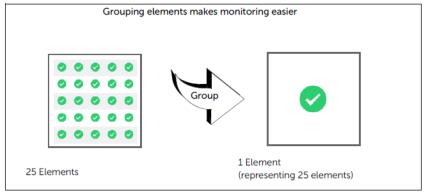
Use the group feature to create a single element that represents a common metric of multiple elements in a panel. When multiple elements are combined into a single element, it is easier to monitor the metric for the elements. For example, suppose you have a panel with 25 elements, and each element represents the throughput of a server in a data center. You can use the group feature to combine the 25 elements into a single element that represents all of the other elements. After the 25 elements are combined into a single element, you can more easily monitor the throughput of the servers.
Group elements
After elements are grouped into a single element, you can easily view all elements represented by the single element by double-clicking the grouped element. The grouped element monitors the status of multiple objects and metrics, and reports on their accumulated data. In other words, a grouped element enables you to view the high-level state of monitored elements and then to drill down to members for deeper analysis and troubleshooting.
When you drill down into a grouped element, you may see other grouped element members at lower levels in the hierarchy. When you reach a single metric, if you double-click it, a graph opens to show the metric’s values over time.
The following are examples of grouped elements:
• An LED showing the health of many hosts
• A Gauge showing the average Max. Response Time for all the servlets running in an application
If your account does not include the required permissions, you may not be able to perform certain tasks described in this chapter. Contact your administrator for more information.
For more information, see these sections:
Related topic
Grouping elements
To group elements in a panel, use one of the following procedures, depending on the circumstance:
•
Grouping elements (simple)—Allows you to define multiple levels of groups, one level at a time. Use this procedure if you only want to define one, maybe two, group levels. For ease-of-use, the elements automatically display a preview as you define the group and visualization for the level. If you don’t like what you see in the preview, click
Cancel.
Grouping elements (simple)
1. Set the dashboard in edit mode:
– On the
Panel toolbar, click the Edit Settings (

) icon and select Group….
2. From the Group By drop-down menu, select the object property to use for grouping the elements. The grouped element will display the aggregated metric for the selected object property.
3. Click Next.
4. Define the visualization information:
– Visualization Style—Specifies the element to use for displaying object/metric data in the panel for the current level. For more information, see
Guidelines for choosing elements.
– Order By—Specifies the sort order for the elements: Displayed Value, Displayed Value (Ascending), Name, Name (Descending)
5. Optionally, for advanced users, define the Roll-up Rules for metric data that is grouped.
– values using—Specifies the method for aggregating the metric data to display a value:
– Automatic (default)—Portal determines the best method to use.
– Average—The average of all the members of a group.
– Child Status Count—The number of children over their thresholds.
– Child Status Percentage—The percentage of children over their thresholds.
– Maximum—The highest value of all the members of a group.
– Minimum—The lowest value of all the members of a group.
– Sum—The sum of all the members of the group.
– status (reg/green/…)—Specifies the method for aggregating the data to display a status.
Worst Case (default)—The worst state is shown. For example, an LED group is red if one member is red.
– Child Count—The count of group members that are either yellow or red. For example, an LED monitors the CPU utilization of 10 members. If the group LED uses Child Count, then the warning threshold is 6, meaning that if six or more members enter a warning state, the LED turns yellow.
– Child Percentage—The percentage of group members that are yellow or red. For example, an LED monitors the CPU utilization of 10 members. If the group LED uses Child Percentage of 50 for a warning threshold, then the LED turns yellow if five or more members enter the warning state.
6. Click OK.
7. Optionally, perform any of the following:
– To create another group level above the group that you just defined, repeat this procedure, starting with
step – – To delete the group level that you just defined, on the
“Panel toolbar“, click the Edit Settings (

) icon and select Ungroup.
Grouping elements (advanced)
1. Set the dashboard in edit mode:
– On the
“Panel toolbar“, click the Edit Settings (

) icon and choose Edit > Panel Configuration.
If no group information has been defined for the panel, the Panel Configuration dialog appears.
2. Click Advanced Grouping to display the Advanced Panel Configuration dialog box.
In the Advanced Panel Configuration dialog box, the Number of levels of grouping field is set to 0 and there is only a single section: Lowest Level.
If group information has already been defined for the panel, the Advanced Panel Configuration dialog box appears after choosing Edit > Panel Configuration.
In the Advanced Panel Configuration dialog box, the Number of levels of grouping field is set to 1 or higher and, in addition to the Lowest Level section, there is a section for each defined level of grouping.
3. Enter the number of group levels in the Number of levels of grouping field. Alternatively, use the up/down arrows next to the input field to add/remove group levels.
A section for each level appears in the dialog box.
4. Define each level and the lowest level by clicking the arrow next to the level header and entering the requested information.
For Levels 1 and Higher:
– Visualization Style—Specifies the element to use for displaying object/metric data in the panel for the current level. For more information, see
“Guidelines for choosing elements“.
– Group into rows and columns—Specifies whether to group and display elements in a grid, which requires you to assign an object property to columns and rows.
- If you select Yes, the Column and Row fields appear.
- If you select No, the Group by field appears.
The organization of the content in a grid depends on the selected properties from the Column and Row drop-down menus.
– Group By / Column, Row—Specifies the object property (properties) to use for grouping and displaying grouped elements.
– Order By—Specifies the sort order for displaying grouped elements.
– Roll-up Rules (Advanced)
- values using—Specifies the method for aggregating the metric data to display a value.
- Automatic (default)—Portal determines the best method to use.
- Average—The average of all the members of a group.
- Child Status Count—The number of children over their thresholds.
- Child Status Percentage—The percentage of children over their thresholds.
- Maximum—The highest value of all the members of a group.
- Minimum—The lowest value of all the members of a group
- Sum—The sum of all members of the group.
- Multiple Traces (for multiple-trace graphs only). See
“Grouping data into multiple-trace graphs“.
– status (red/green…)—Specifies the method for aggregating the data to display a status.
- Worst Case (default)—The worst state is shown.
- Child Count—The count of group members that are either yellow or red.
For example, an LED monitors the CPU utilization of 10 members. If the group LED uses Child Count, then the warning threshold is 6, meaning that if six or more members enter a warning state, the LED turns yellow.
- Child Percentage: The percentage of group members that are yellow or red.
For example, an LED monitors the CPU utilization of 10 members. If the group LED uses Child Percentage of 50 for a warning threshold, then the LED turns yellow if five or more members enter the warning state.
For the Lowest Level:
– Visualization Style—Specifies the element to use for displaying object/metric data in the panel for the current level. For more information, see
“Guidelines for choosing elements“.
– Group elements from same content template—Select this check box if you want to create a grouped element based on the grouping configuration of the content template(s) that you chose in the Object Selection Wizard. You can then group these grouped elements further by adding additional levels.
Clear this check box to expand (ungroup) the contents of the previously selected template(s). The object-metric pairs specified in the content template(s) are now available to be grouped by adding additional levels.
– Order By—Specifies the sort order for displaying grouped elements. The sort can be specified using one or more object properties.
5. Click OK to apply the defined grouping to the panel.
Configuring the rows and columns of grids
This task describes how to manually order and rename the columns and rows in a panel configured as a grid.
1. Set the dashboard in edit mode:
3. On the
“Panel toolbar“, click the Edit Settings (

) icon and choose Edit > Advanced Grid Configuration.
4. Click the Column or Row tab to change the settings.
5. Use the Group into drop-down menu option to specify a different grouping property.
6. Use the Order by drop-down menu to select a sorting option.
If you choose Manual, use the Up and Down buttons to reorder the columns/rows.
7. To rename header text, under Display Name, click the text and enter a new name.
8. Click OK.
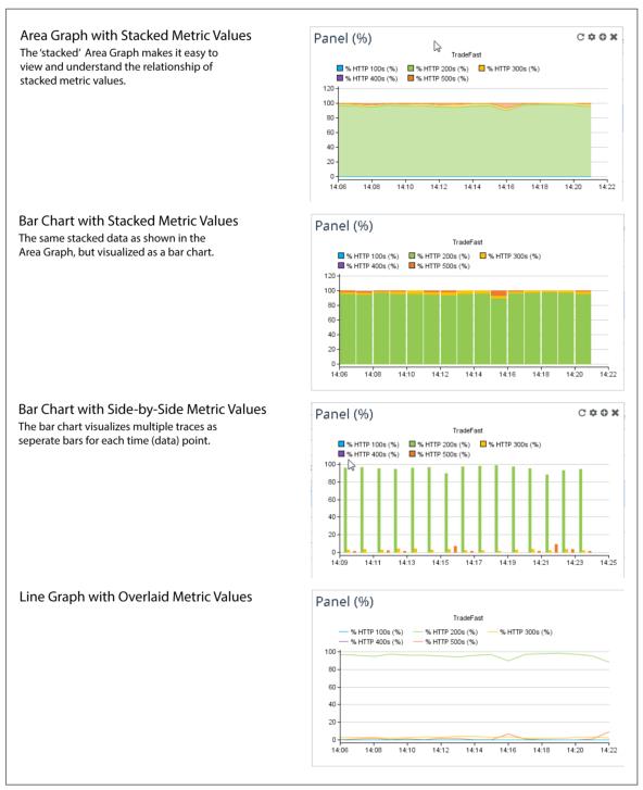
Grouping data into multiple-trace graphs
The capability to view data as multiple traces becomes available when you select the Multiple Traces data grouping rule. There are several ways to view data as multiple traces:
• Area Graph displaying stacked metric values
• Bar Chart displaying stacked metric values
• Bar Chart displaying side-by-side metric values
• Line Graph displaying overlaid metric values
You select Multiple Traces from the Value Using drop-down menu in the Advanced Panel Configuration dialog box.
The following figure shows the four ways of viewing multiple-trace data. In this example, we are monitoring the percentages of five HTTP response codes for a particular web application.
To display a tooltip value for a particular metric, mouse over appropriate time point, and in the color-coded area corresponding to the metric of interest.
Ways of viewing multi-trace data
Creating multiple-trace graphs
This section shows you how to create multiple-trace graphs.
This task describes how to create an Area Graph for displaying stacked metric values.
1. From the Select Metric panel of the Object Selection Wizard, click Create Panel. The Panel Configuration dialog box appears.
2. From the Visualization Style drop-down menu, select Area Graph.
3. Click Advanced Grouping. The Advanced Panel Configuration dialog box appears.
4. In the Number of levels of grouping field, enter 1.
5. From the Value Using drop-down menu, select Multiple Traces.
6. Optionally, you can display the Area Graph with Steplines (connect data point using horizontal and vertical lines):
– Click Edit Panel Settings. The Dashboard Panel Settings dialog box appears.
– In the Graph Settings section, under the Graph Style drop-down menu, select Stepline. Then click OK to close the Dashboard Panel Settings dialog box and return to the Advanced Panel Configuration dialog box.
7. Click OK to create the stacked Area Graph.
This task describes how to create a Bar Chart for displaying metric values in either a Stacked or Side-by-Side format.
1. From the Select Metric panel of the Object Selection Wizard, click Create Panel. The Panel Configuration dialog box appears.
2. From the Visualization Style drop-down menu, select Bar Chart.
3. Click Advanced Grouping. The Advanced Panel Configuration dialog box appears.
4. In the Number of levels of grouping field, enter 1.
5. From the Value using drop-down menu, select Multiple Traces.
6. Click Edit Panel Settings. The Dashboard Panel Settings dialog box appears.
7. In the Graph Settings section, select the Multiple Trace Bars drop-down menu and select either Stacked or Side By Side.
8. Click OK to create the appropriate bar chart.
This task describes how to create a Line Graph displaying overlaid metric values.
1. From the Select Metric panel of the Object Selection Wizard, click Create Panel. The Panel Configuration dialog box appears.
2. From the Visualization Style drop-down menu, select Line Graph.
3. Click Advanced Grouping. The Advanced Panel Configuration dialog box appears.
4. In the Number of levels of grouping field, enter 1.
5. From the Value using drop-down menu, select Multiple Traces.
6. Click OK to create the Line Graph displaying overlaid metric values.
Using content templates to create a group
A simple way to create a group is to use an existing content template. Although you can create your own content templates, Alluvio Portal includes many predefined content templates. Content templates define groups by specifying all of the object types and metrics found within the levels of the group hierarchy. Content templates also specify the visualization styles elements in the group hierarchy.
Grouping elements with object properties
Object properties describe characteristics of objects. You can use object properties to apply thresholds and to group elements. The ability to use object properties to group elements enables you to better organize dashboard content for improved data monitoring.
For example, suppose you want to group hosts by their operating systems. One approach is to create an object property called Host OS and then set an individual object property value for each host object, such as the value Windows Host or Linux Host. You can then use the object property Host OS to group elements into host categories—either Windows or Linux.
This table lists additional possibilities for grouping by an individual object property. (For example, the object property named Country can be used to group hosts by the object property values United States, England, and Singapore.
Object property name to group hosts | Object property values to assign to individual hosts |
Country | United States, England, Singapore |
State | Maryland, Virginia, North Carolina |
City | Bethesda, Richmond, Raleigh |
Building | Main HQ, Building B, Building C |
Floor | 1, 2, 3 |
Rack | A, B, C |
Shelf | 6, 7, 8 |
Serial Number | 1h4165G, 1h4166G, 1h4167G |
For more information, see:
Object property types
There are three types of object properties:
• System
• Data Source
• User-Defined
All three types can be used for grouping. However, user-defined object properties provide the most flexibility for grouping because you can specify any object property that you deem important. (For details, see
“Examples of user-defined object properties“.) Unlike user-defined object properties, you cannot create or edit system object properties or data source object properties.
For more information about creating user-defined object properties, see
“Creating user-defined object properties“.
Introduction to user-defined object properties
User-defined object properties give you the capability to categorize objects at a granular level. You gain added precision for organizing dashboard content and monitoring specific metric values.
User-defined object properties can be exported and imported to, for example, move them from one instance of Portal to another.
There can be potential problems if you specify a user-defined object property with the same name as a system or data source object property. For example, conflicts occur when you apply a user-defined object property to an object that already has an identically named system or data source object property applied to it. If there is a conflict between a data source object property and a user-defined object property, the data source object property overrides the user-defined object property. Similarly, if there is a conflict between a system object property and a user-defined object property, the system object property overrides the user-defined object property.
There are two types of user-defined object properties:
• Individual object properties—An individual object property applies to a specific object.
• Pattern-based properties—A pattern-based property applies to a set of objects based on the object type and/or object name patterns (that is, a similar naming pattern). Pattern-based properties are useful when you want to group objects based on some common object name structure.
Creating user-defined object properties
You can create or edit object properties and pattern-based properties. However, if you want a global view to prioritize pattern-based properties, or to delete object properties and pattern-based properties, see
“Globally managing user-defined object properties“.
Perform this task to access the Edit Object Properties dialog box:
1. Perform one of the following:
– On the
“Panel toolbar“, click the Edit Settings (

) icon and choose Edit > Object Properties.
– Right-click an element and choose Edit > Object Properties.
2. Click Edit Object Properties.
3. Create an object property:
– Click Create Object Property.
– Click New to create an object property.
– From the Property Name drop-down menu, select the object property name.
– In the Property Values field, enter the property value.
Click Add Value to define more than one value for a multiple-value property.
For example: a Cisco router located in New York.
– Click Create.
The new object property appears on the Edit Object Property dialog box.
4. Create a pattern-based property:
– Click Create Pattern-based Property.
– In the Description field, enter a description to easily identify the pattern-based property.
– Specify one or both Dashboard Element Specifiers:
Object Type. Use this option to match objects based on object type. For example, if you specify the object type AppResponse > Application, then the pattern-based property will apply only to AppResponse Applications objects. Leave this option unchecked to match all object types.
Object Name Pattern. Use this option to match objects based on the object name. For example, specifying tf* will match tfPortal01 and tfconnect01, but not w2ptr2. Clear this option to match all object names.
– Click New (next to the Property Name field) to create an object property name.
– From the Property Name field drop-down menu, select the object property name.
– In the Property Values field, enter the property value.
Click Add Value to define more than one value for a multiple-value property.
For example: a Cisco router located in New York.
– Click Create.
The new pattern-based object property appears on the Edit Object Property dialog box.
After you create an object property, you can use it to group elements. For more information, see
“Content Creators: About Group Elements“.
Examples of user-defined object properties
This section provides the following examples:
Example of an object property
Suppose you want to monitor metrics on a set of objects (that are displayed as elements in a panel). Not all the objects are of equal importance, however. Therefore, you might categorize these objects by level of importance. In doing so, you can create an object property named Importance.
Next, you set individual object property values for each object (Tier 1, Tier 2, and so on).
You can then group your objects by Importance. Consequently, the objects are grouped into their respective tiers of importance (Tier 1, Tier 2, and so on) in the panel.
The following example describes how to group by object property:
1. Identify the objects to group by object property.
For example,
- ORACLE REMOTE DB will have an object property value of Tier 1.
- STOCK TRADER-Keynote will have an object property value of Tier 2.
3. Group objects by the new object property by order of importance.
Example of a pattern-based property
The process for creating pattern-based properties is similar to the process for creating object properties.
Suppose your panel elements display metrics for routers that have names which reference the states of New York, Pennsylvania, and Washington (as in NY_router_1, NY_router_2, NY_router_3, PA_router_1, and so on).
To organize these state objects, you can use an object name pattern. Next, you create a pattern-based property named State with a value matching each group: New York, Pennsylvania, and Washington.
The result is three pattern-based properties:
• Pattern-Based Property 1:
– Object Name Pattern: *NY*
– Property Name: State
– Property Value: New York
• Pattern-Based Property 2:
– Object Name Pattern: *PA*
– Property Name: State
– Property Value: Pennsylvania
• Property-Based Property 3:
– Object Name Pattern: *WA*
– Property Name: State
– Property Value: Washington
You can then group the applicable routers based on the values New York, Pennsylvania, and Washington by doing the following (for each of the three groups):
2. Selecting State from the Group By drop-down menu of the Advanced Panel Configuration dialog box.
Globally managing user-defined object properties
To access all user-defined object properties in the Object Property Management screen, choose Administration > Dashboards: Object Properties.
The functionality of the Object Property Management screen is similar to that of the Edit Object Properties dialog box (which is accessible from the panel or element level). Additional tasks that you can perform from the Object Properties Management screen include prioritizing pattern-based properties, deleting object properties and pattern-based properties, and importing/exporting object property and pattern-based property definitions.
When two or more pattern-based properties with the same name apply to the same object, the pattern-based property with the highest priority in the table overrides the other pattern-based property.
Customized grouping of AppResponse (9.x) data
When you want to use object properties to group AppResponse (9.x) data, you can define the object properties in (description fields on) AppResponse (9.x).
Customized grouping: Defining object properties in AppResponse (9.x)
There may be times when you want a quick and easy way of defining object properties for a custom grouping of AppResponse (9.x) data. In such cases, you can define the object properties directly from the AppResponse (9.x) Console. After you define these object properties, they can be used for grouping just like any other object property. For more information about object properties, see
“Grouping elements with object properties“.
Note the following details about defining object properties in AppResponse (9.x):
• Object properties are defined in the description field (255 characters or less) for Defined Applications and Business Groups in the Defined Application Manager and Business Group Manager of the AppResponse (9.x) Console. For more information, see the AppResponse (9.x) documentation.
• The format is [A:B], where A is the property name and B is a property value(s).
• Like any other object property, you can view an AppResponse (9.x)-defined object property in the Object Properties section of the Configure Dashboard Elements dialog box.
• When grouping data, you can select these object properties from the Group By drop-down menu in the Advanced Panel Configuration dialog box. For more information, see
“Grouping elements“.
Defining object properties in AppResponse (9.x): A simple use case
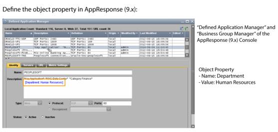
Suppose you want to create an object property to identify the department that uses an application. The following figure shows an example of how an object property called Department identifies the group within the organization that uses the application. Additionally, the example describes how to define the new object property in AppResponse (9.x) and then view it in Portal.
Example of defining an object property in AppResponse (9.x)
Predefined object property names and associated dashboard drill-downs
Although you can assign any name to an object property that you define in an AppResponse (9.x) data source, we recommend that you take advantage of the following predefined object property names that can launch applicable dashboard templates using right-click drill-downs:
• Key Locations
• Key Interface
These predefined object property names are associated with specific dashboard templates. For example, Key Locations is associated with the Single Application, Multiple Locations and Single Web Application, Multiple Locations dashboard templates. On the other hand, Key Interface launches any of the single-interface dashboard templates.
 ) icon.
 ) icon.
 ) icon.