Typical report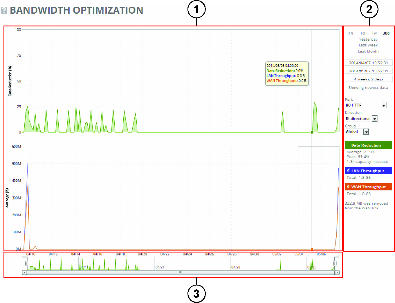
Control | Description |
Export To | Select either the Email or URL option from the drop-down list. |
Email Addresses | Specify the email address of the recipient. (Only displays when Email is selected.) |
Email Subject | (Only displays when Email is selected.) Specify the email subject. (Only displays when Email is selected.) |
Destination URL | Specify the URL. (Only displays when URL is selected.) |
Format | Select HTML, CSV, or PDF from the drop-down list. |
Per Appliance Report | Enables appliance report settings. Generates graphs per appliance for HTML/PDF reports. Generates one CSV per appliance for CSV reports. |
Export Now | Select Export Now and click Export to start the export immediately. |
Schedule Export | Select Schedule Export and specify the start date, time, and frequency of the export. Use this format yyyy/mm/dd hh:mm:ss |
Export | Exports the data. |
Printable view | Displays the print menu. |
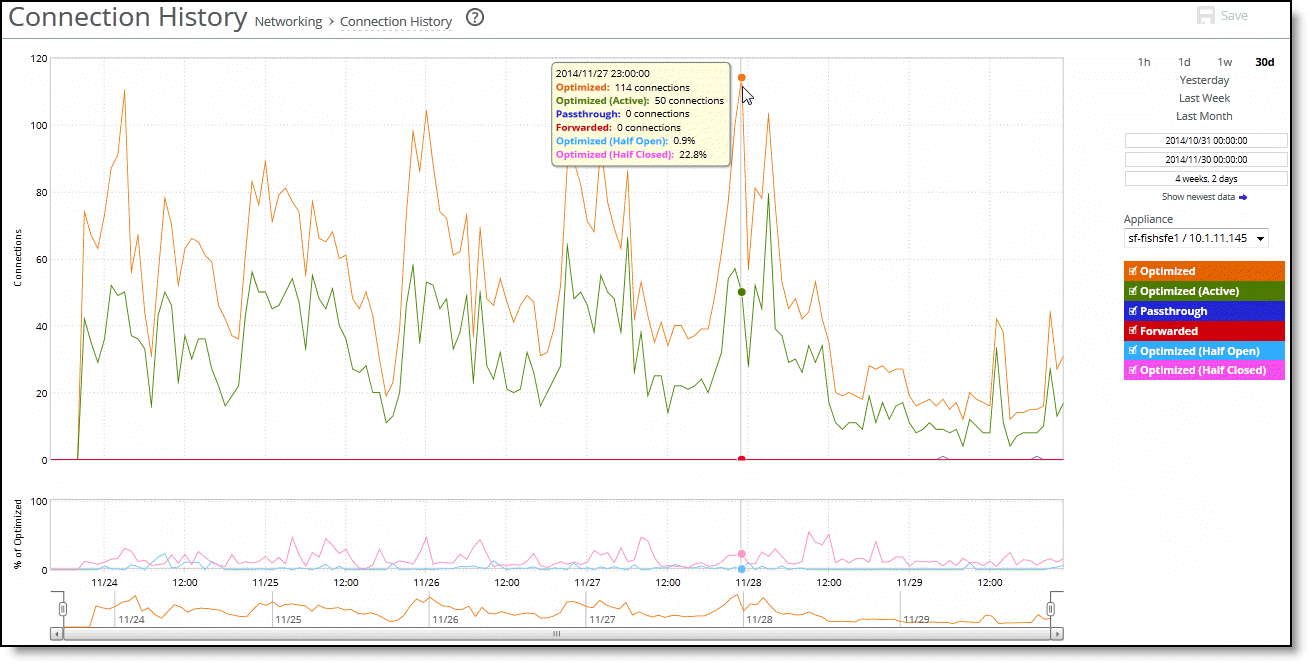
Packet type | Description |
Optimized | Displays the total connections, including half-open, half-closed (where half-open and half-closed are TCP connection states), idle, established and optimized. |
Optimized (Active) | Displays the total active connections that are established and optimized. |
Passthrough | Displays the total connections passed through, unoptimized. |
Forwarded | Displays the total number of connections forwarded by the connection-forwarding neighbor managing the connection. |
Optimized (Half Open) | Displays the percentage of half-opened connections represented in the optimized connection total. A half-open connection is a TCP connection that hasn’t been fully established. Half-open connections count toward the connection count limit on the SteelHead because, at any time, they can become a fully open connection. If you’re experiencing a large number of half-opened connections, consider a more appropriately sized SteelHead. |
Optimized (Half Closed) | Displays the percentage of half-closed active connections represented in the optimized connection total. Half-closed connections are connections that the SteelHead has intercepted and optimized but are in the process of being disconnected. These connections are counted toward the connection count limit on the SteelHead. (Half-closed connections can remain if the client or server doesn’t close their connections cleanly.) If you’re experiencing a large number of half-closed connections, consider a more appropriately sized SteelHead. |
Control | Description |
Time Interval | Select a report time interval of 1 hour (1h), 1 day (1d), 1 week (1w), 30 days (30d), yesterday, last week, or last month. Time intervals that don’t apply to a particular report are dimmed. For a custom time interval, enter the start time and end time using the format yyyy/mm/dd hh:mm:ss Because the system aggregates data on the hour, request hourly time intervals. For example, setting a time interval to 08:30:00 to 09:30:00 from 2 days ago doesn’t create a data display, whereas setting a time interval to 08:00:00 to 09:00:00 from 2 days ago will display data. When you request a custom time interval to view data beyond the aggregated granularity, the data isn’t visible because the system is no longer storing the data. For example, these custom time intervals don’t return data because the system automatically aggregates data older than seven days into two-hour data points: •Setting a one-hour time period that occurred two weeks ago. •Setting a 75-minute time period that occurred more than one week ago. You can quickly see the newest data and see data points as they’re added to the chart dynamically. To display the newest data, click Show newest data. |
Group | Select the group from the drop-down list. |
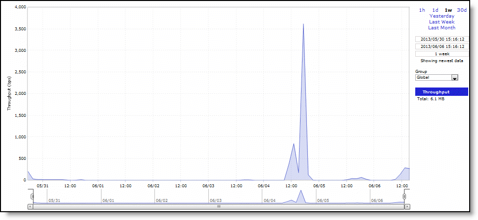
Data series | Description |
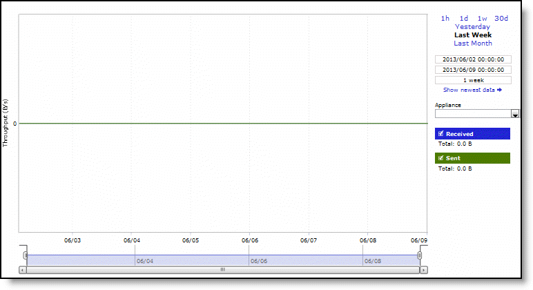
Throughput | Displays the throughput in bits per second. |
Control | Description |
Time Interval | Select a report time interval of 1 hour (1h), 1 day (1d), 1 week (1w), 30 days (30d), yesterday, last week, or last month. Time intervals that don’t apply to a particular report are dimmed. For a custom time interval, enter the start time and end time using the format yyyy/mm/dd hh:mm:ss Because the system aggregates data on the hour, request hourly time intervals. For example, setting a time interval to 08:30:00 to 09:30:00 from 2 days ago doesn’t create a data display, whereas setting a time interval to 08:00:00 to 09:00:00 from 2 days ago will display data. When you request a custom time interval to view data beyond the aggregated granularity, the data isn’t visible because the system is no longer storing the data. For example, these custom time intervals don’t return data because the system automatically aggregates data older than 7 days into 2-hour data points: •Setting a one-hour time period that occurred two weeks ago. •Setting a 75-minute time period that occurred more than one week ago. You can quickly see the newest data and see data points as they’re added to the chart dynamically. To display the newest data, click Show newest data. |
Group | Select the group from the drop-down list. |
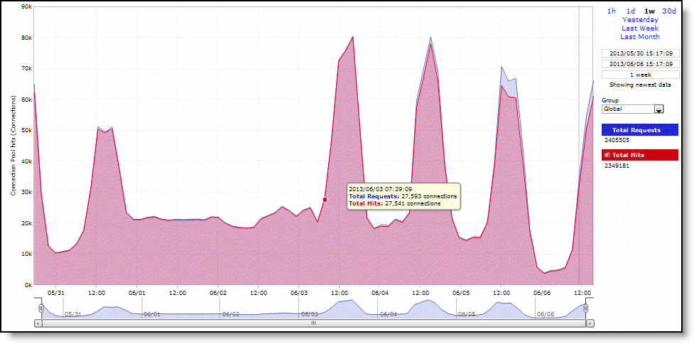
Field | Description |
Total Requests | Specifies the total number of requests for connections to peer appliances. |
Total Hits | Specifies the total number of successful connections and connections that are serviced by already existing inner channel connections. |
Connection Pool hits (Connections) | Specifies the total number of successful connections and connections that are serviced by already existing inner channel connections. The connection pool holds many idle TCP connections up to the maximum pool size. When a client requests a new connection to a previously visited server, the pool manager checks the pool for unused connections, returns one if available, and then replenishes the pool with another idle connection. |
Control | Description |
Time Interval | Select a report time interval of 1 hour (1h), 1 day (1d), 1 week (1w), 30 days (30d), yesterday, last week, or last month. Time intervals that don’t apply to a particular report are dimmed. For a custom time interval, enter the start time and end time using the format yyyy/mm/dd hh:mm:ss You can quickly see the newest data and see data points as they’re added to the chart dynamically. To display the newest data, click Show newest data. |
Group | Select the group from the drop-down list. |
Control | Description |
Time Interval | Select a report time interval of 1 hour (1h), 1 day (1d), 1 week (1w), 30 days (30d), yesterday, last week, or last month. Time intervals that don’t apply to a particular report are dimmed. For a custom time interval, enter the start time and end time using the format yyyy/mm/dd hh:mm:ss Because the system aggregates data on the hour, request hourly time intervals. For example, setting a time interval to 08:30:00 to 09:30:00 from 2 days ago doesn’t create a data display, whereas setting a time interval to 08:00:00 to 09:00:00 from 2 days ago will display data. When you request a custom time interval to view data beyond the aggregated granularity, the data isn’t visible because the system is no longer storing the data. For example, these custom time intervals don’t return data because the system automatically aggregates data older than seven days into two-hour data points: •Setting a one-hour time period that occurred two weeks ago. •Setting a 75-minute time period that occurred more than one week ago. You can quickly see the newest data and see data points as they’re added to the chart dynamically. To display the newest data, click Show newest data. |
Appliance | Select an appliance from the drop-down list. |
Units | Select either packets/sec or bps from the drop-down list. |
Show | Select either total or selected classes from the drop-down list. |
Classes | Select Total or Selected classes from the drop-down list. Selected classes lets you narrow the report by choosing from drop-down lists of classes and remote sites (up to seven). You can’t select a class or a class @ site more than once. Click Update to change the QoS class selection without updating the chart. When the report display includes the total classes, the data series appear as translucent; selected classes appear as opaque. When the report display includes the total classes, the navigator shadows the total sent series. When the report display includes selected classes and remote sites, the navigator shadows the first nonempty sent series. A data series can be empty if you create a QoS class but it hasn’t seen any traffic yet. Selecting a parent class displays its child classes. For example, the report for an HTTP class with two child classes named WebApp1 and WebApp2 displays statistics for HTTP, WebApp1, and WebApp2. When a selected class has descendant classes, the report aggregates the statistics for the entire tree of classes. It displays the aggregated tree statistics as belonging to the selected class. |
Control | Description |
Time Interval | Select a report time interval of 1 hour (1h), 1 day (1d), 1 week (1w), 30 days (30d), yesterday, last week, or last month. Time intervals that don’t apply to a particular report are dimmed. For a custom time interval, enter the start time and end time using the format yyyy/mm/dd hh:mm:ss Because the system aggregates data on the hour, request hourly time intervals. For example, setting a time interval to 08:30:00 to 09:30:00 from 2 days ago doesn’t create a data display, whereas setting a time interval to 08:00:00 to 09:00:00 from 2 days ago will display data. When you request a custom time interval to view data beyond the aggregated granularity, the data isn’t visible because the system is no longer storing the data. For example, these custom time intervals don’t return data because the system automatically aggregates data older than seven days into two-hour data points: •Setting a one-hour time period that occurred two weeks ago. •Setting a 75-minute time period that occurred more than one week ago. You can quickly see the newest data and see data points as they’re added to the chart dynamically. To display the newest data, click Show newest data. |
Appliance | Select an appliance from the drop-down list. |
Units | Select either packets/sec or bps from the drop-down list. |
Show | Select either total or selected classes from the drop-down list. |
Classes | Select Total or Selected classes from the drop-down list. Selected classes lets you narrow the report by choosing from drop-down lists of classes (up to eight). You can’t select a class more than once. Click Update to change the QoS class selection without updating the chart. When the report display includes the total classes, the data series appear as translucent; selected classes appear as opaque. When the report display includes the total classes, the navigator shadows the total received series. When the report display includes selected classes, the navigator shadows the first nonempty received series. A data series can be empty if you create a QoS class but it hasn’t seen any traffic yet. Selecting a parent class displays its child classes: for example, the report for an HTTP class with two child classes named WebApp1 and WebApp2 displays statistics for HTTP, WebApp1, and WebApp2. When a selected class has descendent classes, the report aggregates the statistics for the entire tree of classes. It displays the aggregated tree statistics as belonging to the selected class. |
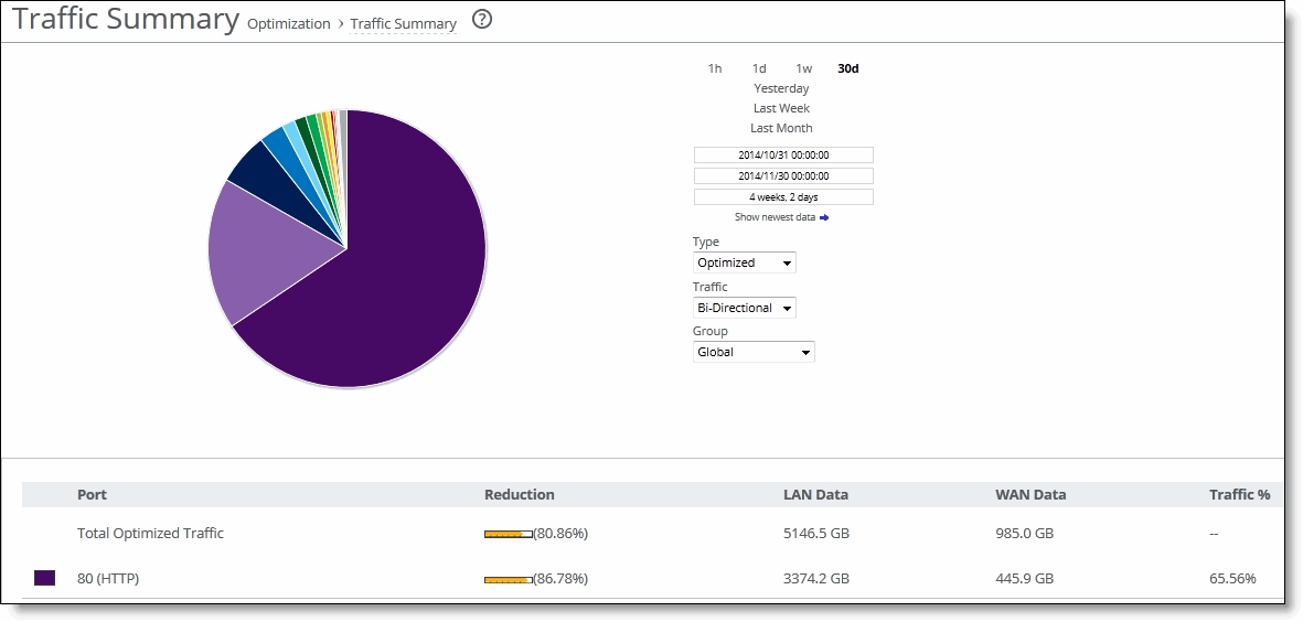
Column | Description |
Port | Displays the TCP/IP port number and application for each row of statistics. |
Reduction | Displays the amount of data reduction. |
LAN Data | Displays the amount of traffic through the LAN. |
WAN Data | Displays the amount of traffic on the WAN. |
Traffic % | Displays the percentage of the total traffic each port represents. |
Control | Description |
Time Interval | Select a report time interval of 1 hour (1h), 1 day (1d), 1 week (1w), 30 days (30d), yesterday, last week, or last month. Time intervals that don’t apply to a particular report are dimmed. For a custom time interval, enter the start time and end time using the format yyyy/mm/dd hh:mm:ss Because the system aggregates data on the hour, request hourly time intervals. For example, setting a time interval to 08:30:00 to 09:30:00 from 2 days ago doesn’t create a data display, whereas setting a time interval to 08:00:00 to 09:00:00 from 2 days ago will display data. When you request a custom time interval to view data beyond the aggregated granularity, the data isn’t visible because the system is no longer storing the data. For example, these custom time intervals don’t return data because the system automatically aggregates data older than seven days into two-hour data points: •Setting a one-hour time period that occurred two weeks ago. •Setting a 75-minute time period that occurred more than one week ago You can quickly see the newest data and see data points as they’re added to the chart dynamically. To display the newest data, click Show newest data. |
Type | Select a type (Optimized, Pass Through, Both) from the drop-down list. |
Traffic | Select a traffic direction (Bi-Directional, WAN to LAN, or LAN to WAN) from the drop-down list. |
Group | Select the group from the drop-down list. |
Data series | Description |
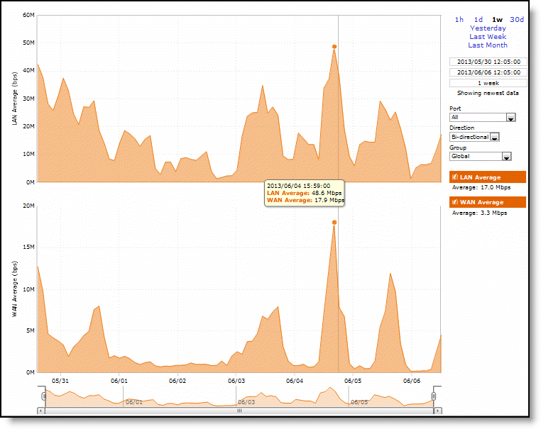
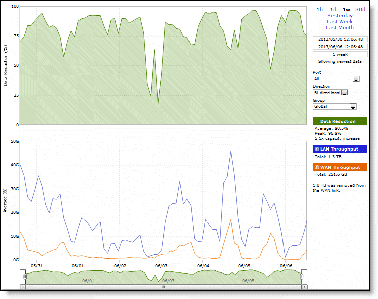
LAN Average (bps) | Displays the average throughput. RiOS calculates the LAN average at each data point by taking the number of bytes transferred, converting that to bits, and then dividing by the granularity. For instance, if the system reports 100 bytes for a data point with a 10-second granularity, RiOS calculates: 100 bytes * 8 bits/byte / 10 seconds = 80 bps This means that 80 bps was the average throughput over that 10-second period. The average that appears below the LAN Average is an average of all displayed averages. |
WAN Average (bps) | Displays the average throughput. RiOS calculates the WAN average at each data point by taking the number of bytes transferred, converting that to bits, and then dividing by the granularity. For instance, if the system reports 100 bytes for a data point with a 10-second granularity, RiOS calculates: 100 bytes * 8 bits/byte / 10 seconds = 80 bps This means that 80 bps was the average throughput over that 10-second period. The average that appears below the WAN Average is an average of all displayed averages. |
Control | Description |
Time Interval | Select a report time interval of 1 hour (1h), 1 day (1d), 1 week (1w), 30 days (30d), yesterday, last week, or last month. Time intervals that don’t apply to a particular report are dimmed. For a custom time interval, enter the start time and end time using the format yyyy/mm/dd hh:mm:ss Because the system aggregates data on the hour, request hourly time intervals. For example, setting a time interval to 08:30:00 to 09:30:00 from 2 days ago doesn’t create a data display, whereas setting a time interval to 08:00:00 to 09:00:00 from 2 days ago will display data. When you request a custom time interval to view data beyond the aggregated granularity, the data isn’t visible because the system is no longer storing the data. For example, these custom time intervals don’t return data because the system automatically aggregates data older than seven days into two-hour data points: •Setting a one-hour time period that occurred two weeks ago. •Setting a 75-minute time period that occurred more than one week ago You can quickly see the newest data and see data points as they’re added to the chart dynamically. To display the newest data, click Show newest data. |
Port | Select a port from the drop-down list. The list appends the port name to the number where available. |
Direction | Select a traffic direction (Bi-directional, WAN to LAN, or LAN to WAN) from the drop-down list. |
Group | Select a group from the drop-down list. |
Data series | Description |
Data Reduction % | Displays the peak and total decrease of data transmitted over the WAN, according to this calculation: (Data In – Data Out)/(Data In) Displays the capacity increase x-factor below the peak and total data reduction percentages. |
WAN and LAN Throughput | Depending on that direction you select, specifies one of these: •Bi-Directional - traffic flowing in both directions •WAN-to-LAN - inbound traffic flowing from the WAN to the LAN •LAN-to-WAN - outbound traffic flowing from the LAN to the WAN |
Control | Description |
Time Interval | Select a report time interval of 1 hour (1h), 1 day (1d), 1 week (1w), 30 days (30d), yesterday, last week, or last month. Time intervals that don’t apply to a particular report are dimmed. For a custom time interval, enter the start time and end time using the format yyyy/mm/dd hh:mm:ss Because the system aggregates data on the hour, request hourly time intervals. For example, setting a time interval to 08:30:00 to 09:30:00 from 2 days ago doesn’t create a data display, whereas setting a time interval to 08:00:00 to 09:00:00 from 2 days ago will display data. When you request a custom time interval to view data beyond the aggregated granularity, the data isn’t visible because the system is no longer storing the data. For example, these custom time intervals don’t return data because the system automatically aggregates data older than seven days into two-hour data points: •Setting a one-hour time period that occurred two weeks ago. •Setting a 75-minute time period that occurred more than one week ago. You can quickly see the newest data and see data points as they’re added to the chart dynamically. To display the newest data, click Show newest data. |
Port | Select a port or select All to view all ports from the drop-down list. The list appends the port name to the number where available. |
Direction | Select a traffic direction (Bi-Directional, WAN to LAN, or LAN to WAN) from the drop-down list. |
Group | Select the group from the drop-down list. |
Control | Description |
Time Interval | Select a report time interval of 1 hour (1h), 1 day (1d), 1 week (1w), 30 days (30d), yesterday, last week, or last month. Time intervals that don’t apply to a particular report are dimmed. For a custom time interval, enter the start time and end time using the format yyyy/mm/dd hh:mm:ss Because the system aggregates data on the hour, request hourly time intervals. For example, setting a time interval to 08:30:00 to 09:30:00 from 2 days ago doesn’t create a data display, whereas setting a time interval to 08:00:00 to 09:00:00 from 2 days ago will display data. When you request a custom time interval to view data beyond the aggregated granularity, the data isn’t visible because the system is no longer storing the data. For example, these custom time intervals don’t return data because the system automatically aggregates data older than seven days into two-hour data points: •Setting a one-hour time period that occurred two weeks ago. •Setting a 75-minute time period that occurred more than one week ago. You can quickly see the newest data and see data points as they’re added to the chart dynamically. To display the newest data, click Show newest data. |
Type | Select a type (Optimized, Pass Through, Both) from the drop-down list. |
Traffic | Select a traffic direction (Bi-Directional, WAN to LAN, or LAN to WAN) from the drop-down list. |
Group | Select the group from the drop-down list. |
Data series | Description |
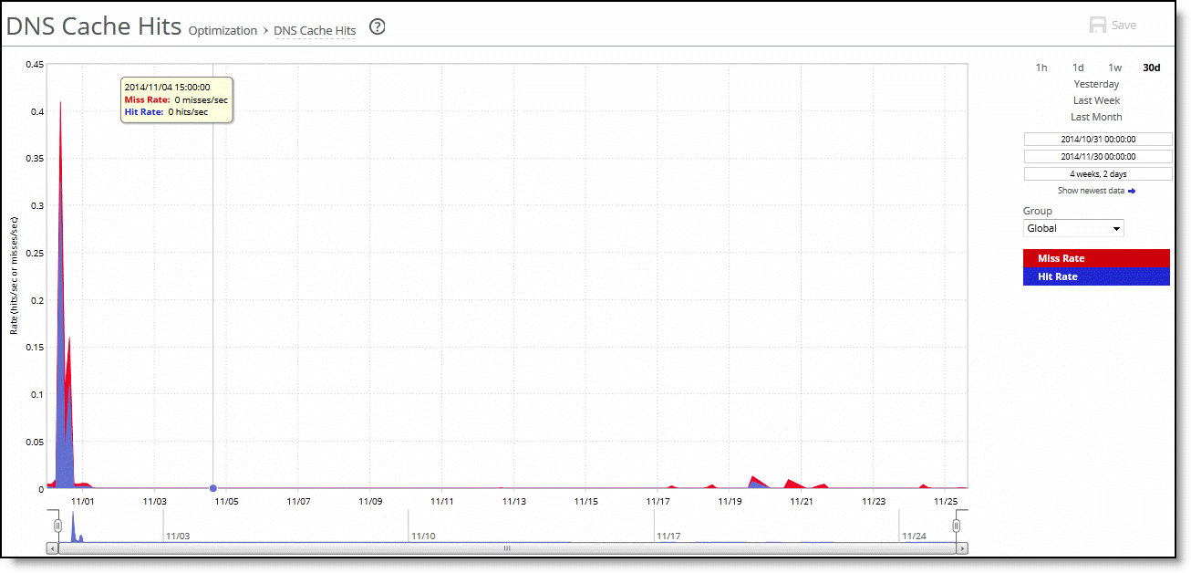
Miss Rate | Displays the rate of cache misses. |
Hit Rate | Displays the rate of cache hits. |
Control | Description |
Time Interval | Select a report time interval of 1 hour (1h), 1 day (1d), 1 week (1w), 30 days (30d), yesterday, last week, or last month. Time intervals that don’t apply to a particular report are dimmed. For a custom time interval, enter the start time and end time using the format yyyy/mm/dd hh:mm:ss Because the system aggregates data on the hour, request hourly time intervals. For example, setting a time interval to 08:30:00 to 09:30:00 from 2 days ago doesn’t create a data display, whereas setting a time interval to 08:00:00 to 09:00:00 from 2 days ago will display data. When you request a custom time interval to view data beyond the aggregated granularity, the data isn’t visible because the system is no longer storing the data. For example, these custom time intervals don’t return data because the system automatically aggregates data older than seven days into two-hour data points: •Setting a one-hour time period that occurred two weeks ago. •Setting a 75-minute time period that occurred more than one week ago. You can quickly see the newest data and see data points as they’re added to the chart dynamically. To display the newest data, click Show newest data. |
Group | Select the group from the drop-down list. |
Field | Description |
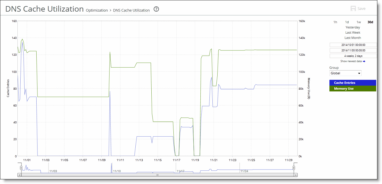
Cache Entries | Displays the number of DNS entries in the cache. |
Memory Use | Displays the cache memory used in bytes. |
Control | Description |
Time Interval | Select a report time interval of 1 hour (1h), 1 day (1d), 1 week (1w), 30 days (30d), yesterday, last week, or last month. Time intervals that don’t apply to a particular report are dimmed. For a custom time interval, enter the start time and end time using the format yyyy/mm/dd hh:mm:ss Because the system aggregates data on the hour, request hourly time intervals. For example, setting a time interval to 08:30:00 to 09:30:00 from 2 days ago doesn’t create a data display, whereas setting a time interval to 08:00:00 to 09:00:00 from 2 days ago will display data. When you request a custom time interval to view data beyond the aggregated granularity, the data isn’t visible because the system is no longer storing the data. For example, these custom time intervals don’t return data because the system automatically aggregates data older than seven days into two-hour data points: •Setting a one-hour time period that occurred two weeks ago. •Setting a 75-minute time period that occurred more than one week ago. You can quickly see the newest data and see data points as they’re added to the chart dynamically. To display the newest data, click Show newest data. |
Group | Select the group from the drop-down list. |
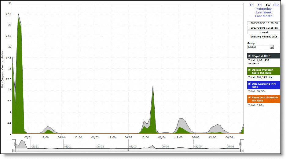
Data series | Description |
Request Rate | Select to display the rate of HTTP objects, URLs, and object prefetch requests. |
Object Prefetch Table Hit Rate | Select to display the hit rate of stored object prefetches per second. The SteelHead stores object prefetches from HTTP GET requests for cascading style sheets, static images, and Java scripts in the Object Prefetch Table. |
URL Learning Hit Rate | Select to display the hit rate of found base requests and follow-on requests per second. The SteelHead learns associations between a base request and a follow-on request. Instead of saving each object transaction, the SteelHead saves only the request URL of object transactions in a Knowledge Base and then generates related transactions from the list. |
Parse and Prefetch Hit Rate | Select to display the hit rate of found and prefetched embedded objects per second. The SteelHead determines that objects are going to be requested for a given web page and prefetches them so that they’re readily available when the client makes its requests. |
Control | Description |
Time Interval | Select a report time interval of 1 hour (1h), 1 day (1d), 1 week (1w), 30 days (30d), yesterday, last week, or last month. Time intervals that don’t apply to a particular report are dimmed. For a custom time interval, enter the start time and end time using the format yyyy/mm/dd hh:mm:ss Because the system aggregates data on the hour, request hourly time intervals. For example, setting a time interval to 08:30:00 to 09:30:00 from 2 days ago doesn’t create a data display, whereas setting a time interval to 08:00:00 to 09:00:00 from 2 days ago will display data. When you request a custom time interval to view data beyond the aggregated granularity, the data isn’t visible because the system is no longer storing the data. For example, these custom time intervals don’t return data because the system automatically aggregates data older than seven days into two-hour data points: •Setting a one-hour time period that occurred two weeks ago. •Setting a 75-minute time period that occurred more than one week ago. You can quickly see the newest data and see data points as they’re added to the chart dynamically. To display the newest data, click Show newest data. |
Group | Select the group from the drop-down list. |
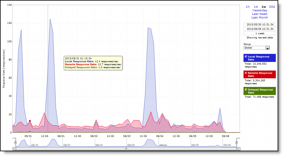
Data series | Description |
Local Response Rate | Specifies the number of NFS calls that were responded to locally. |
Remote Response Rate | Specifies the number of NFS calls that were responded to remotely (that is, calls that traversed the WAN to the NFS server). |
Delayed Response Rate | Specifies the delayed calls that were responded to locally but not immediately (for example, reads that were delayed while a read ahead was occurring and were responded to from the data in the read ahead). |
Control | Description |
Time Interval | Select a report time interval of 1 hour (1h), 1 day (1d), 1 week (1w), 30 days (30d), yesterday, last week, or last month. Time intervals that don’t apply to a particular report are dimmed. For a custom time interval, enter the start time and end time using the format yyyy/mm/dd hh:mm:ss Because the system aggregates data on the hour, request hourly time intervals. For example, setting a time interval to 08:30:00 to 09:30:00 from 2 days ago doesn’t create a data display, whereas setting a time interval to 08:00:00 to 09:00:00 from 2 days ago will display data. When you request a custom time interval to view data beyond the aggregated granularity, the data isn’t visible because the system is no longer storing the data. For example, these custom time intervals don’t return data because the system automatically aggregates data older than seven days into two-hour data points: •Setting a one-hour time period that occurred two weeks ago. •Setting a 75-minute time period that occurred more than one week ago. You can quickly see the newest data and see data points as they’re added to the chart dynamically. To display the newest data, click Show newest data. |
Group | Select the group from the drop-down list. |
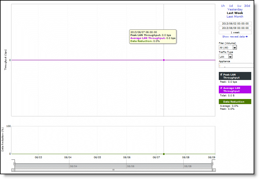
Field | Description |
Peak LAN/WAN Throughput | Displays the peak LAN/WAN data activity. The system stores peak statistics in terms of bytes transferred over the LAN, but calculates the normal throughput using a granularity of 10 seconds. |
Average LAN/WAN Throughput | Displays the average LAN/WAN data activity. The system stores nonpeak statistics as the number of bytes transferred over the LAN/WAN, and calculates the throughput by converting bytes to bits and then dividing the result by the granularity. For instance, if the system reports 100 bytes for a data point with a 10-second granularity, RiOS calculates: 100 bytes * 8 bits/byte / 10 seconds = 80 bps This means that 80 bps was the average throughput over that 10-second period. The total throughput shows the data amount transferred during the displayed time interval. |
Data Reduction | Specifies the percentage of total decrease in overall data transmitted (when viewing all SnapMirror filers). The system calculates data reduction as (total LAN data - total WAN data) / total LAN data. |
Control | Description |
Time Interval | Select a report time interval of 1 hour (1h), 1 day (1d), 1 week (1w), 30 days (30d), yesterday, last week, or last month. Time intervals that don’t apply to a particular report are dimmed. For a custom time interval, enter the start time and end time using the format yyyy/mm/dd hh:mm:ss Because the system aggregates data on the hour, request hourly time intervals. For example, setting a time interval to 08:30:00 to 09:30:00 from 2 days ago doesn’t create a data display, whereas setting a time interval to 08:00:00 to 09:00:00 from 2 days ago will display data. When you request a custom time interval to view data beyond the aggregated granularity, the data isn’t visible because the system is no longer storing the data. For example, these custom time intervals don’t return data because the system automatically aggregates data older than seven days into two-hour data points: •Setting a one-hour time period that occurred two weeks ago. •Setting a 75-minute time period that occurred more than one week ago. You can quickly see the newest data and see data points as they’re added to the chart dynamically. To display the newest data, click Show newest data. |
Filer (Volume) | Select a filer from the drop-down list to view detailed statistics on that filer or select all to view statistics on all filers. You can use data reduction information to fine-tune the optimization settings for that filer. The SteelHead automatically identifies and summarizes information by filer based on the SnapMirror traffic seen by the appliance. Peak lines appear after one hour for filer detail reports. When viewing all volumes for a single filer, the report stacks the throughput series because the sum (total throughput of all volumes) is meaningful. When there are more volumes than colors, the report reuses the colors, starting again from the beginning of the list. |
Traffic Type | Select either LAN or WAN to display the amount of data transmitted over the LAN/WAN during the selected time period. |
Appliance | Select an appliance from the drop-down list. |
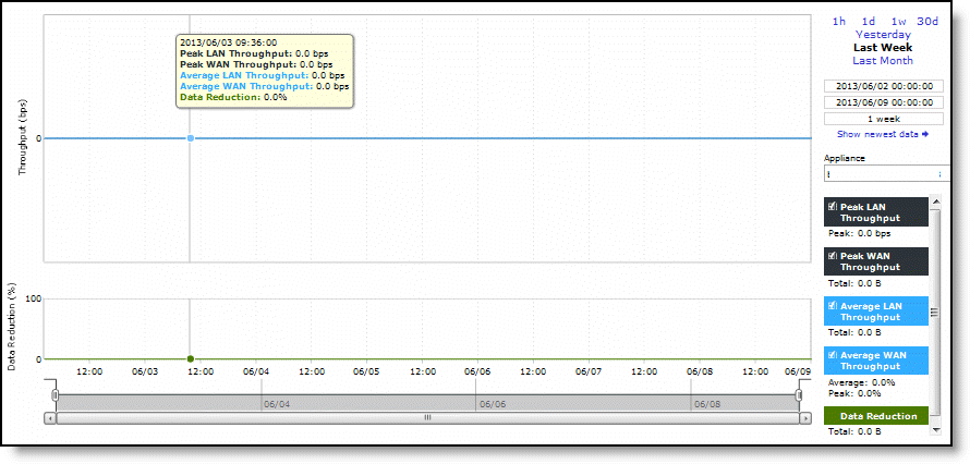
Data series | Description |
Data Reduction | Specifies the percentage of total decrease in overall data transmitted (when viewing all Symmetrix RDF groups). |
WAN/LAN Throughput | Specifies the total throughput transmitted over the WAN and LAN. |
Control | Description |
Time Interval | Select a report time interval of 1 hour (1h), 1 day (1d), 1 week (1w), 30 days (30d), yesterday, last week, or last month. Time intervals that don’t apply to a particular report are dimmed. For a custom time interval, enter the start time and end time using the format yyyy/mm/dd hh:mm:ss Because the system aggregates data on the hour, request hourly time intervals. For example, setting a time interval to 08:30:00 to 09:30:00 from 2 days ago doesn’t create a data display, whereas setting a time interval to 08:00:00 to 09:00:00 from 2 days ago will display data. When you request a custom time interval to view data beyond the aggregated granularity, the data isn’t visible because the system is no longer storing the data. For example, these custom time intervals don’t return data because the system automatically aggregates data older than seven days into two-hour data points: •Setting a one-hour time period that occurred two weeks ago. •Setting a 75-minute time period that occurred more than one week ago. You can quickly see the newest data and see data points as they’re added to the chart dynamically. To display the newest data, click Show newest data. |
Appliance | Select an appliance from the drop-down list. |
Data series | Description |
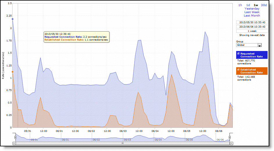
Requested Connection Rate | Displays the rate of requested SSL connections. |
Established Connection Rate | Displays the rate established SSL connections. |
Control | Description |
Time Interval | Select a report time interval of 1 hour (1h), 1 day (1d), 1 week (1w), 30 days (30d), yesterday, last week, or last month. Time intervals that don’t apply to a particular report are dimmed. For a custom time interval, enter the start time and end time using the format yyyy/mm/dd hh:mm:ss Because the system aggregates data on the hour, request hourly time intervals. For example, setting a time interval to 08:30:00 to 09:30:00 from 2 days ago doesn’t create a data display, whereas setting a time interval to 08:00:00 to 09:00:00 from 2 days ago will display data. When you request a custom time interval to view data beyond the aggregated granularity, the data isn’t visible because the system is no longer storing the data. For example, these custom time intervals don’t return data because the system automatically aggregates data older than seven days into two-hour data points: •Setting a one-hour time period that occurred two weeks ago. •Setting a 75-minute time period that occurred more than one week ago. You can quickly see the newest data and see data points as they’re added to the chart dynamically. To display the newest data, click Show newest data. |
Group | Select the group from the drop-down list. |
Control | Description |
All Sites | Select All Sites to display data reports of all the sites. |
Site | Select Site and then enter the name of the site in the text box. Displays reports of all appliances that belong to a site. |
SiteType | Select Site Type and then select the site type from the drop-down list. Displays reports of all appliances that belong to a site type. |
Appliances | Select an appliance from the drop-down list. Displays reports that are specific to that appliance. |
YouTube | Select to display statistics on the YouTube traffic. YouTube caching is handled as a special case given its growing popularity in the enterprise and is enabled by default in SCC. |
Time Interval | All reports include statistics for the last 30 days. Select a report time interval of the last 15 minutes, 1 hour, 1 day, 7 days, 15 days, or enter a custom time interval. For a custom time interval, select the Customize Date... option. You can type the start date and end date using the yyyy/mm/dd format. You can also select the dates from the calendar. The From date cannot be older than the last 30th day. For example, if the To date is May 30th the From date cannot be older than May 1st. |
Control | Description |
All Sites | Select All Sites to display data reports of all the sites. |
Site | Select Site and then enter the name of the site in the text box. Displays reports of all appliances that belong to a site. |
SiteType | Select Site Type and then select the site type from the drop-down list. Displays reports of all appliances that belong to a site type. |
Appliances | Select an appliance from the drop-down list. Displays reports that are specific to that appliance. |
Time Interval | All reports include statistics for the last 30 days. Select a report time interval of the last 15 minutes, 1 hour,1 day, 7 days, 15 days, or enter a custom time interval. For a custom time interval, select the Customize Date... option. You can type the start date and end date using the yyyy/mm/dd format. You can also select the dates from the calendar. The From date cannot be older than the last 30th day. For example, if the To date is May 30th the From date cannot be older than May 1st. |
Data series | Description |
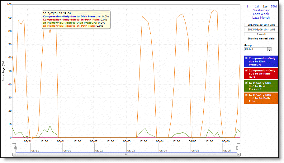
Compression-Only due to Disk Pressure | Displays the adaptive compression occurring due to disk pressure. |
Compression-Only due to In-Path Rule | Displays the adaptive compression occurring due to in-path rule. |
In-Memory SDR due to Disk Pressure | Displays the in-memory SDR due to disk pressure. |
In-Memory SDR due to In-Path Rule | Displays the maximum in-memory SDR due to in-path rule. |
Control | Description |
Time Interval | Select a report time interval of 1 hour (1h), 1 day (1d), 1 week (1w), 30 days (30d), yesterday, last week, or last month. Time intervals that don’t apply to a particular report are dimmed. For a custom time interval, enter the start time and end time using the format yyyy/mm/dd hh:mm:ss Because the system aggregates data on the hour, request hourly time intervals. For example, setting a time interval to 08:30:00 to 09:30:00 from 2 days ago doesn’t create a data display, whereas setting a time interval to 08:00:00 to 09:00:00 from 2 days ago will display data. When you request a custom time interval to view data beyond the aggregated granularity, the data isn’t visible because the system is no longer storing the data. For example, these custom time intervals don’t return data because the system automatically aggregates data older than seven days into two-hour data points: •Setting a one-hour time period that occurred two weeks ago. •Setting a 75-minute time period that occurred more than one week ago. You can quickly see the newest data and see data points as they’re added to the chart dynamically. To display the newest data, click Show newest data. |
Group | Select the group from the drop-down list. |
Data series | Description |
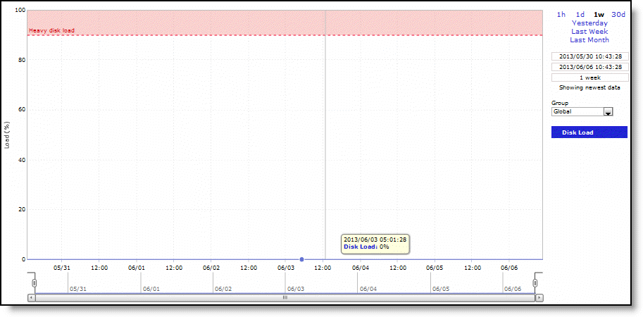
Disk Load | Displays the RiOS data store disk load. |
Control | Description |
Time Interval | Select a report time interval of 1 hour (1h), 1 day (1d), 1 week (1w), 30 days (30d), yesterday, last week, or last month. Time intervals that don’t apply to a particular report are dimmed. For a custom time interval, enter the start time and end time using the format yyyy/mm/dd hh:mm:ss Because the system aggregates data on the hour, request hourly time intervals. For example, setting a time interval to 08:30:00 to 09:30:00 from 2 days ago doesn’t create a data display, whereas setting a time interval to 08:00:00 to 09:00:00 from 2 days ago will display data. When you request a custom time interval to view data beyond the aggregated granularity, the data isn’t visible because the system is no longer storing the data. For example, these custom time intervals don’t return data because the system automatically aggregates data older than seven days into two-hour data points: •Setting a one-hour time period that occurred two weeks ago. •Setting a 75-minute time period that occurred more than one week ago. You can quickly see the newest data and see data points as they’re added to the chart dynamically. To display the newest data, click Show newest data. |
Group | Select the group from the drop-down list. |
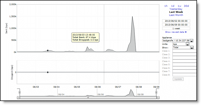
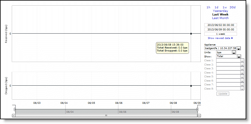
Packet type | Description |
Received | Specifies the total number of bytes received over the WAN. |
Sent | Specifies the total number of bytes sent over the WAN. |
Control | Description |
Time Interval | Select a report time interval of 1 hour (1h), 1 day (1d), 1 week (1w), 30 days (30d), yesterday, last week, or last month. Time intervals that don’t apply to a particular report are dimmed. For a custom time interval, enter the start time and end time using the format yyyy/mm/dd hh:mm:ss Because the system aggregates data on the hour, request hourly time intervals. For example, setting a time interval to 08:30:00 to 09:30:00 from 2 days ago doesn’t create a data display, whereas setting a time interval to 08:00:00 to 09:00:00 from 2 days ago will display data. When you request a custom time interval to view data beyond the aggregated granularity, the data isn’t visible because the system is no longer storing the data. For example, these custom time intervals don’t return data because the automatically aggregates data older than seven days into two-hour data points: •Setting a one-hour time period that occurred two weeks ago. •Setting a 75-minute time period that occurred more than one week ago. You can quickly see the newest data and see data points as they’re added to the chart dynamically. To display the newest data, click Show newest data. |
Appliance | Select an appliance from the drop-down list. |
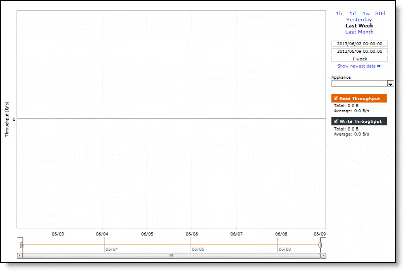
Control | Description |
Total Bytes Read | Specifies the total number of bytes read over the WAN. |
Average Read Throughput | Specifies the average read throughput. |
Total Bytes Written | Specifies the total number of bytes written over the WAN. |
Average Write Throughput | Specifies the average write throughput. |
Average Read IOPS | Specifies the average read IOPS. |
Average Write IOPS | Specifies the average write IOPS. |
Average Read Latency | Specifies the average read latency. |
Average Write Latency | Specifies the average write latency. |
Control | Description |
Time Interval | Select a report time interval of 1 hour (1h), 1 day (1d), 1 week (1w), 30 days (30d), yesterday, last week, or last month. Time intervals that don’t apply to a particular report are dimmed. For a custom time interval, enter the start time and end time using the format yyyy/mm/dd hh:mm:ss Because the system aggregates data on the hour, request hourly time intervals. For example, setting a time interval to 08:30:00 to 09:30:00 from 2 days ago doesn’t create a data display, whereas setting a time interval to 08:00:00 to 09:00:00 from 2 days ago will display data. When you request a custom time interval to view data beyond the aggregated granularity, the data isn’t visible because the system is no longer storing the data. For example, these custom time intervals don’t return data because the system automatically aggregates data older than seven days into two-hour data points: •Setting a one-hour time period that occurred two weeks ago. •Setting a 75-minute time period that occurred more than one week ago. You can quickly see the newest data and see data points as they’re added to the chart dynamically. To display the newest data, click Show newest data. |
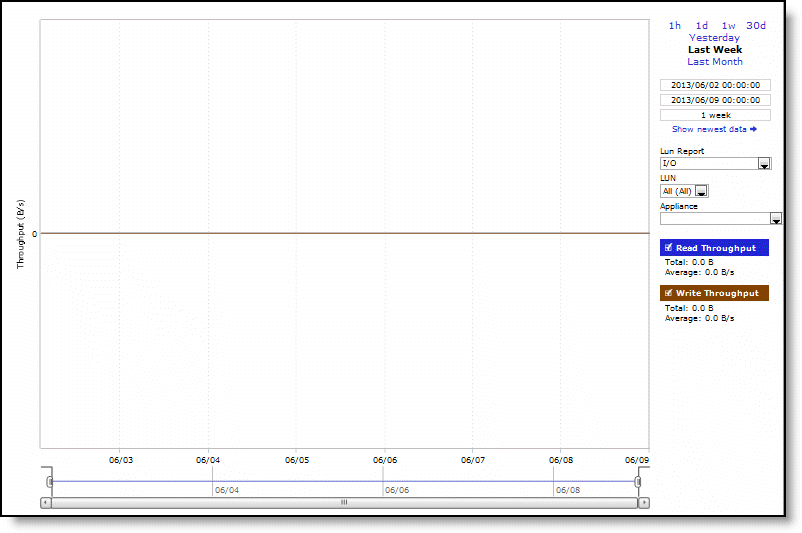
LUN Report | Select a LUN report (I/O, I/O Operations Per Sec, I/O Latency) from the drop-down list. |
LUN | Select a LUN from the drop-down list. |
Appliance | Select an appliance from the drop-down list. |
Control | Description |
Total Bytes Read | Specifies the total number of bytes read over the WAN. |
Average Read Throughput | Specifies the average read throughput. |
Total Bytes Written | Specifies the total number of bytes written over the WAN. |
Average Write Throughput | Specifies the average write throughput. |
Average Read IOPS | Specifies the average read IOPS. |
Average Write IOPS | Specifies the average write IOPS. |
Average Read Latency | Specifies the average read latency. |
Average Write Latency | Specifies the average write latency. |
Control | Description |
Time Interval | Select a report time interval of 1 hour (1h), 1 day (1d), 1 week (1w), 30 days (30d), yesterday, last week, or last month. Time intervals that don’t apply to a particular report are dimmed. For a custom time interval, enter the start time and end time using the format yyyy/mm/dd hh:mm:ss Because the system aggregates data on the hour, request hourly time intervals. For example, setting a time interval to 08:30:00 to 09:30:00 from 2 days ago doesn’t create a data display, whereas setting a time interval to 08:00:00 to 09:00:00 from 2 days ago will display data. When you request a custom time interval to view data beyond the aggregated granularity, the data isn’t visible because the system is no longer storing the data. For example, these custom time intervals don’t return data because the system automatically aggregates data older than seven days into two-hour data points: •Setting a one-hour time period that occurred two weeks ago. •Setting a 75-minute time period that occurred more than one week ago. You can quickly see the newest data and see data points as they’re added to the chart dynamically. To display the newest data, click Show newest data. |
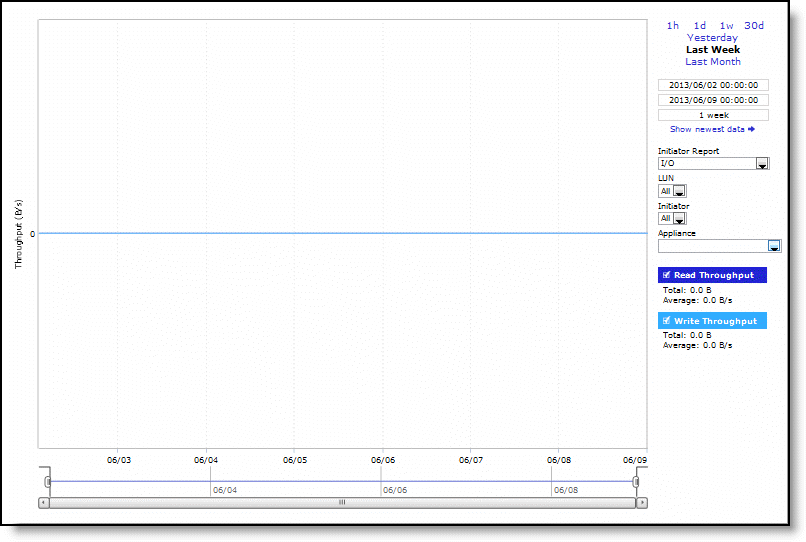
Initiator Report | Select an initiator report (I/O, I/O Operations Per Sec, I/O Latency) from the drop-down list. |
LUN | Select a LUN from the drop-down list. |
Initiator | Select an initiator from the drop-down list. |
Appliance | Select an appliance from the drop-down list. |
Control | Description |
Total Bytes Read and Prefetched from SteelFusion Core | Specifies the total number of bytes read over the WAN. |
Average Read + Prefetch Throughput | Specifies the average read throughput. |
Total Bytes Written to SteelFusion Core | Specifies the total number of bytes written over the WAN. |
Average Write Throughput | Specifies the average write throughput. |
Control | Description |
Time Interval | Select a report time interval of 1 hour (1h), 1 day (1d), 1 week (1w), 30 days (30d), yesterday, last week, or last month. Time intervals that don’t apply to a particular report are dimmed. For a custom time interval, enter the start time and end time using the format yyyy/mm/dd hh:mm:ss Because the system aggregates data on the hour, request hourly time intervals. For example, setting a time interval to 08:30:00 to 09:30:00 from 2 days ago doesn’t create a data display, whereas setting a time interval to 08:00:00 to 09:00:00 from 2 days ago will display data. When you request a custom time interval to view data beyond the aggregated granularity, the data isn’t visible because the system is no longer storing the data. For example, these custom time intervals don’t return data because the system automatically aggregates data older than seven days into two-hour data points: •Setting a one-hour time period that occurred two weeks ago. •Setting a 75-minute time period that occurred more than one week ago. You can quickly see the newest data and see data points as they’re added to the chart dynamically. To display the newest data, click Show newest data. |
Appliance | Select an appliance from the drop-down list. |
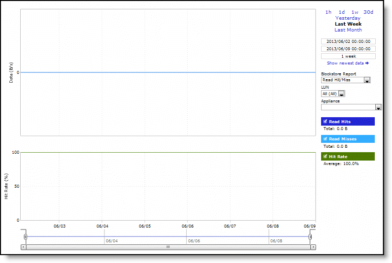
Control | Description |
Hits | Specifies the number of hits. |
Misses | Specifies the number of misses. |
Hit Rate | Specifies the hit rate. |
Bytes Written Blockstore | Specifies bytes written blockstore. |
Uncommitted Bytes at <date> <time> | Specifies uncommitted bytes at a date and time. |
Bytes Committed to SteelFusion Core | Specifies the bytes committed to SteelFusion Core. |
Average Commit Throughput | Specifies the average committed throughput. |
Average Commit Delay | Specifies the average committed delay. |
Control | Description |
Time Interval | Select a report time interval of 1 hour (1h), 1 day (1d), 1 week (1w), 30 days (30d), yesterday, last week, or last month. Time intervals that don’t apply to a particular report are dimmed. For a custom time interval, enter the start time and end time using the format yyyy/mm/dd hh:mm:ss Because the system aggregates data on the hour, request hourly time intervals. For example, setting a time interval to 08:30:00 to 09:30:00 from 2 days ago doesn’t create a data display, whereas setting a time interval to 08:00:00 to 09:00:00 from 2 days ago will display data. When you request a custom time interval to view data beyond the aggregated granularity, the data isn’t visible because the system is no longer storing the data. For example, these custom time intervals don’t return data because the system automatically aggregates data older than seven days into two-hour data points: •Setting a one-hour time period that occurred two weeks ago. •Setting a 75-minute time period that occurred more than one week ago. You can quickly see the newest data and see data points as they’re added to the chart dynamically. To display the newest data, click Show newest data. |
Blockstore Report | Select a blockstore report (Read Hit/Miss, Uncommitted Data, Commit Throughput, Commit Delay) from the drop-down list. |
LUN | Select a LUN from the drop-down list. |
Appliance | Select an appliance from the drop-down list. |
Hostname | IP address | Model | Version | Peer/neighbor | Peer/neighbor To |
vsh-334 | 10.5.160.134 | VCX | 9.2.0 | peer | vsh-580 |
vsh-335 | 10.5.160.140 | VCX | 9.5.0 | peer | sh-23 |
vsh-861 | 10.5.160.130 | — | — | neighbor | sh-23 |
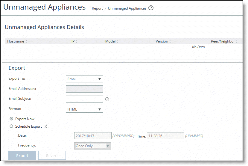
Control | Description |
Export To | Select Email or File from the drop-down list to export the data. |
Email Addresses | Specify the email address to which you want to send the report data. Separate the addresses using a comma. |
Email Subject | Type a customized email subject. This subject replaces the default subject. |
Destination URL | If you have selected File, specify the destination URL. |
Format | Select the format from the drop-down list: HTML, CSV, or PDF. |
Export Now | Select to send the report immediately. |
Schedule Export | Select to schedule date, time, and frequency for a scheduled report: •Date - Specify the date using this format: yyyy/mm/dd •Time - Specify the time using this format: hh:mm:ss •Frequency - Specify the frequency from the drop-down list. |
Export/Revert | Exports the report data; reverts the settings. |
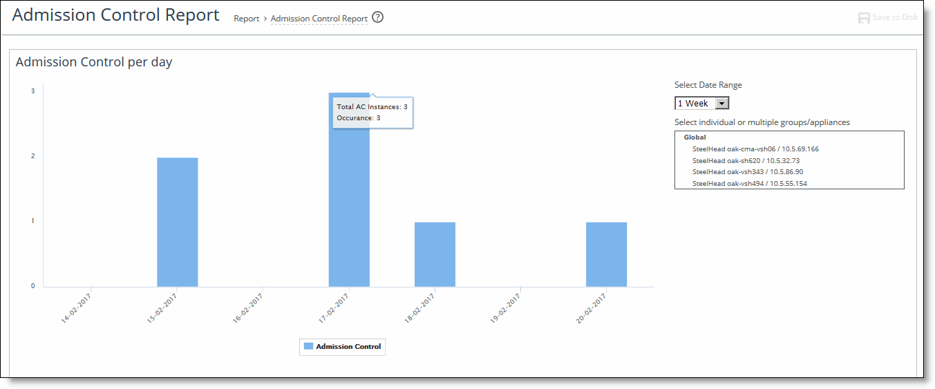
Control | Description |
Connection limit | Indicates the system connection limit has been reached. Additional connections are passed through unoptimized. |
Service | Indicates that the number of connections receiving unoptimized service has exceeded the supported limit. |
CPU | The appliance has entered admission control due to high CPU use. During this event, the appliance continues to optimize existing connections, but new connections are passed through without optimization. The alarm clears automatically when the CPU usage has decreased. |
MAPI | The total number of MAPI optimized connections has exceeded the maximum admission control threshold. for the alarm to clear. |
TCP | The appliance has entered admission control due to high TCP memory use. During this event, the appliance continues to optimize existing connections, but new connections are passed through without optimization. The alarm clears automatically when the TCP memory pressure has decreased. |
Memory | The appliance has entered admission control due to memory consumption. The appliance is optimizing traffic beyond its rated capability and is unable to handle the amount of traffic passing through the WAN link. During this event, the appliance continues to optimize existing connections, but new connections are passed through without optimization. No other action is necessary; the alarm clears automatically when the traffic has decreased. |
Control | Description |
Appliance | Displays the appliance name and IP address. |
Appliance Model | Displays the appliance model. |
Type of event | Displays the total number of events for the appliance according to the type of event (that is, admission control, TCP, memory, CPU, MAPI, connection limit, and service. |
Control | Description |
Export To | Select Email or URL from the drop-down list to export the report data. |
Email Addresses | Specify the email address to which you want to send the report data. Separate the addresses using a comma. |
Email Subject | Type the email subject |
Format | Select the format from the drop-down list: HTML, CSV, or PDF. |
Per Appliance Report | Select to generate graphs per appliance for HTML or PDF reports. For CSV Reports, generates one CSV per appliance. |
Export Now | Select to send the report immediately. |
Schedule Export | Select to schedule date, time, and frequency for a scheduled report: •Date - Specify the date using this format: yyyy/mm/dd •Time - Specify the time using this format: hh:mm:ss •Frequency - Specify the frequency from the drop-down list. |
Export/Revert | Exports the report data; reverts the settings. |