Object Views
Each site, group, device, interface, and host has its own curated view that is designed to present specific information about the object. You can access an object view from the Home page, the Topology Viewer, Search results, other object views, or the Metrics page. Wherever you can click an object name, you can launch the object view.
This section covers the following topics.
Site View
A site-curated view focuses on a single site and presents information about what is being monitored, what has changed, and the overall health of the site. From this view, you can drill down for more information, or you can explore the information on each tab to see what this site comprises and to look at the metrics collected.
The information and health for a site are products of aggregated information from devices, interfaces, sub-sites, and groups that are part of the site.
The following panels are displayed by default:
• Device Health – By Device
• Device Health – By Type
• Interface Health – By Device
• Top Interfaces – Utilization
• Top Interfaces – Packet Error Rate
• Top Interfaces – Packet Discard Rate
• Configuration Changes
The following panels can be added to a site view:
• Data
– Metric Chart
– SteelCentral Net Profiler
– Attributes
– Top/Bottom N Metric Chart
– Metric Period Summary
– Enumerated Time Series
• Summary
– Health Summary
– Configuration Changes
– Health Summary by Device Type
– Synthetic Tests by Test Type
– Navigator Tree
• Maps
– Topology
– Geographic Health
• Banners
– Summary
– Alert Summary
– Header/Separator
Group View
Similar to the site curated view, a group curated view focuses on a single group and presents information about what is being monitored, what has changed, and the overall health of the group. From this view, you can drill down for more information, or you can explore each tab to see what comprises this site and to look at the metrics collected.
The information and health for a group are products of aggregated information from devices, interfaces, sub-sites, and other groups that comprise the group.
The same panels displayed in a
“Site View" are displayed in a group object view.
Device View
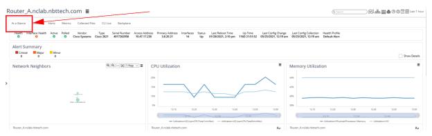
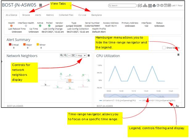
A device curated view, like the one shown below, focuses on a single device and presents information about the overall health of the device, its monitored interfaces, and changes that have occurred. You can also view and explore neighboring devices (up to 5 hops away) in the Network Neighbors panel. From the device object view, you can drill down for more information on interfaces or utilization statistics, or you can discover information, such as specific metrics or attributes, on the view tabs.
The following panels are displayed by default for a device:
• Network Neighbors
• CPU Utilization
• Memory Utilization
• Disk Utilization
• Devices Availability
• Interface Health
• Top Interfaces – Utilization
• Top Interfaces – Packet Error Rate
• Top Interfaces – Packet Discard Rate
• Configuration Changes
The following panels can be added to a site view:
• :Data
– Metric Chart
– SteelCentral Net Profiler
– Attributes
– Top/Bottom N Metric Chart
– Metric Period Summary
– Enumerated Time Series
• Summary
– Health Summary
– Configuration Changes
– Synthetic Tests by Test Type
– Navigator Tree
• Maps
– Topology
• Banners
– Summary
– Alert Summary
– Header/Separator
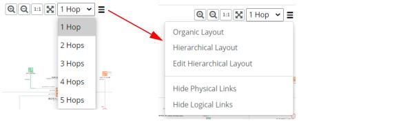
Network Neighbors Panel Controls
The Network Neighbors panel for devices defaults to a high-value schematic layout and provides interface name annotations, object information panels using mouse over, object selection, and right-click operations, as shown in the following screen:
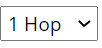
The controls in the Network Neighbors panel let you set the zoom level, select the number of hops from the object you want to see, and choose an action for a selected device in the panel, as shown in the following screens:
The table below describes each control.
Icon | Control | Description |
| Zoom In | Increases the zoom level of the view. |
| Zoom Out | Decreases the zoom level of the view. |
| Zoom to Original Size | Returns the view to the original zoom level. |
| Full-screen topology | Displays the topology on one screen. |
| Hop Count | Choose how many route hops away from this device you want to display (up to 5 hops). |
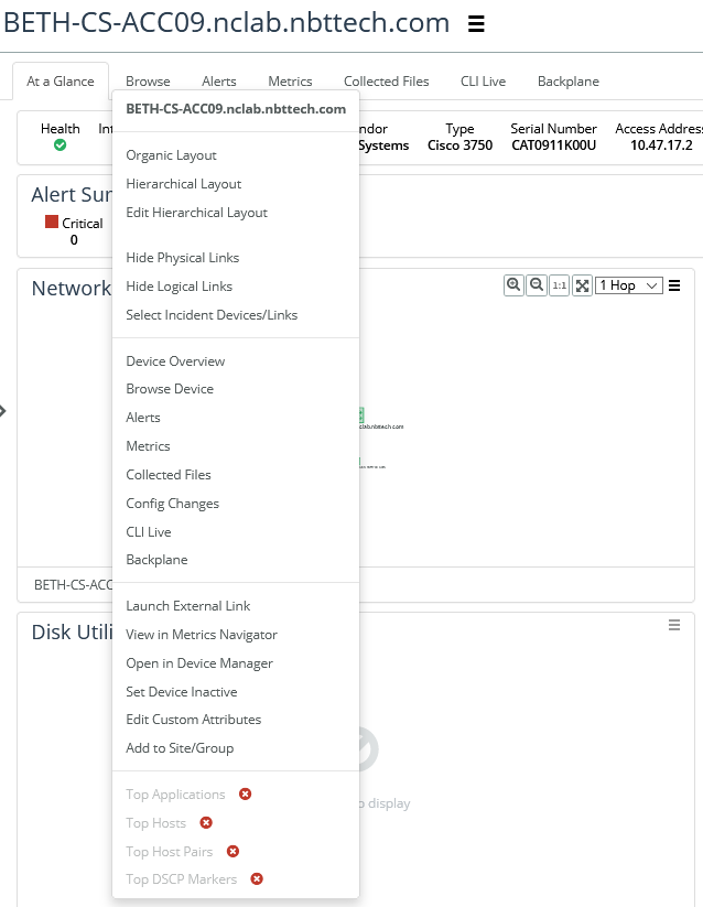
| Actions (Hamburger Menu) | This pop-up menu is active when you have selected an object in the neighbors display. The actions listed depend upon available actions for the object type. For more information, see
“Topology Actions". |
Interface View
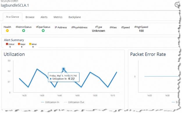
An interface-curated view, like the one shown below, focuses on the health of a single interface.
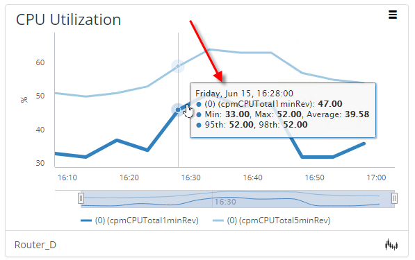
Line graphs make it easy to compare information (such as ingress versus egress utilization on the interface) and to see the value for a given point along the line by hovering over it. Notice in the figure below that we are viewing the utilization for interface lagbundleSCLA.1 for March 3 at 14:42. At that time, our ingress utilization was 0.22 percent.
The following default panels are displayed for a interface view:
• Utilization
• Packet Error Rate
• Packet Discard Rate
• CoS Throughput
• CoS Discards
• Operational Status
• Ethernet Statistics Errors (for Ethernet interfaces)
The following panels can be added to an interface view:
• :Data
– Metric Chart
– SteelCentral Net Profiler
– Attributes
– Top/Bottom N Metric Chart
– Metric Period Summary
– Enumerated Time Series
– Device Hardware Status
– Device Entity Sensor Data
• Summary
– Health Summary
– Configuration Changes
– Event Type
– Synthetic Tests by Test Type
– Navigator Tree
• Maps
– Topology
– Geographic Health (by site)
• Banners
– Summary
– Alert Summary
– Header/Separator
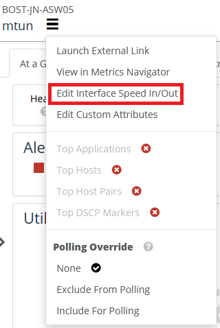
Interface Speed Override
You can override the interface speeds used for calculating interface statistics by using the Edit Interface Speed In/Out option from the Interface View menu, as shown in the following screen:
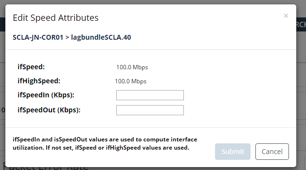
The ifSpeed and ifHighSpeed attributes remain unchanged but you can set the unidirectional speeds used for calculating interface statistics by setting the ifSpeedIn and ifSpeedOut interface attributes, as shown on the following screen:
Object View Tabs
The tabs available for an object view depends upon the object type. The table below lists the tabs, which object types they appear in, and describes their function.
Tab | Available in... | Description |
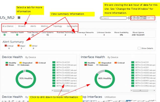
At a Glance | All object types | Provides an overview of health for this object. The panels shown on the page depend upon the type of object. |
Browse | Displays the attributes for this object. Additionally, the following may be displayed: • Device – Group membership and interfaces are shown. • Site –Site and group membership and devices that are members of this site are shown. • Interfaces/Sub-interfaces – Interface attributes are shown. |
Alerts | Brings you to the Alerts Summary page, showing a line graph of alerts and severity over time. |
Metrics | Lets you load a Metric Class to view the metric polling results. For example, for a device object, you could select CPU Utilization, click the Load button, and view a timestamped table of results in this tab. |
Topology | Sites/Groups only | Displays the topology for the Site/Group, as well as its one-hop neighbors. In this topology, you can pan and zoom, and you can perform certain actions from the menu for one or more selected objects. For more information, see
“Topology Actions" in the Topology section. |
Collected Files | Devices only | Lets you view any of the files collected during scheduled collection (for example, Configuration, ARP Table). |
CLI Live | Opens the command line interface for the device. You must have administrative privileges to see this option. |
Backplane | | Provides a graphical view of the device connectivity with mouse-over information and drill downs. |
Working With Panels
NetIM supports custom configurations of panels on the Home page and the various supported object view pages. This section uses the Home page as an example, although the procedures are the same for all object view pages,. This section consists of the following topics:
Editing Panels on the Homepage
The Custom Views feature provides you with control over a key part of NetIM’s visualization. With NetIM’s Custom Views feature, you can do the following:
• Re-define default dashboards
• Add specialized dashboards
• Control what is present in a dashboard
• Control what dashboard displays for what element.
Custom Views also introduces the concepts of Custom View Templates and Template Rules.
A Custom View Template defines the visual content and layout for the page. The data shown in the view is defined by the object or element on which the template is being applied.
A Custom View Template Rule associates a template with one or more elements. The template rules are used to automatically pick the template you want displayed when the “At-a-Glance” dashboard is selected for the element.
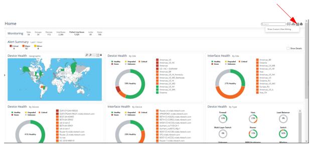
To edit an panels on the Homepage, follow these steps:
1. Log into the UI as admin.
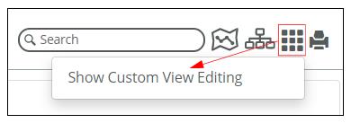
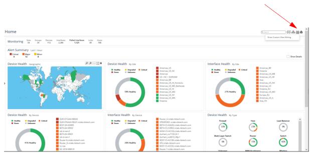
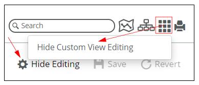
2. On the
Home page, click on the Custom View edit icon

in the upper right, as shown in the following screen:
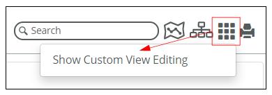
3. Click on Show Custom View Editing, as shown in the following screen:
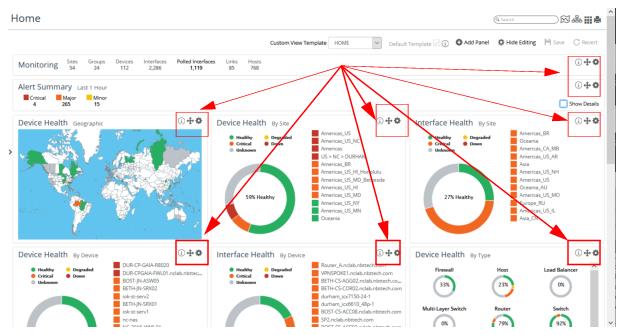
The position descriptor, move, and editing icons

appear in the upper right corner of each object view, as follows. The

icon provides the position or location of the panel.
The

icon allows you to move the panel using a visual drag-and-drop paradigm. The

icon provides a menu that allows you to edit, clone or delete the panel:
To exit
Custom View editing mode, select the
Hide Editing button or
Hide Custom View Editing when you click on the
Custom View edit icon
again, as shown in the following screen:
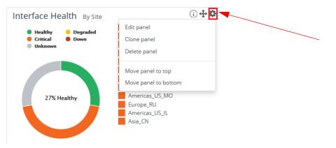
4. Click on the editing icon

for the object you want to edit. The following menu appears:
5. To edit the panel, click on Edit Panel.
The following screen appears:
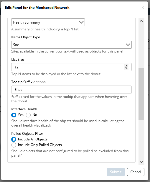
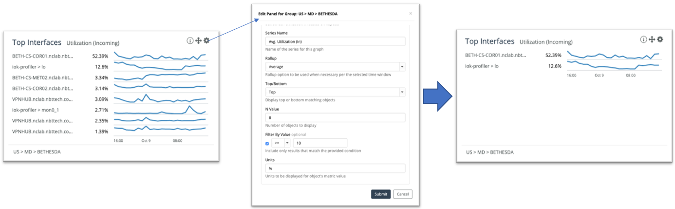
6. From the Edit Panel screen you can do the following:
– Change the title, sub-title, and size of the object
– Change the panel content settings
Custom Views have added several visualization options including Geographic Heat Map by Interface Health, a Top-N/Bottom-N chart, and a Navigator tree panel. The Geographic Health panel can be to any dashboard.
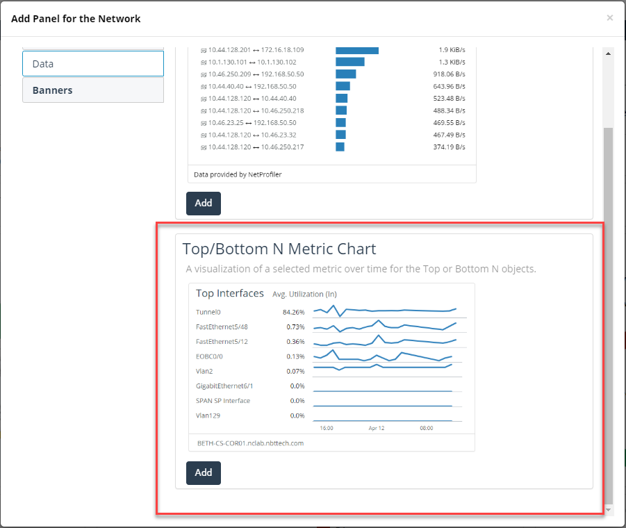
The Top-N/Bottom-N Chart lists the top-N or bottom-N elements. The chart provides the latest value and a spark-line showing recent history to the top-n or bottom-n elements. You can find this visualization component used in NetIM to provide metrics associated with a device’s interfaces, as shown in the following screen:
The Navigator Tree panel is a hierarchical, tree-based viewer that is sorted by the worst health. You can add this new visualization panel to any dashboard:
– Apply filters
7. When you are satisfied with your edits, click the Submit button.
Adding Panels to the Homepage
1. On the Homepage, click on the Custom View edit icon
in the upper right, as shown in the following screen:
2. Click on Show Custom View Editing, as shown in the following screen:
The

:icon appears in the menu options at the top of the page, as follows:
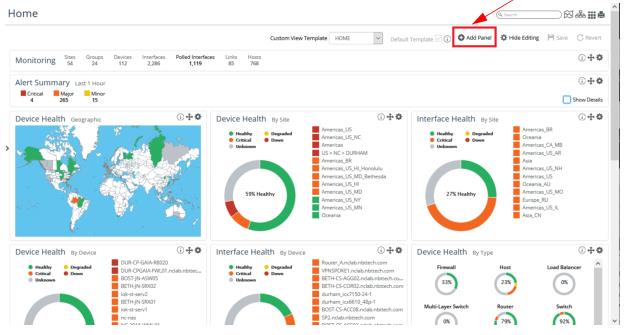
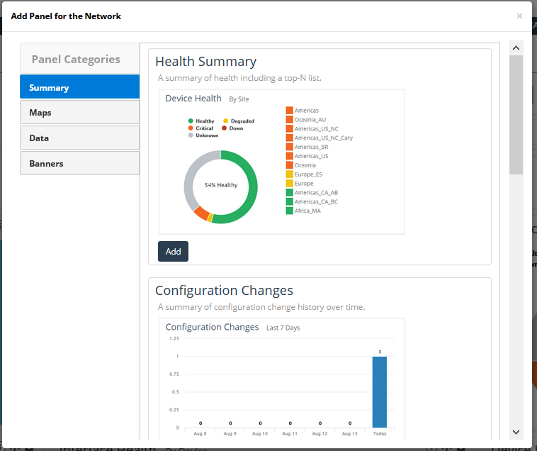
3. To add a panel to the homepage, click on the Add Panel icon.
The following screen appears:
4. Select the new panel type from the categories under Summary, Maps, Data, and Banners.
5. To save your choice click the Add button.
An Edit Panel for the Monitored Network dialog box appears, appropriate for the panel you have chosen to add, as follows:
6. Use the Edit Panel dialog box to define the new panel.
7. When you are satisfied with your edits, click the Submit button, and the new panel appears on the homepage.
System-defined templates cannot be overwritten so if your template name is the same as a system template, you will be prompted to provide a new name.
After saving the new template you can decide if you want it to be the new default template by clicking the Default Template check box.
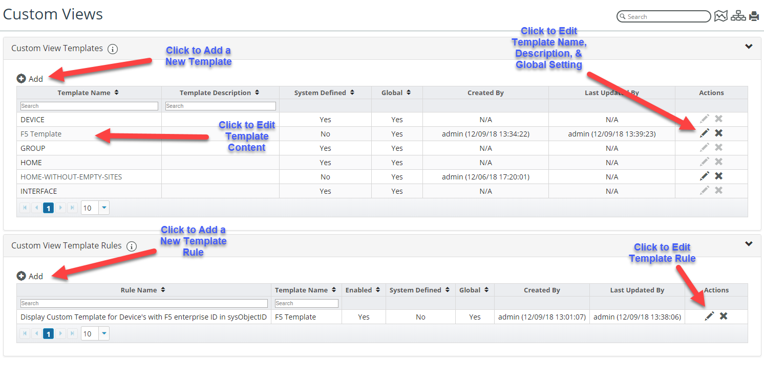
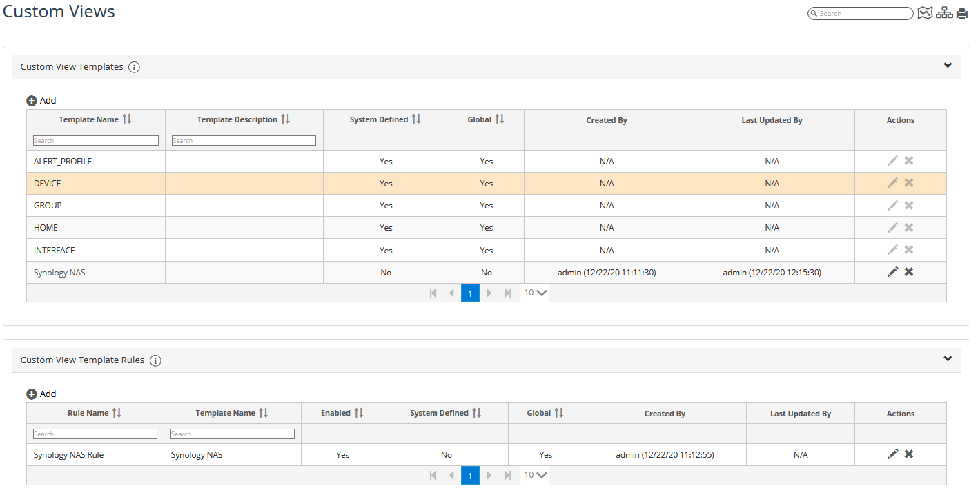
All your templates are available by navigating to Configure > All Settings->Organize->Custom Views.
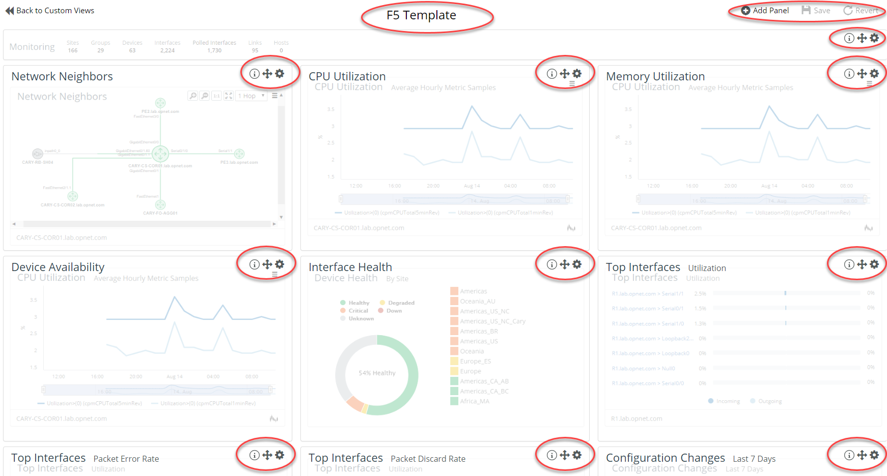
The Custom Views page allows you to add, delete, and modify Custom View Templates and Custom View Template Rules. Custom View Templates are most easily created, as we have done above, by graphically editing an existing However, you can also create and edit templates from the Custom Views page, as shown in the following screen:
Editing an existing populated template from the Custom Views page is very similar to enabling custom view editing from a populated dashboard. You can see in the following that we chose to edit the F5 Template from above. The controls and options are nearly identical as shown in the red-circled highlights as follows:
For more information on
Custom Views, see
Working with Custom ViewsExample Panels from Home and Object Pages
NetIM supports several types of default
Summary,
Map,
Data, and
Banner panels, as well as additional panels that can be added by users. For more information, see
“Adding Panels to the Homepage".
The following are some of the more useful panels:
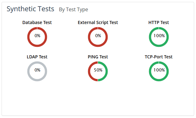
Synthetic Test Panel
The Synthetic Test panel displays the health of your synthetic tests summarized by test type, as shown in the following screen:
In addition to the Home page, the synthetic test summary information panel can be found on the Device At-a-Glance page, and Group/Site At-a-Glance page.
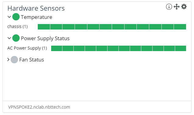
Hardware Sensor Status Panel
The Hardware Sensor Status panel allows you to easily view a summary of the hardware sensor status of your device’s power supply, fan, and overall temperature, as shown in the following screen:
You can now configure and view ENTITY-SENSOR-MIB data in the Device Hardware Sensor Status panel. The ENTITY-SENSOR-MIB is a standard MIB and hence more widely supported by vendors than individual proprietary MIBs for hardware sensor data.
The sensor data is aggregated to high-level LEDs in the panel that can be expanded to see the detail for each sensor.
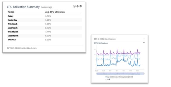
Metric Period Summary Panel
The Metric Period Summary panel allows you to easily compare metric values over time using a summary of various, selectable, time periods for the chosen metric. Additionally, the panel provides quick, drill-down access to a detailed time-series data for the selected time period, as shown in the following screens:
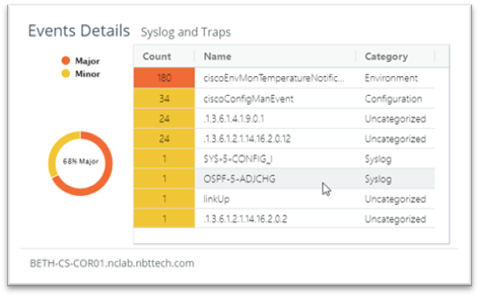
Event Details Panel
The Event Details Panel provides a summary visualization of all received SNMP Traps and Syslogs that have been associated with a specific element. The table displays a ranked listing of the events and their associated severity and category, as shown in the following screen:
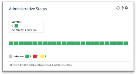
Enumerated Value LED Series Panel
The Enumerated Value LED Series panel allows for customized visualization of any “enumerated” metric (for example, status, health, and so on). You can customize colors and display of the values over time, as shown in the following screen:
Top/Bottom-N Custom View Panel
Top/Bottom-N Panel Filtering is provided in Top/Bottom-N Custom View panels. You can select whether you want the results shown in the Top-N/Bottom-N panel to be limited to only elements that eclipse a selected threshold value, as shown in the following screen:
Working with Custom Views
NetIM supports custom views that allow users to create private or public templates and then associate them with a rule set for viewing objects.
Template rules are powerful in that they allow you to granularly control when a template will be used.
Templates can be made default meaning they will override the system-defined templates. Custom View Templates and Template Rules can be global or user specific. Global means they are available to all users.
The admin is the only user role that can create and edit global templates and rules.
Template views and rules created by a user are specific to the user who created the template and template rule. If an admin role edits a user’s template o template rule o be global then they will belong to the admin and the original user who created them will no longer have privileges to the template view or rule.
To create, edit, modify, or delete a custom view follow these steps:
1. Login to the UI as admin.
2. Navigate to CONFIGURE->All Settings->Organize->Custom Views.
The following screen appears:
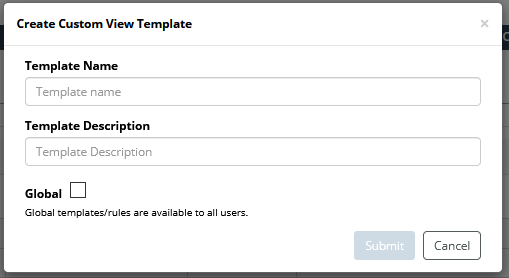
3. Create a template by clicking on the +Add icon in the Custom View Templates frame.
The following screen appears:
4. Provide the following information and the click the Submit button to create the template:
– Template Name
– Template Description
– Whether or not you want the template to be available to all users
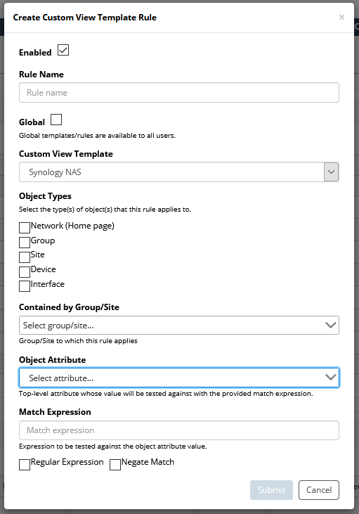
5. Create a template rule set to associate with the custom template the +Add icon in the Custom View Template Rules frame.
The following screen appears:
Custom View Template rules associate a specific template with one or more elements within the application, such that the selected template will be automatically displayed for that element when the at-a-glance view for that element is loaded, for example:
6. Provide the following information and then click the Submit button to create the template:
– Whether the rule should be Enabled (default) or disabled.
– Rule Name
– Whether or not you want the rule to be available to all users
– Which custom view template you want to associate with the rule
– Object types to associate with the rule
If you select Network (Home page), the remaining choices are grayed out.
– Group/Sites to which the rule applies
– Object Attributes
– Match Expression
– Whether the Match Expression should be a Regular Expression or a Negative Match
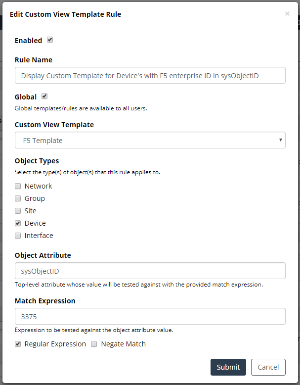
Template rules use an attribute of an object and associated matching criteria to control when a template should be used to display the data of a certain object. In the following example, we have chosen to trigger the F5 template when its sysObjectID contains F5’s IANA-defined enterprise ID, as shown in the following screen:
7. (Optional) Edit or delete a template or a template rule by clicking on the

icons in the
Actions column.
Working with Charts
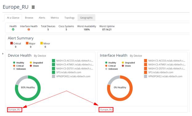
All charts associated with sites/groups, devices, and interfaces include a footer with the name of the object they pertain to, as shown in the following screen:
The object name footers allow you to maintain the object context as you navigate the page. Additionally, including the object name footer with each chart enables you to take screen shots of the chart without the additional need to label them with the object name.
Line Charts
In addition to including an object name footer on all charts, the line chart has been significantly enhanced with many new features.
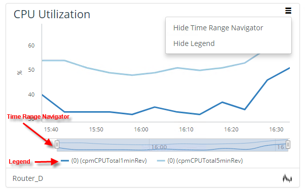
The following new functionality has been added to the line chart:
• Time Range Navigator
Allows you to focus in on a specific time range.
• Upper Right-Hand Menu
Allows you to show/hide
– Time Range Navigator
– Legend
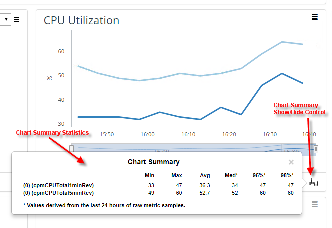
• Chart Footer
Provides Chart Summary Statistics
• Trend Lines
• Detailed mouse overs
The following CPU Utilization screen shows these new line chart features:
The chart footer

provides access to the following Chart Summary statistics, as shown in the following screen:
• Min
• Max
• Average
• Median
• 95th percentile
• 98th percentile
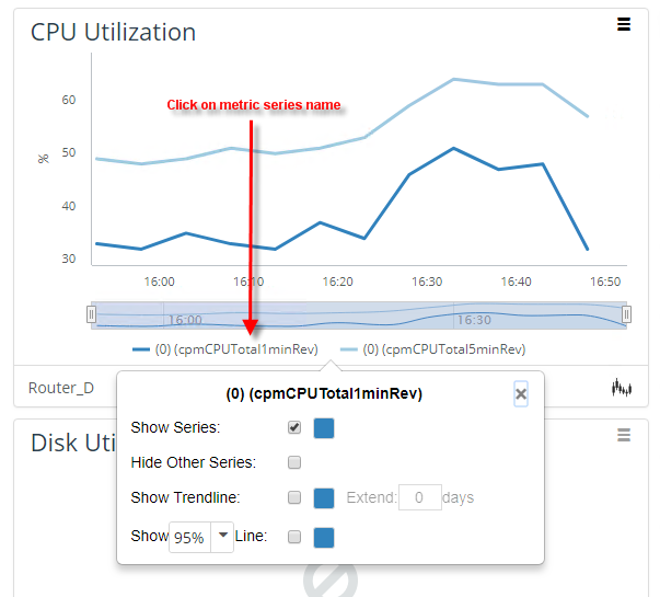
Clicking a series in the legend provides more controls including the ability show/hide the metric series of interest, show/hide other metric series, and show/hide linear regression trend lines and 95th and 98th percentile threshold lines, as shown in the following screen:
The line chart mouse overs now contain more information and associated statistics allowing you access to key information with less navigation required, as shown in the following screen:
Working with Navigator
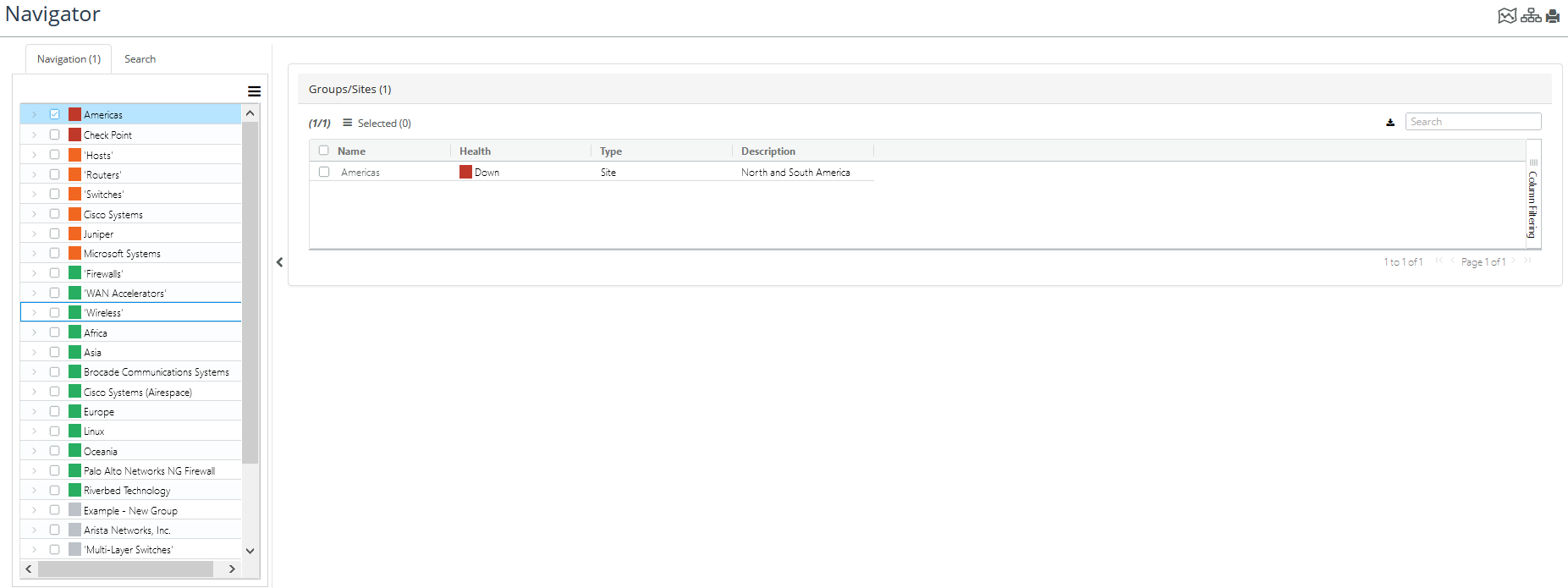
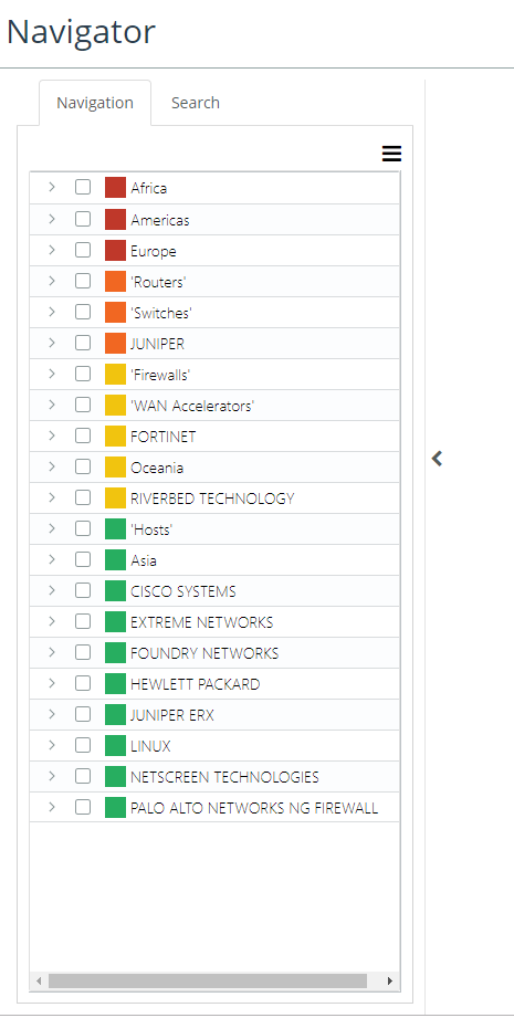
Navigator provides hierarchical, tree-based views with associated health LEDs allowing you to navigate and browse through your managed infrastructure. Navigator provides you with a new way to view the health of your infrastructure and drill-down to degraded assets.
You can also add a
Navigator Tree panel to the
Home and object pages. For more information, see
“Working With Panels“.
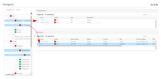
To launch Navigator, navigate to More->Navigator. The following screen appears:
The Navigator tree on the left side is sorted by each sites or group’s health, as shown in the following screen:
You can quickly identify degraded sites and groups and then drill-down in a tree-like paradigm to find the specific degraded assets and their attributes, as shown in the following screen:
