Viewing Reports and Logs
This chapter describes how to display system reports and user and system logs to evaluate performance or troubleshoot. It includes these topics:
Networking Reports
Optimization Reports
Branch Services Reports
SteelFusion Edge Reports
Diagnostic Reports
Overview
This section describes the report format basics, before describing individual reports.
All of the time-series reports are clear, interactive, and easy to navigate. The statistics presented in this report format are readily accessible, and all updates to the report window appear in real time. This section describes the report format in detail.
Navigating the Report Layout
The time-series report format not only makes data easily accessible, but also enhances your ability to explore data in context. An example of a typical report appears in
Figure: A Time-Series Report, with the key areas labeled. For details about individual reports, see the report description.
Figure: A Time-Series Report
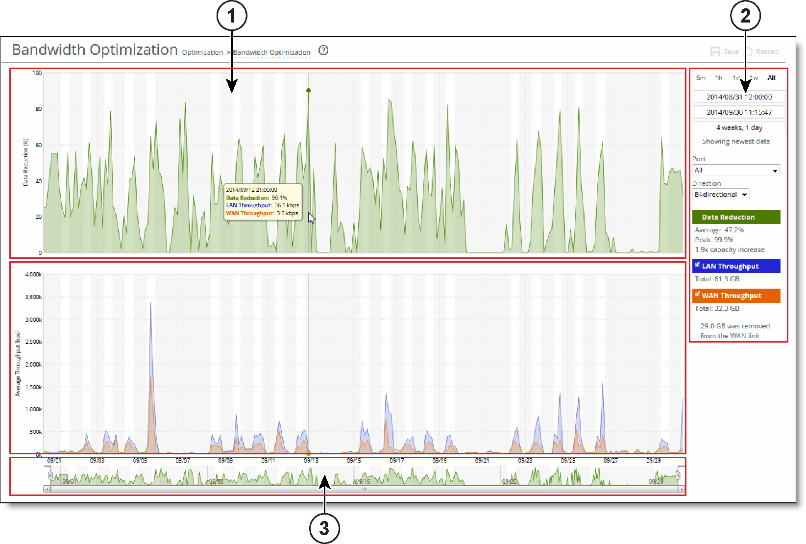

Plot Area
The plot area is where the data visualization occurs. Reports can display either a single-pane or dual-pane layout. In a dual-pane layout, both panes remain synchronized with respect to the x-axis. Each pane is capable of having two y-axes (a primary one on the left and a secondary one on the right).
The reports present the majority of data series as simple line series graphs, but some reports display area series graphs where appropriate. The types of area series graphs are:
• Layered series, which appear on top of each other in the z direction. These are identified by transparent colors.
• Stacked area series, which appear on top of each other in the y direction. RiOS uses stacked area graphs to depict an aggregate broken down into its constituent parts. In this type of graph, each series is a mutually exclusive partition of some aggregate data set, identified by opaque colors. A stacked series is appropriate when the sum of all the series is meaningful.
Hover over a specific data point to see what the y values and exact time stamp are in relation to peaks.
To view the time stamp and value of each data series at that time
• Place the mouse pointer over the plot area.
A tool tip displays the time stamp and the value of each data series at that time. The plot area colors the series names appropriately, and the data values have their associated units.
The plot area also displays subtle shading to denote work hours (white background) and nonwork hours (gray background). RiOS defines work hours as 8:00 AM to 5:00 PM (0800 to 1700) on weekdays. You can’t configure the work hours.
To zoom the plot area
1. Place the mouse pointer over the plot area, and then click and hold the left mouse button.
2. Move the mouse left or right and release the left mouse button to zoom in.

Control Panel
Use the control panel to control how much data the chart displays, chart properties, and whether to view or hide the summary statistics.
To change the chart interval
• Click a link: 5m (5 minutes), 1h (1 hour), 1d (1day), 1w (1 week), or All (all data). All data includes statistics for the last 30 days.
If the current size of the chart window matches any of the links, that link appears in bold black text; the system ignores any clicks on that link. If the time duration represented by any of the links is greater than the total data range of the chart, those links are dimmed.
• Chart window controls - More window-related controls appear below the chart window interval links. These controls offer more precise control of the window and also display various window properties. From top to bottom:
• Text field containing the left edge (starting time) of the chart window.
• Text field containing the right edge (ending time) of the chart window.
• Text field containing the chart window interval. The chart window interval in this text field isn’t always exactly correct, but it is correct to two units (with the units being days, hours, minutes, and seconds). For example, if the chart window interval is exactly two days, three hours, four minutes, and five seconds, this text field displays 2 days, 3 hours.
• Link or static text that represents the chart window state of attachment to the end of the chart. When the chart window is attached, the report replaces the link with the static text Showing newest data. When the chart is showing newest data, you can see new data points as the system adds them automatically to the chart every 10 seconds. This automatic data point refresh can be powerful when you launch a new configuration and need to analyze its impact quickly. You can’t change the 10-second default.
When the chart window isn’t attached to the end of the chart, the report replaces the static text with a link that displays Show newest data. Click this link to slide the chart window to the end of the chart range of data and attach the window.
All three text fields validate your input; if you enter text in an invalid format, an error message appears. If you enter valid text that is logically invalid (for example, an end time that comes before the current start time), an error message appears. With all three text fields, if the focus leaves the field (either because you click outside the field or press Tab), the chart window updates immediately with the new value. Pressing Enter while in one of these fields has the same effect.
Custom Controls
Below the chart window controls is an optional section of custom, report-specific controls. The custom controls vary for each report. In
Figure: A Time-Series Report, the Bandwidth Optimization report displays Port and Direction drop-down lists.
When you change the value of a custom control, the system sends a new request for data to the server. During this time, the control panel is unavailable and an updating message appears on the chart. When the report receives a response, the system replaces the chart, populates it with the new data, and makes the control panel available again.
Chart Legend
The chart legend correlates the data series names with line colors and contains a few other features.
You can hide or show individual data series. When a white check box icon appears next to the data series name, you can hide the series from the plot area.
To hide individual series from the plot area
• Clear the check box next to the data series name.
To display individual series in the plot area
• Select the check box next to the data series name.
You can’t toggle the visibility of all series, because it doesn’t always make sense to hide a series (for example, if there’s only one data series in the chart). For these series, a white check box doesn’t appear next to the series name. In
Figure: A Time-Series Report, you can hide the LAN Throughput and WAN Throughput series, but you can’t hide the Data Reduction series.
The legend also displays statistics. Each report defines any number of statistics for any of the data series in the chart. The system bases the statistics computation on the subset of each data series that is visible in the current chart window. The statistics display changes immediately if you change the chart window. The plot area reflects the changing chart window, as do the associated controls in the control panel.
The reports also support nonseries statistics (for example, composite statistics that incorporate the data from multiple data series); these statistics appear at the bottom of the legend, below all the series.
The three most popular statistics calculations are:
• Average - the average of all the data points
• Peak - the maximum of all the data points
• Total - the integral of the series (area under the curve). It is important to note that the total reported under each Throughput color in the chart legend displays the total amount of data transferred during the displayed time interval.

Navigator
Directly above the scroll bar is the navigator, which shows a much smaller and simpler display of the data in the plot area. The navigator displays only one data series.
Use the navigator to navigate the entire range of chart data. The scroll bar at the bottom shows you which portion of the total data range is displayed in the plot area.
The navigator display can appear very different from the plot area display when an interesting or eye-catching series in the plot area isn’t the series in the navigator.
To resize the current chart window
• Move the handles on either side of the chart window in the navigator.
The charts have a minimum chart window size of five minutes, so if you resize the chart window to something smaller, the chart window springs back to the minimum size.
You can also click the data display portion of the navigator (not the scroll bar) and the chart window moves to wherever you clicked.
Setting User Preferences
You can change report default settings to match your preferred style. When you customize any report-specific settings, the system immediately writes them to disk on the SteelHead. The system saves all of your custom settings, even after you log out, clear your browsing history, or close the browser. When you view the report again, your custom settings are intact.
The system saves the chart window. Whenever you change the chart window, the next time you view any report, the chart window is set to the last chart window used.