About the report format
The time-series report format not only makes data easily accessible, but also enhances your ability to explore data in context.
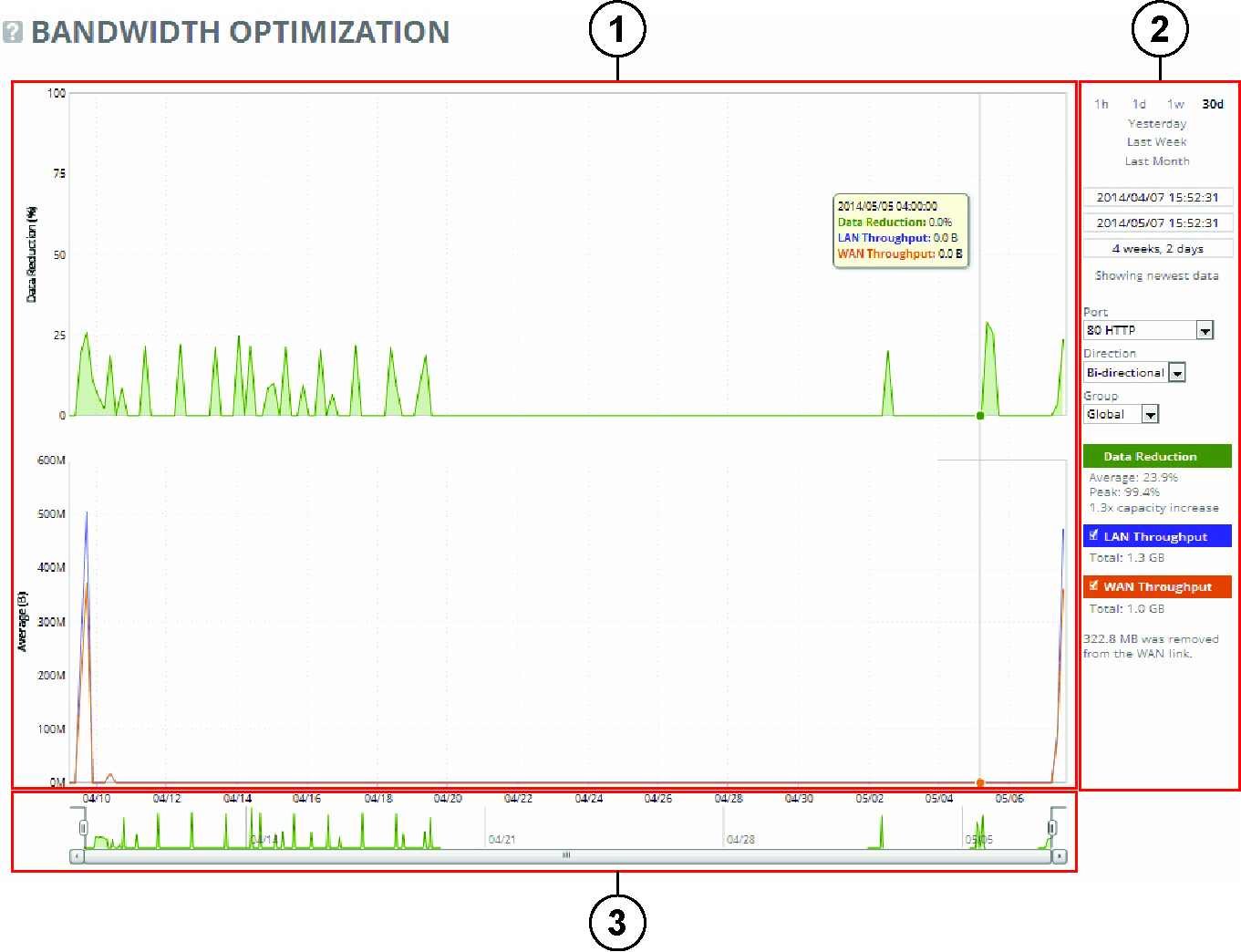
Typical report with plot area (1), control panel (2), and navigator (3)
Plot area
The plot area is where the data visualization appears. Reports can display either a single-pane or dual-pane layout. In a dual-pane layout, both panes remain synchronized with respect to the x-axis. Each pane is capable of having two y-axes (a primary one on the left and a secondary one on the right).
The reports present the data series as simple line series graphs, but some reports display area series graphs where appropriate. The types of area series graphs are:
• Layered series, which appear on top of each other in the z direction. These are identified by transparent colors.
• Stacked area series, which appear on top of each other in the y direction. RiOS uses stacked area graphs to depict an aggregate broken down into its constituent parts. In this type of graph, each series is a mutually exclusive partition of some aggregate data set, identified by opaque colors. A stacked series is appropriate when the sum of all the series is meaningful.
Control panel
Use the control panel to control how much data the chart displays, the chart properties, and whether to view or hide the summary statistics. You can select one of these time intervals: 1h (one hour), 1d (one day), 1w (one week), 30d (30 days), Yesterday, Last Week, or Last Month. If the current size of the chart window matches any of the intervals, that interval appears in bold black text; the system ignores any clicks on that link. If the time duration represented by any of the links is greater than the total data range of the chart, those links are dimmed.
Chart window controls. Window-related controls appear below the chart window interval links. These controls offer more precise control of the window and also display various window properties. From top to bottom:
• Text field containing the left edge (starting time) of the chart window.
• Text field containing the right edge (ending time) of the chart window.
• Text field containing the chart window interval. The chart window interval in this text field isn’t always exactly correct, but it is correct to two units (with the units being days, hours, minutes, and seconds). For example, if the chart window interval is exactly two days, three hours, four minutes, and five seconds, this text field displays two days, three hours.
• Link or static text that represents the chart window state of attachment to the end of the chart. When the chart window is attached, the report replaces the link with the static text Showing newest data. When the chart is showing newest data, you can see new data points as the system adds them automatically to the chart every 10 seconds. This can be very powerful when you launch a new configuration and need to analyze its impact quickly. You can’t change the 10-second default.
When the chart window isn’t attached to the end of the chart, the report replaces the static text with a link that displays Show newest data. Click this link to slide the chart window to the end of the chart range of data and attach the window.
All three text fields validate your input; if you enter text in an invalid format, an error message appears. If you enter valid text that’s logically invalid (for example, an end time that comes before the current start time), an error message appears. With all three text fields, if the focus leaves the field (either because you click outside the field or press Tab), the chart window updates immediately with the new value. Pressing Enter while in one of these fields has the same effect.
Custom controls
Below the chart window controls is an optional section of custom, report-specific controls. The custom controls vary for each report.
When you change the value of a custom control, the system sends a new request for data to the server. During this time, the control panel is unavailable and an updating message appears on the chart. When the report receives a response, the system replaces the chart, populates it with the new data, and makes the control panel available again.
Chart legend
The chart legend correlates the data series names with line colors and contains a few other features.
You can hide or show individual data series. When a white check box icon appears next to the data series name, you can hide the series from the plot area.
The legend also displays statistics. Each report defines any number of statistics for any of the data series in the chart. The system bases the statistics computation on the subset of each data series that’s visible in the current chart window. The statistics display changes as the chart window changes. The reports also support nonseries statistics (for example, composite statistics that incorporate the data from multiple data series); these statistics appear at the bottom of the legend, below all the series.
Navigator
Directly above the scroll bar is the navigator, which shows a much smaller and simpler display of the data in the plot area. The navigator displays only one data series.
Use the navigator to navigate the entire range of chart data. The scroll bar at the bottom shows you that portion of the total data range is displayed in the plot area.
The navigator display can appear very different from the plot area display when an interesting or eye-catching series in the plot area isn’t the series in the navigator.